• Welcome to BirdForum, the internet's largest birding community with thousands of members from all over the world. The forums are dedicated to wild birds, birding, binoculars and equipment and all that goes with it.

    Please register for an account to take part in the discussions in the forum, post your pictures in the gallery and more.
ZEISS DTI thermal imaging cameras. For more discoveries at night, and during the day.

Is this too overexposed? (1 Viewer)

peteh

Well-known member
Hi,

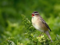
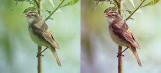
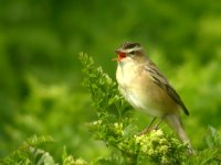
Recently I took a pile of Sedgey pictures, and when I took this one I was hoping it would come out well, but up until now I have ignored it because of the overexposed breast.
So I'm uploading this to get some feedback as to whether the overexposure does ruin the picture and also is there anything I can do to reduce it in photoshop.
(I have tried darkening but it keeps making the whole picture waaay to dark imo.)
Also any other comments as to how I can improve generally would be welcome.
(The photo hasn't been cropped just unsharp masked.)
Thanks
Pete.
 

Attachments

  • sedgewarbler2.jpg
    sedgewarbler2.jpg
    91.7 KB · Views: 408
Last edited:
Hi petee23,

I'm just uploading some shots of Common Whitethroat to my computer that I took this morning so I'm very aware of this problem! - it's often better to under-expose a little just to keep detail in the highlights, although (depending on the top shutter-speed of your camera) this can be hard to achieve in very bright light. you can't put back detail in Photoshop that has been burned-out completely but you can tone-down the bright whites a little in 'Levels.' As well as the more regularly used 'Input levels' you'll find underneath the 'Output Levels' - just slide the right-hand pointer over to the left a little, away from the whitest part until you get the desired effect. As with all such tools, too much will look 'orrible!

Adey
 
Hi peteee23,

It's still a nice shot and compositionally spot on. I like the pose and the contrast of the bird against the greenery. The over-exposure does detract the eye a bit but the photo is still a good one.

I'm afraid that Adey is right, there isn't too much that you can do about over-exposure. Rather than altering jsut the broghtness, lowering the contrast sometimes helps, but if the detail isn't there in the first place then there isn't much that you can do bout it. The only alternative to my mind would be to start using the clone tool and or drawing/painting in the problems areas, but I'm afraid that I don't like to do that myself. A bit of sharpening and cropping is all I like to use. Photoshop is a marvellous utility but I'm inexperienced in it's use. The magic wand is a useful tool for just selecting the area that you want to apply adjustment to, such as the breast int his case wihich may be worthwhile as regards contrast or levels, since the rest of the shot is fine.

Obviously the time to tackle this problem is at the time of taking the shot. I generally try to expose for the brightest area of the shot and if possible bracket exposures too.

I like it enough to give four stars.
 
Great image.

Sorry for the liberties taken below. In my opinion, on my monitor, the picture has a slight yellow cast. Also, using "Neat Image" I reckon you could get away with a bit more sharpening; particularly I'd guess on your original.

I'd like to think I'm not pedantic enough for this "critique" business: probably wouldn't have noticed the over-exposure if you hadn't mentioned it. I reckon you've been sitting on your four star image too. Shame on you!
 

Attachments

  • sedgewarbler.jpg
    sedgewarbler.jpg
    61 KB · Views: 358
Well done, normjackson, you've made a good shot even better - and you're right about the over-exposed bits not detracting too much. It actually shows what a glorious sunny day it was! In these situations a film camera wouldn't have done much better - especially without 'hand-printing' from the neg.

Adey
 
Hi,

Thanks for the comments, much appreciated.

Norm - how did you remove the yellow cast so well?
I would like to learn that as I take a lot of pictures in the same area and I've had a few come out a bit yellowy.

ps what is neat image?

Thanks
Pete.
 
I've got to disagree here with the comments about Norman's "improvement" on the photo. What was initially a very good photo of a Sedge Warbler (nowt wrong with it Pete!), has turned out to be a badly over-exposed photo of a Moustached warbler. Where was it Pete and why didn't you tell me about it?
 
Hi, Petee,

How about trying the magic wand, select the area with the wand then play with the brightness. It does the trick but beware it can be a very fiddly option. But if it works why not.

Still a great shot
 
CJW I accept that my revision is probably very clumsy. I literally spent under a minute on it in Photoshop (and you'll see it was past my bedtime!) I should say, though, I spent so little time on it only because I don't feel comfortable "hijacking" someone's picture without their express permission. M'be a little more caution with the sliders in Photoshop is called for...

Anyway, Peter, if you're interested in experimenting with "color balance" in Photoshop, look under Image->Adjust->Color Balance. If you perceive a yellow cast, try sliding the bottom slider from yellow towards blue and see what you think. Photoshop lets you make the adjustments separately for highlights, midtones and shadows.

I said in my post I hadn't paid much attention to the overexposed breast. I've since had a sneaky-peeky and doing a bit of burning-in does bring out a wee bit more detail there. I wonder, is the version we see significantly more compressed than the original?

www.neatimage.com/download.html is the web page to go to if you're interested in using this program. I've been using it on some ancient prints I've scanned in. Essentially it's allowed me to do what appear suicidal levels of sharpening in Photoshop (many photos taken on cheap fixed-focus cameras) and still end up with something that wouldn't make Georges Seurat cringe. Then again he might.
 
CJW,

I not too sure how you intended your last comments.....

Are you saying the improvement made by norm were so bad they turned a Sedge warbler into a moustached warbler?

Or are you saying you think the bird is infact a moustached warbler (as you asked where it was seen), if so why? Can't see it myself, but then again i'm still a novice at this.
 
Sorry Adey, I didn't acknowledge your compliment. Cat's out the bag now in that any praise due is due to a few seconds on Photoshop and the ability of Neat Image to remove noise after an extra sharpen. Personally I like the slight extra sharpen apparent on the bird which gives a heightened sense of differential focus. I do think maybe I was a bit heavy handed with the colour balance which maybe has left the bird a little monochromatic. Also while we're agreed the bright breast doesn't stop it being an outstanding image, I can well understand Pete (sorry I called you Peter earlier, a slip not deliberate formality) wanting to know if it can be improved with more detail there.

I see as I write this we have another angle from Malky who has tried to address Pete's initial concern about the burnt-out breast and has toned down the greens. The green is less summery or lurid depending on your take. I wonder if Pete likes this breast. How did you do it Malky?
 
Hi,

I have took everything on board and come up with an image I am happy with now. :)
I adjusted the greens and used neat image (thanks norm),
adjusted the levels a bit more (thanks adey)
and have done a tiny bit of clone stamping in photoshop on the breast. (thanks ianf).
Time to go play with some more photos I think :)
 

Attachments

  • sedgewarbler2d_filtered.jpg
    sedgewarbler2d_filtered.jpg
    84.9 KB · Views: 283
Last edited:
Jeff, just to clarify. My comment about the moustached warbler was tongue-in-cheek and based on the fact that that all the 'edited' photos now show a black crown (almost purple/black on some) and some really dark streaking on the mantle/scaps. It's obviously a sedge warbler and all this colour manipulation is really unnecessary. I prefer the original image as a true representation of the species. I also think the that the yellow caste as commented on by some is a result of reflection from the plant on which the bird is perched.
 
Delighted you've got a result you're now pleased with. Sorry to be stating the obvious, but don't forget to keep the original under lock and key. You may well later come around partly or completely to CJW's opinions. Or maybe develop new techniques you wish to try out. My other obvious observation is that your development of image processing technique should not be at the expense of "getting out there" (though it's pretty grim outside here at the moment). Whether before or after your revisions, your picture is still "only" a four star. We're saving the five star rating for your picture of a Moustached warbler sitting next to a Spectacled warbler, perhaps the pair being attacked by an exceptionally hungry Griffon vulture. 3:) 3:) 3:)
 
Hi All,

This has been a really interesting thread showing how we all 'see' a bird-photo in a slightly different way. I suppose only the original photographer can get it spot-on - that is if he/she can remember percisely how the bird 'looked' at the time and then get the photo right in-computer. Whilst we're on Sedge Warblers, I've attached a shot of one that I took yesterday which, apart from cropping and re-sizing, has had no manipulation to it whatsoever (not even to remove that little white dot on the lower mandible!). It would be interesting to see how everyone would alter this to bring out the best shot in there.

Adey
 

Attachments

  • sedge w.jpg
    sedge w.jpg
    50.2 KB · Views: 268
You've got to be kidding, Adey! Who's now going to be brave enough (or foolish enough) to consider offering an improved version of this picture? It's terrific.

Still, so as not to be accused of a jealous, sulky silence, I decided to put your picture into a few photo-enhancing programs to see what they did to it. The only one which didn't completely ruin it, in my opinion, was the Adobe Photoshop plugin "Quantum Mechanic"; this is, I believe, a rather expensive plugin much favoured by some professional photographers (I recently downloaded the 30 day limited demos of the Lite and Pro version). The default settings seemed to do a very subtle sharpening and increase in contrast. You may like the result.

Also (mischievously perhaps?) after loading the picture into Photoshop I clicked on Image->Adjust->Levels then clicked on the middle eye-dropper. Doing clicks with this eye-dropper in the greyish regions in the bottom left of the picture can be used to provide admittedly crude but instant colour balance changes. You can even change your sedge warbler into a house sparrow with a click of a button!
 
I've got a rather ancient version of Photoshop so I'm not sure whether some of the more recent plug-ins will work or not!

I tried the usual 'Levels' and a bit of 'Unsharp Mask' on the shot and they didn't seem to improve it at all - perhaps this is one image that doesn't need any messing-about with.

I'd never bothered with those eye-droppers before - I wondered what they were for - thanks!

Incidentally, the image has appeared slightly darker on this page than the original - if this is usual it may be worth lightening any images a tad before uploading to the site.

Adey
 
There are an awful lot of variables involved: the application that is displaying the picture; the monitor and monitor settings; and of course if you're looking at printing, the printer, choice of inks and paper etc etc can all have an effect. Oh yes, and did I mention people?

You've got a great picture to play with on those wet winter evenings because it has so much detail and colour in it. Of course virtually any processing you do to it will lose something but may produce something new that has value elsewhere.

Did you play with the eyedropper? Not sure that's what it's really for, but playing with that certainly beats putting eye drops for hayfever into a bloodshot eye (Youch!). I promised myself I wouldn't do this, but I'm going to post my "colour balance changed" version of your picture I did. Yes, I know, house sparrows and all that, but still I'm trying, probably unsuccessfully, to illustrate that even the perfect image might benefit from a "tweak" when it's required to perform a new function.

Best wishes, always.

P.S. If you're interested in seeing whether you can use a current plugin, the Quantum Mechanic demos are at www.camerabits.com/QM2.html

P.P.S If you've been staring at your picture too long, don't forget to try the old artists mirror trick by doing Image->Rotate Canvas->Flip Horizontal
 

Attachments

  • thumbs.jpg
    thumbs.jpg
    18.1 KB · Views: 218
Photo Shop is a super package, but as I am red /green colour blind I tend to shy away from trying to enhance colours or change hues. Really embarrassing when wifey tells you your fine picture of a Nuthatch now resembles a Robin!! But I did like the first enhancement, and still see the original as a fine photo.
 
Nice one Bob. You know it is possible to produce an improvement on Adey's picture for a 2x2 pixel thumbnail. OK, m'be not, but I wanted to give Adey concrete evidence that I at least tried.

I hope your wife's comments are delivered kindly. In my book any mickey taking is always construed as an offer to take on more work. If she isn't proficient in Photoshop, how about you buy her a user guide for her birthday? Just don't blame me for the consequences if you buy something from the "For Dummies" or "For Idiots" series;)

Happy birding.
 
Warning! This thread is more than 21 years ago old.
It's likely that no further discussion is required, in which case we recommend starting a new thread. If however you feel your response is required you can still do so.

Users who are viewing this thread

Back
Top