• Welcome to BirdForum, the internet's largest birding community with thousands of members from all over the world. The forums are dedicated to wild birds, birding, binoculars and equipment and all that goes with it.

    Please register for an account to take part in the discussions in the forum, post your pictures in the gallery and more.
ZEISS DTI thermal imaging cameras. For more discoveries at night, and during the day.

OK ... deep breath! These are my efforts (1 Viewer)

Hi Deborah

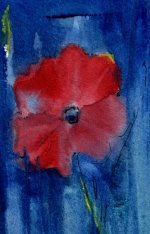
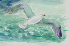
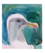
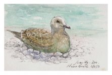
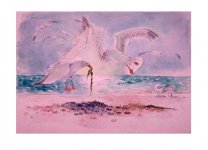
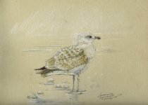
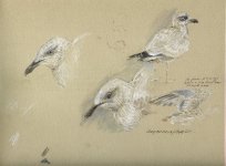
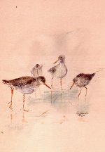
I've been holding off posting on this thread while I considered a meaningful response. I am so pleased you are resuming your painting in earnest. What I like about this work is the sense of movement, the sense, say, that a perched bird is just about, but not quite, to take off. It's alive. Or it's seconds away from doing something else. Your ring ouzel is a case in point. Or like your heron, patiently waiting but can spring into action in a flash. They and your work are alive. Much wildlife art is static and lifeless (and I am not referring to anyone specifically on this forum). You get the shape and the structure too...you get the jizz!

So don't stop, keep at it, and I do think the immediacy of watercolour suits your style.

Joanne
 
Last edited:
Thanks Joanne - for me, that's probably the highest compliment I could be paid as it's so close to what I'd like to get from sketching/painting - I'm not trying to get birds exactly right (don't have the patience!!), more hoping to capture something of the essence of their vitality and behaviour - the thing that makes us all watch them in the first place I suppose - the results can be disasterous but sometimes, like a role of film, you get the odd shot that works out of loads that don't ...
 
Just found this thread by accident.
Why don't you put your pictures up into your Gallery, Deborah, where they would get a much wider viewing?
Alan


I missed this yesterday Alan, sorry! It was bad enough getting up the nerve to post in the Art Forum, don't think I'm ready for the Gallery yet! ;) The nice thing about this Forum is everyone is so supportive and encouraging - it feels kinda cosy :-O
 
Tell yourself, "My work is 10 times better than I think it is." ;) Maybe you'll start to see them the way everybody else does. :) Kate

Believe me, if I thought my stuff was really awful, I wouldn't post them up at all!! (Have only deleted a few since I started LOL!) - I was always my most severe critic anyway, more from a sense of has what has been produced expressed desired intention? If so, then fine, if not, then it's marginally frustrating that's all - something perhaps we could all relate to? I'm just not used to showing anything to anyone but especially not used to drawing birds - so that will come with practice like everything else in life!

Here's a little w/c study of a Poppy for you and w/c painting of Vatican from several years ago - thought you'd like the bright colours?
 

Attachments

  • Aug02217.JPG
    Aug02217.JPG
    148.9 KB · Views: 73
  • smoke over vatican.JPG
    smoke over vatican.JPG
    175.9 KB · Views: 80
Last edited:
Here's a little w/c study of a Poppy for you and w/c painting of Vatican from several years ago - thought you'd like the bright colours?

Love the vatican watercolour, used to enjoy penning old historic buildings/cathedrels etc myself ~ is this a detail from a larger pic?

Also like the little Cormorant from your earlier post, I love watching them out there, far out at sea ~ they look so completely lost within themselves! (wish I could do that myself sometimes;) )

Matt
 
Last edited:
Some more HG's (sorrreee!) - just sketches, no progress with painting yet
 

Attachments

  • hgflightpaintdraft.JPG
    hgflightpaintdraft.JPG
    113.8 KB · Views: 82
  • HGsketchprep1.JPG
    HGsketchprep1.JPG
    81 KB · Views: 84
  • juve hgpaintdraft.JPG
    juve hgpaintdraft.JPG
    103.4 KB · Views: 88
The eye of the middle HG is particularly well executed, must have been a bit of a fiddle with such small details when using water colours?

Like the first pic too! ..great colours and movement with that one.

Matt
 
Thanks Arthur & Matt

Here's the final attempt at producing my first ever full bird composition! (the flash has made it look a bit pinker than it is and a lot of the linework didn't come out in photo)
 

Attachments

  • seaweed combat.JPG
    seaweed combat.JPG
    91.1 KB · Views: 104
Last edited:
This is really successful, Deborah! The lighting is exquisitely rendered and the characterful activity just alive - great stuff. The overall composition is effective (a bit like the close-up panning on Rod Schneider's face on the beach in Jaws!). Great start - keep going . . .
 
lol! - Thanks for the encouragement Tim. ( just difficult to get a reasonable shot to upload it's really blurry??!) I'm quite pleased with the composition but my watercolour needs oodles of practice still.
 
Last edited:
One little piece of seaweed and still they squabble;)

Deb, thats great!

Now you have a ''completed work'' ..have it framed and whack it on the wall!!

Matt
 
Last edited:
lol! - Thanks for the encouragement Tim. ( just difficult to get a reasonable shot to upload it's really blurry??!) I'm quite pleased with the composition but my watercolour needs oodles of practice still.

One little piece of seaweed and still they squabble;)

Deb, thats great!

Now you have a ''completed work'' ..have it framed and whack it on the wall!!

Matt

Hi Deborah

Everything that you have done here has been a wonderful artistic achievment for you - so well done. :t:

Your final composition: It is super so you have achieved every way that you have. I love the pink flush. It gives it more 'zzaz pinaz', my wording and it is not in the dictionary.

So all I can say here is love it, and I appreciate what you have done here a lot. It has been a joy to see and appreciate:t:

Keep on adding to your collection here. I want to see more of your abilities here, now and in the future. :t:

A fan here for life. ;)
 
Cheers for the comments. BUT I DON'T LIKE IT!! :'D (honestly)

tried messing around with different techniques on my new pastel sketchpad (these are reworked fieldsketch - gulls again and rehashed an old Redshank sketch, don't have any others at the moment)

Charcoal, chalk, pencil and watercolour - took about 20 minutes for each
 

Attachments

  • juvhgchalkcharcoal.JPG
    juvhgchalkcharcoal.JPG
    148.6 KB · Views: 92
  • hgpastelpaper.JPG
    hgpastelpaper.JPG
    150.7 KB · Views: 85
  • redshank2.JPG
    redshank2.JPG
    145.4 KB · Views: 94
Last edited:
Cheers for the comments. BUT I DON'T LIKE IT!! :'D (honestly)


Without meaning to be rude, I don't like the pink either.....perhaps you should make a point of photographing it in natural light, take it outside if necessary.(difficult with current weather)

Joanne

Edit: just referring to the pink....not the picture, I like the action.
 
Last edited:
Really like the mixed media work -especially the first gull. My first thoughts were that it would be a lovely image for a card.
 
Warning! This thread is more than 17 years ago old.
It's likely that no further discussion is required, in which case we recommend starting a new thread. If however you feel your response is required you can still do so.

Users who are viewing this thread

Back
Top