• Welcome to BirdForum, the internet's largest birding community with thousands of members from all over the world. The forums are dedicated to wild birds, birding, binoculars and equipment and all that goes with it.

    Please register for an account to take part in the discussions in the forum, post your pictures in the gallery and more.
ZEISS DTI thermal imaging cameras. For more discoveries at night, and during the day.

Transmittance and visual perception (1 Viewer)

Surveyor

The more I understand, the more I understand why I
Prompted by some comments in the Leica BA 8x32 thread I thought I might make some observations for general comments.

It is obvious that there is a lot of misunderstanding about the value of transmittance curves on the forum.

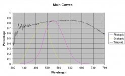
A transmittance curve is a radiometric measurement of spectral color and is very useful for comparing hardware to hardware but has very little meaning to the human observer. The spectral information is generally a lot higher than either the photopic curve for daytime viewing or the scotopic curve for night time viewing of the average human eye. The transmittance curve is severely truncated to the respective daytime or nighttime sensitivity of the human eye.

Brightness, a perception, not a measurable metric, is related more to the correlated color temperature of the curve as established by CIE standards. Generally, for a given illuminate, the higher the CCT the more the perceived brightness will be.

The CCT and CRI have a profound effect on how the eye perceives color. The color perception is related to how well the CCT and CRI (color rendering index) matches the eyes perception of the CCT of the atmosphere at the time of observation.

Nighttime CCT for moonlight is generally considered about 4000K for an illuminant A or B.

Daytime CCT ranges from 3000 to 7500K for D65 illuminant at various times of day and conditions.


So, unless you know your preferred illuminate, CCT, etc. and that data is published with the transmittance curve you will not know how your sight will correlate to the transmittance curve.

Most of the posts on this forum are perceptions and unless the time of day, atmospheric conditions and the photometric values are supplied by the poster it is nearly impossible to relate one observers observations to anyone else’s.

http://www.birdforum.net/showpost.php?p=3577749&postcount=5
 

Attachments

  • 8x32 BA photometric curves.jpg
    8x32 BA photometric curves.jpg
    54.7 KB · Views: 160
Last edited:
Hi Ron.
That seems to put a spanner in the works for visual testers.

I can't say I fully appreciate the effects this has on individual observers perceptions.
Older eyes will probably be yellower or have less clarity than younger eyes.
The two eyes differ.

The colour temperature changes constantly with weather, Sun position, transparency, air pollution etc.
Photographers sometimes measure colour temperature but not general observers.
 
Hi Ron.

Older eyes will probably be yellower or have less clarity than younger eyes.
The two eyes differ.
How right you are. Several years ago I had cataract surgery and afterwards car headlights and other things started appearing very bright and a lot bluer, to the point of being just plain annoying.

Since then my eye/brain perception has returned to my pre surgery perception of color, and my acuity is a lot better, but it took a little while.

That’s why I frequently use Threshold of Recognition (clinically: sensory threshold) in the book. So many people suppose everything optical comes in a neatly packaged and easily understood box. But, to quote that sage of optical engineering . . . Aristotle: “Just ain’t so.” :cat:

Bill
 
Just wanted to reinforce Ron's comments on perception.

When we look at a white sheet of paper in normal daylight if our brains treated the signals from the receptors in our eye equally it should appear a yellowish green. We are quite unaware that the blue signal (s-cone) signal is only a tiny fraction of the green sinal (m-cone). In fact our blue receptor has a peak sensitivity is about 440nm when the photometric curve appears to be hitting the baseline. Our brains do a kind of auto white balance that mentally equalises the contribution of the three receptors to appear white..

What we call normal daylight changes constantly. As Ron pointed out it may be quite red or blue shifted at different times of day and weather condition. On a sunny day it is really the balance of direct yellowish light from the sun and the scattered shorter wavelengths (blue) from the rest of the sky. That white piece of paper angled to the sun will be a 'warm' white, but in the deep shadows, strongly blue, (though it may not seem obvious because of the brains auto white balance trick). How individuals read this heterogeneous information appears to differ quite wildely.

Binoculars are very variable in their transmission at 440nm. On the forum its quite common for users to judge one binocular brighter than another because of the shadows look lighter. This may simply be because of a blue bias to it's transmission curve and have nothing to do with do with maximum transmission or even particularly 555nm peak sensitivity levels.

On a personal note, unlike Ron, I seem to find the colour rendition of a scene more natural with a warmer balanced binocular transmission when the ambient light is blue shifted and a bluer bias preferable the daylight is warmer. I know in a technical test I can spot a fairly small difference in total transmission, but in normal daytime use it's virtually impossible due to our pupils continually adjusting the light level at the retina. Even in deep twilight, when the pupil dilation should be constant, it's not at all easy. Conversely, I find even a small difference in the blue/red ratio much more obvious, and it's very easy to find targets which appear 'brighter' or 'darker' accordingly.

We all differ, physiologically and psychologically, and will naturally arrive at different preferences, but I would agree that proclaiming one binocular 'brighter' than another on a visual test is fraught with danger.

David
 
Last edited:
Just wanted to reinforce Ron's comments on perception.

When we look at a white sheet of paper in normal daylight if our brains treated the signals from the receptors in our eye equally it should appear a yellowish green. We are quite unaware that the blue signal (s-cone) signal is only a tiny fraction of the green sinal (m-cone). In fact our blue receptor has a peak sensitivity is about 440nm when the photometric curve appears to be hitting the baseline. Our brains do a kind of auto white balance that mentally equalises the contribution of the three receptors to appear white..

What we call normal daylight changes constantly. As Ron pointed out it may be quite red or blue shifted at different times of day and weather condition. On a sunny day it is really the balance of direct yellowish light from the sun and the scattered shorter wavelengths (blue) from the rest of the sky. That white piece of paper angled to the sun will be a 'warm' white, but in the deep shadows, strongly blue, (though it may not seem obvious because of the brains auto white balance trick). How individuals read this heterogeneous information appears to differ quite wildely.

Binoculars are very variable in their transmission at 440nm. On the forum its quite common for users to judge one binocular brighter than another because of the shadows look lighter. This may simply be because of a blue bias to it's transmission curve and have nothing to do with do with maximum transmission or even particularly 555nm peak sensitivity levels.

On a personal note, unlike Ron, I seem to find the colour rendition of a scene more natural with a warmer balanced binocular transmission when the ambient light is blue shifted and a bluer bias preferable the daylight is warmer. I know in a technical test I can spot a fairly small difference in total transmission, but in normal daytime use it's virtually impossible due to our pupils continually adjusting the light level at the retina. Even in deep twilight, when the pupil dilation should be constant, it's not at all easy. Conversely, I find even a small difference in the blue/red ratio much more obvious, and it's very easy to find targets which appear 'brighter' or 'darker' accordingly.

We all differ, physiologically and psychologically, and will naturally arrive at different preferences, but I would agree that proclaiming one binocular 'brighter' than another on a visual test is fraught with danger.

David

A few years ago, there was a truck wreck that spilled hundreds of gallons of anti-freeze on I-5 a few miles south of Bellingham, Wa. KOMO radio interviewed several motorists concerning it. Some reported the liquid to be GREEN; others said it was YELLOW. The difference was caused by the individual’s receptors, the angle of the sun upon it, intermittent cloud cover, and the individual’s interpretation of what the receptors were sending to the brain.

Most optical engineers consider the dividing line between yellow and green to be .580 microns. But, in the real world that doesn’t cater to optical engineers, who can really say? :cat:

Bill
 
Last edited:
Bill.

You are right. The normal male population can be divided 45:55% between two genetic variants of the L (red) which slightly different spectral sensitivities. However, what we decide to call each colour is acquired through cultural agreement. That shifts with language and social grouping. What's yellow to you may well be green or orange to someone else.

David
 
Interesting thread. Color analyses and perception with regard to painting has a lot of common ground. On the matter of language used to describe color, we are culturally trained to some degree to accept, or expect, the sky to be 'blue', trees 'green', etc. This is quite evident when folks begin painting, they will often resort to depicting a symbol of an object, as well as color it as they 'know' it to be, not what it is they are actually looking at.
It takes a bit of coercion to convince folks to abandon that approach and start analyzing colors contextually, in a comparative way, and in the process subjugate the ever eager rational mind that is dying to tell you what it 'is'...
What might actually be going on in nature is that at times the trees will appear blue, and sky to be green! In a relative sense...

The simplest way I know of to think about color relationships is a 2 axis diagram: Lighter/Darker on one axis, and Warmer/Cooler on the other. Of course temperature rolls through both sides of the color wheel, but it is a useful comparative method.

The issue of 'white balance' in the brain is also an area of great interest in painting. The color and brilliance of white in shadow is completely different than in direct sunlight. Many beautiful paintings are based on that difference. Look at Sorolla's work on the beaches of Spain, or many of Sargent's watercolors of Venice, and elsewhere. To me, the fact that the mind can stitch together volumes of light and shadow passing over an object and make it a 'whole' is a sort of cognitive miracle.

I completely agree also that in nature it is almost impossible for the eye to be a 'reliable' constant, as it is in a state of continuous response to shifts in exposure/brightness, etc. every time the eye moves...

This does not invalidate in my mind, any and all comparative field tests of optics, because one can still learn something from other's experience, even if it can't be stated to be clinically 'accurate'. Folks, keep those field reports coming. I like reading 'em, even if I really need to take them all with a grain of salt.. ;-)

Bill
 
Some of Sargeant's portraits are here in London, and I've seen some of his European watercolours but that looks like a more mature hand. Excellent!

David
 
One an English teacher and translator, the other an interpreter for Prince Philip and others.

So I ask my two good friends as we idle our time away in the coffee bar.

Is it correct to say?
'The yolk of an egg is white' or 'The yolk of an egg are white'.
They ponder and discuss for quite a whike and decide that it is correct to say.
'The yolk of an egg is white'.

I say.
''No, the yolk of an egg is yellow''.

The power of suggestion.
 
We are certainly capable of fooling ourselves with regard to high key, pale surfaces. It still find it a fascinating paradox that our mind will perceive an object in light and shadow, and yet deduce a third 'local color' from those 2 stimuli. Thus we can say confidently that a wall is white, when in fact it appears to be blue or perhaps glowing with a warm tone from reflection off the ground. Its that white balance filter in the brain which has to be overcome to actually determine the color of something to be painted.
 
We are certainly capable of fooling ourselves with regard to high key, pale surfaces. It still find it a fascinating paradox that our mind will perceive an object in light and shadow, and yet deduce a third 'local color' from those 2 stimuli. Thus we can say confidently that a wall is white, when in fact it appears to be blue or perhaps glowing with a warm tone from reflection off the ground. Its that white balance filter in the brain which has to be overcome to actually determine the color of something to be painted.

6 “I WANT AN AUTO-FOCUS BINOCULAR.”

Despite what you have read or been told, there are no non-electronic auto-focus binoculars.

“But how can that be; I saw it myself?” Answer: the power of suggestion.

Years ago I made a bent-nail puzzle and gave it to a friend to tinker with while we talked. Figuring it out in short order, I grabbed the puzzle, turned my back, put it back together, and gave it to him again saying “Okay, hotdog, let’s see you get this one apart as fast; I put it together backwards.” Although we continued talking for quite a while, he couldn’t figure it out.

The puzzle only worked one way. Thus it couldn’t have been put together “backwards.” Yet, the power of suggestion caused him to flounder. :cat:

Bill
 
Surveyor, Ron, post 1,
I have hesitated if I should react on your statements, since this topic returns frequently on this forum, but I think I can perhaps contribute with my "vision"regarding Transmission and brightness.
Your statement (in bold), that "Transmission curves have very little meaning to the human observer" is in my opinion not correct, but for interested readers I have made a compilation of existing literature on this topic especially in English (I composed it because of the discussions on Birdforum), you can find it on the WEB-site of House of Outdoor under "Verrekijkers testen en vergelijken"and the title "Test of color vision, brightness, resolution and contrast in binocular images" (the title "test"is actually wrong, but I will ask the lady responsible for the WEB-site to change it, since it is not a test but a glue-together of published data). As a professionally trained spectroscopist I know fairly well now how to "read"a transmission spectrum.
First of all a transmission spectrum gives an impression of the amount of light the optical components of a binocular leave us with. That is one component of perceived brightness, but another one is how the preferent colors are presented: yellow is perceived much brighter by the avaverage eye than red for example.
A trained spectroscopist can read a transmission spectrum very well with respect to the overall color impression an optical instrument produces (a transmission spectrum after all is nothing more than a sort of broadband filter). Moreover, binocular producers use the transmission spectra to deconvolute them with the sensitivity curves of the eye for daylight and night vision and in that way they can establish fairly accurately how the overall color impression of the binocular/telescope is for the average eye.
A good impression is for example the transmission spectrum of the new Leica Noctivids (almost ready for publication). These binoculars yield strictly spoken not a color correct image, since they have a very slight red preference, which one can see by critical examination, but also from the measured transmission spectra. Is that a problem? No not at all, since it is in my opnion a deliberate choice by Leica to give the Noctivids a slightly warmer image expression , which some have described here as "saturated colors". Critical examination shows that yellows and reds are deeper in color with the Noctivids (difficult to describe that properly in words) than the same colors observed with the naked eye. A comparison with the color presentation on some paintings mentioned here seems appropriate. I hope that I have explained my point of view here in a clear way.
Gijs van Ginkel
 
Gijs ,

Awhile back, I sold a bin that were, to my eyes, overly saturated. Particularly affected were the yellows of blue tits; at the same time the blues were dull, desaturated, again to my eyes. That seemed logical to me. Is what I perceived reflected in the transmission readings?
 
Allbinos' review of the Swarovski 8.5x42 EL Swarovision said "very good colours rendering," while of the Nikon Allbinos says "The graph of the 8x42 model is a bit more flat which assures practically perfect colour rendition".

Both these graphs (I don't know how to copy them here) show remarkably flat plateaux. This seems to be a feature of good colour rendition) but many roof prism binoculars show lower transmission in the blues.
 
How right you are. Several years ago I had cataract surgery and afterwards car headlights and other things started appearing very bright and a lot bluer, to the point of being just plain annoying.

Since then my eye/brain perception has returned to my pre surgery perception of color, and my acuity is a lot better, but it took a little while.

Do you recall if the IOL was a Tecnis by chance? OD/OS or OU? I recently had a Nuclear cataract removed OD w/three piece monofocal ZA9003. Prior to removal I was 20/70 now, dependent on the tech, i'm 20/40-20/20.

This IOL shows deeper blues and is brighter though is combined w/OS from 20/25-20/40 again dependent. I only see the real deep blue if I cover OS otherwise it's a blend. Prior to cataract surgery I was problematic w/light sources due to scatter day/night. Even bright tail lights bothered me in daytime.

Now, no issues even at night and no more looking to the ditch to avoid oncoming lights. Besides much better contrast and deeper blues the whites have been "bleached". The amber/dingy tan I was seeing is actually a bright white through the IOL.

I see better in shadows within the woods due in part from small Nuclear cataract OS and less VA, as I've never worn corrective lens, combined w/brighter IOL in dominate OD.

Save a mild bit of Monocular Diplopia at 5' and beyond it's been a rewarding experience. The target was distance, but I can read small neswpaper type at 9", comfortably at 12", and no issues w/computer screen. But, 5' or so past TV I see an oblique shift shadowing instead of letters starting to blur.

Bino settings show little if any difference post op though OS only at moon shows yellow and w/OD only violet tinge of CA is quite apparent.
 
No Nix, my IOL's were simple biconvex with UV blue blocker made by Alcon.

At the time I worked outside a lot of the time.

My vision was not bad, about 20/25 to 20/30 at that time and the IOL's were only 1d difference.

I have been pleased with the results.

I have attached the Alcon propaganda sheet for those that may be looking at this in the near future.

BTW, this was in 2011 so I am sure even further progress has been made.
 

Attachments

  • Alcon SN60WF IOL.pdf
    306.8 KB · Views: 153
Warning! This thread is more than 7 years ago old.
It's likely that no further discussion is required, in which case we recommend starting a new thread. If however you feel your response is required you can still do so.

Users who are viewing this thread

Back
Top