• Welcome to BirdForum, the internet's largest birding community with thousands of members from all over the world. The forums are dedicated to wild birds, birding, binoculars and equipment and all that goes with it.

    Please register for an account to take part in the discussions in the forum, post your pictures in the gallery and more.
ZEISS DTI thermal imaging cameras. For more discoveries at night, and during the day.

testing painting and other media - tips (1 Viewer)

joroco

Well-known member
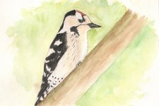
Hi, I have recently started to paint again, it's something I have always wanted to do but never found a subject passionate enough to pursue, thanks to Alan Dalton and some of his contacts I have realized that my birdwatching/photography is the way to go.

I'm not really here as much to show my work but to get constructive feedback/criticism, possible new methods/techniques/ways of approaching a piece.

I don't really get out much due to 3 kids and running a full time business, I would love to get more time to field sketch birds and other things around the birds environment but at the same time I usually focus what time I have on seeing, learning and photographing as many species as I can (cramming in as much as physically possible). I know I would benefit from field sketching and probably will end up trying it when the weather is more friendly anyway.

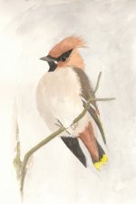
Right now it's just a big learning curve, I think I want to paint something between realism and field sketches with watercolor washes like Irish Bird Art on facebook, almost take that style somewhat more towards realism. Again I'm just learning now so I don't really know what my style is going to be or what I need to focus on more. So tips/thoughts on that as well would be great.

I'm sure I can take this discussion further when/if anyone replies - sorry if what I have written is a bit "loose".

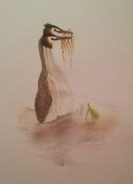
for example I done this from one of my photos: http://birdpaintings.files.wordpress.com/2012/01/northern-wheatear.jpg
as I test for myself I superimposed my painting and the photo to see if I had painted what I could see and what was on the bird - the colors are a bit off but again I'm more getting used to watercolor paint and what I can achieve with it. I'm amazed every time I mix colors with the results it gives and how little of one color you need to make a completely different color (I must do a color mixing chart just for learning about the colors more).

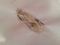
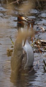
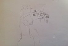
I also took that little feather section and added some pencil (2b or 3b) just to darken the really dark feather and hopefully to lift and define little bits. That came out like the attached. I wonder what can be done to get more out of that? ink would give too dark lines I think (not really what I am after either). Can anything be done/added to make the feathers look "wow"?

Loads of writing, loose questions, hope someone has the time to write back, Thanks all
 

Attachments

  • feathers.jpg
    feathers.jpg
    102.5 KB · Views: 65
Your sample feathers seem to have plenty of "wow." I suppose that with watercolor there is no one solution, some like to add detail just with the watercolor paint, others with ink or pencil. As long as it look right in the end it doesn't really matter! To my eye, your sample seems to have struck a nice balance between realistic and loose.
 
good luck with the project- there's a goodly number (me included) who have gone from zero to regularly producing stuff with the encouragement and learning to be had on here

that wing already has the wow you get from knowing it is laid out right

one of the approx. one million things I've learned on here is to use blues and magentas mixed into in an umber to get really rich looking darks: that was a big jump for me in the search for intensity
 
Hi, Thank you for the replies, I have read that in several places now, like shadows on brown can be a blue/brown etc. little concern that if I do that on the birds the feathers might end up showing some other color through which I don't really want unless of course it's a shadow but still I will keep that in mind.

I have started a piece now, a Northern Wheatear again but this time a male, full bird sitting on a rock. I will do a step by step process I think, photograph after each main layer etc..
That can be found on the blog: http://birdpaintings.wordpress.com/
photo is a bit silly, was just taken with the mobile and uploaded via my phone on the wordpress app, before I start more on the bird I will take a real picture and replace that one.
 
Your sample feathers seem to have plenty of "wow." I suppose that with watercolor there is no one solution, some like to add detail just with the watercolor paint, others with ink or pencil. As long as it look right in the end it doesn't really matter! To my eye, your sample seems to have struck a nice balance between realistic and loose.

Matty: How do you get the fine feathers to show up (the areas around its chest/underside - not the black/dark lines) like on this picture: http://blog.bohanart.com/wp-content/uploads/2011/11/scartanEtCu.jpg
and this one: http://blog.bohanart.com/wp-content/uploads/2011/10/orioleRedBudL.jpg
 
Hi Matt, that's priceless info with those step by step links, just the sort of thing I was/have been looking for. That is pretty much what I done on this piece last night (See attached - what's the best way to transfer painting from paper to computer? Scanner or photo? my photo was just from my phone and the colors are "dull") on the back of the bird in the front, layered 4-5 browns and greys. They are only small, bird itself maybe 10-12cm tall.

Do you have any other tips like that for painting birds? or even small things you have picked up on the way that might be useful for a beginner?
 

Attachments

  • 2012-01-18-00.48.44.jpg
    2012-01-18-00.48.44.jpg
    322 KB · Views: 49
First, the grebes look great!

I usually use a flatbed scanner to go from sketchbook to watercolor paper. If my sketch needs to be slightly resized say from a 8 x 10 to a 5x7 that is really fast on the computer. I can flip it in photoshop and then transfer it to the paper with tracing paper. Likewise I scan the watercolors back to the computer for posting and printing. Lately I've been working small because of time constraints. Temporarily, I limited myself to a size formats that I can scan.

In the past I've done larger paintings that were too big for most flatbeds and had to be photographed. That can be a hassle and the scans always had superior color and detail... even though I'm very comfortable with a camera.

I have a bunch of step-by steps on my blog (http://blog.bohanart.com/category/step-by-step/) that go through the creation of about 30 different watercolors. Those probably can answer many questions about how I approach things in watercolor. Other media would be approached completely differently and of course there is never any one solution. There are many talented artists here and elsewhere that do things very differently than I do. I just learned some techniques in school and experimented to learn others. As long as the end result is pleasant, who really cares how you get there.
 
First, the grebes look great!

I think the bird at the front lacks some shape definition off the wings. Attached is my reference photo, you can see a line in the middle of back and also a soft "v" shape of the edges of the wings. What would you (and anyone else) do to define that better? Mine feels flat. Will a light shadow in those places + a little highlight and shadow in the middle do it?

also attaching my rough sketch, that's what made me decided to paint it...

As for tracing, I seen some block of tracing sketch paper, anyone tried it?
http://www.graphicsdirect.co.uk/products/letraset-trace-pads-90gsm
and is it paper and tracing paper or just tracing paper?

http://www.youtube.com/watch?v=3q-chk-oQ50 about 15 seconds in - what does this person do? Have they drawn/sketched straight on to tracing paper first? or drawn, traced and then transferred?

Thank you
 

Attachments

  • IMG_6514.jpg
    IMG_6514.jpg
    101.4 KB · Views: 34
  • grebes.jpg
    grebes.jpg
    32.1 KB · Views: 30
Yes, I think you do need to add some shading in to get the feel for the way the back and wings meet. Rendering some small subtle creases and rounding out the rest of the form will probably go a long way in suggesting that. Your sketch is nice. You don't necessarily want to render every feather, but those also give an indication of the form, telling you where the back ends and the wings begin.

That looks like a simple block of tracing paper. Typically I do the drawings in the sketchbook, and then trace it onto tracing paper with a fairly hard pencil. I flip the tracing that I made over onto a fresh piece of Watercolor paper and transfer the lines by rubbing it with a folding bone. The graphite neatly gets transferred over. That works great on hot press paper and illustration board. On cold press papers you may quash some of the texture of the paper if you are pressing hard.

In the video you shared they just applied graphite to the entire back of the sketch done on regular paper and traced the main lines over to the watercolor paper. That works fairly quickly but has a disadvantage or two. First, you just can't really do that from a sketchbook very easily. Second, it leaves the back of your drawing covered with graphite (which may or may not matter to you.) Third, since you cover the entire back of the paper with graphite it often smudges all over your watercolor paper while transferring the lines. By using a sheet of tracing paper and transferring your main lines to it first, you can keep things much neater. A disadvantage of the tracing paper method is that the image is flipped like a mirror image. I compensate for that by flipping the image in PhotoShop after scanning the sketch and resizing it to fit the format of my paper. A bonus of the tracing paper method is that it is pretty fast and that you can often get more than one transfer off of a sheet of paper if you should happen to ruin your watercolor. Of course that never happens!!!!;)
 
Hi Thank you for the information/tips, much appreciated.
I have been doing what I can in the evenings, sketching and painting and most of all learning.

Been out in "my" little forest and took some photos and then done sketches and paintings from that. I came up with these, a Lesser Spotted Woodpecker and a Waxwing. Would love any criticism/thoughts/tips etc..

Both originals are A5 size. Re-sized now just to be able to upload them.
 

Attachments

  • lesser-spotted-woodpecker-small.jpg
    lesser-spotted-woodpecker-small.jpg
    69.4 KB · Views: 27
  • waxwing-small.jpg
    waxwing-small.jpg
    163.6 KB · Views: 33
Warning! This thread is more than 12 years ago old.
It's likely that no further discussion is required, in which case we recommend starting a new thread. If however you feel your response is required you can still do so.

Users who are viewing this thread

Back
Top