• Welcome to BirdForum, the internet's largest birding community with thousands of members from all over the world. The forums are dedicated to wild birds, birding, binoculars and equipment and all that goes with it.

    Please register for an account to take part in the discussions in the forum, post your pictures in the gallery and more.
ZEISS DTI thermal imaging cameras. For more discoveries at night, and during the day.

Painting Improvements (1 Viewer)

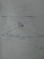
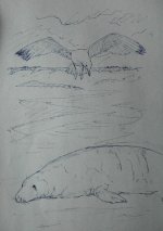
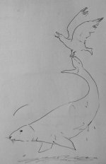
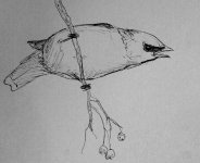
Love the porpoise, Nick, makes me realise I shouldn't be scared of drawing something a bit disgusting. If I want to do it, I'll do it! Still no sketches for it thought about, need to get back to the coast and maybe think about when I've refreshed the beach scene with some sea air.

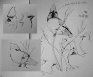
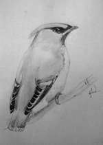
Yesterday I took a walk down through the woods round the house and into the park on the far side of it. Had a a great find with a flock of waxwings that were busying about in a couple of berry bushes. I've seen them before, but these were my first find-them-yourself waxwings, so I was particularly pleased. I didn't get any sketches done in situ, but commited as much of their character as I could to memory. Its funny that I always think of them as fat dumpy birds, they're not really, it's just they have a lot of feathers. When the stretch and move about it makes them look thinner and they seem to change shape like they're make of plasticene, stretching and contracting as they reach for berries.

I banged out a couple of sketches of what I'd seen when I got home. They range from passable to atrocious. I worked on a slightly better version using a few photos this morning (that's the last picture.). Sorry if they look a bit funny colours wise, it's a bit grey out today, so the lights not very bright for photoing the drawings. I have brightened them up a bit in Photo editor.

Planning a trip for the weekend so may have more of something to show you later. Bye for now,
 

Attachments

  • scrappy waxwings.jpg
    scrappy waxwings.jpg
    143.4 KB · Views: 54
  • waxwingsketch.jpg
    waxwingsketch.jpg
    52.2 KB · Views: 42
  • waxwing.jpg
    waxwing.jpg
    147.5 KB · Views: 57
lovely work, I particularly find the second one appealing. They're hard birds to draw, so many beautiful little things on them to notice, and they twist themselves into some great shapes - you've done great with these.
 
Echo exactly what Nick's said - they look as though they ought to be easy to draw 'cos they have such obvious angles and defining marks - but they're buggers. No 2 is as waxy as one could ever hope to get. Love it.
 
lovely work, I particularly find the second one appealing. They're hard birds to draw, so many beautiful little things on them to notice, and they twist themselves into some great shapes - you've done great with these.


Agree with nick, difficult species to get right. mainly due to the crest, and in particular the dark lores and bib, thes however are great, lovely field drawings leading to two very fine, refined pieces at home. These are excellent.
Like the Magpie too, with a really super Goldeneye sketch catching my eye on the seal page, keep it up....
 
Walked across to Rodley NR on the other side of Leeds. Did not see either the Water Rail or Kingfisher I had hoped for, but made do with a little group of Gadwall which were feeding on the grass. A really under-rated bird i think, there very pretty in a subtle sort of way.

The deer walked out from the reeds while I watched the Gadwall, bold as brass and completely unphased. I've seen deer a lot of times at home, we have them all over, but I've never seen one appear so fearless. Not sure the resulting sketches are that good, but the oppurtunity is not one to be missed!

All the best,
 

Attachments

  • gadwall.jpg
    gadwall.jpg
    128.8 KB · Views: 49
  • ROEDEER.jpg
    ROEDEER.jpg
    143.8 KB · Views: 45
Gadwall are great birds, ducks that seem to be happy! Love the sketches, they're also happy. Deer heads make me twitch nervously, I can't draw them, these are great.
 
Gadwall are pretty little things aren't they. The waxwing work is real top stuff, I've only ever seen 'em once, they don't seem to get down here very often and certainly not in the numbers you lucky northern types get them.

Mike
 
It's a long time since I saw this scene but I still want to get it painted at some point. I've been trying out compositions for it. It seems I have a few options.

The first composition seems okay, the gulls not that well drawn but the layout works for me. Maybe the bird is a bit small. How do people feel about the expanse of empty wet sand in front of the seal?

The second composition is maybe a bit more interesting. There's a bit of a problem of scaling in this example, either the gull needs to be smaller, or the seal bigger. Also not sure about the placement of the gull in relation to the horizon.

What do you lot think? What about mixing up the components, gull flying, but whole seal, or first picture, but with more midground sand. What about two gulls? Any suggestions would be helpful.

Oh, and picture 3, not sure what's going on there, but just for the record, I swear that actually happened.;)
 

Attachments

  • Composition1.jpg
    Composition1.jpg
    108.5 KB · Views: 37
  • Composition2.jpg
    Composition2.jpg
    136.9 KB · Views: 39
  • DSC_0034.JPG
    DSC_0034.JPG
    93.1 KB · Views: 39
Last edited:
composition is about having the eye drawn through the picture taking in all the space along the way, so as they are pics one and two are weaker than 3. 1 has all the interest slap bang in the middle, they eye goes straight there and stays, in 2 the picture is cut in half by the empty space between the gull and the seal. 3 is a nice composition, as the shape of the seal swirls back into the background to reveal the gull, a composition based on this could be the one that works. So after having said all that, I'll now say that you can find long books on composition and dividing pictures into points of interest and suchlike but you don't have to follow any of them to make a successful picture, and a finished painting can look a lot different to the composition sketch, even if it follows it exactly as the addition of colours and tones become additional focal points and 'guides'. Keep the energy flowing round the paper however you can - if you pick at Lars Jonsson's work, the spaces between the focal points are handled with minimum fuss so as to allow the eye to pass over them to the next point.

Right, I need a drink!
 
Warning! This thread is more than 15 years ago old.
It's likely that no further discussion is required, in which case we recommend starting a new thread. If however you feel your response is required you can still do so.

Users who are viewing this thread

Back
Top