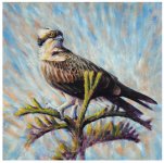
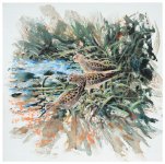
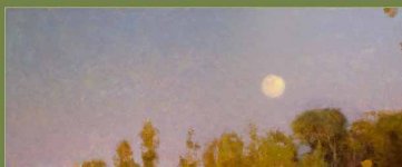
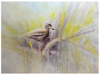
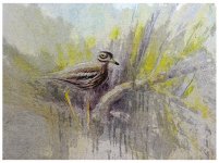
• Welcome to BirdForum, the internet's largest birding community with thousands of members from all over the world. The forums are dedicated to wild birds, birding, binoculars and equipment and all that goes with it.

    Please register for an account to take part in the discussions in the forum, post your pictures in the gallery and more.
ZEISS DTI thermal imaging cameras. For more discoveries at night, and during the day.

Ed's thread (2 Viewers)

The middle sketch is a real corker and it's the right choice for a worked up version.

I can't convince myself of the square, small format though; For my money it feels a bit too constricting to suit the kind of supercharged, energy filled style that's yours and yours alone?

Mike
Good point but it might be possible on a square as long as you don't put the subject in the center area...having done a few square, I used the diagonal to help break the tendency to static comp.
 
I don't think it's the square format so much as the size of the subject relative to the available area. Where I feel Ed's major strength lies is in the way he applies paint with such vim and vigour and with a larger subject there's very little room left for the dance of paint and canvas that I love and that Ed does so well.

Mike
 
hello all

I don't think the osprey will become a success- but here it is with an effort to integrate it better bird and sky- at least to wrap the light around it a bit as recommended

onward!
 

Attachments

  • q9 550 osprey DSC_2931 copy.jpg
    q9 550 osprey DSC_2931 copy.jpg
    176 KB · Views: 39
moving swiftly along- I've got some square board to use up and have resolved to be a bit more restrained about trowelling on the colour

so here's three Least Sandpipers done quite quickly evenings this week - I've tried hard here to let the paint lie where it falls, leave gaps and not to correct or overpaint

plus mindful of Colleen's encouragement to think what the picture is about: here is it meant to be about

1 the birds being more quietly coloured than background (although these have come out a little too gingery for Leasts)

2 the repeating-but-different pattern from one bird to the next, scaps more prominent than the heads
 

Attachments

  • q9 550 DSC_2929 copy.jpg
    q9 550 DSC_2929 copy.jpg
    191.5 KB · Views: 51
that's improved some, and I agree with the comment about your best forte, but let me see what you might think of letting go a bit more and instead of the color streaking, consider melding the sky more and the "active" part would be the brushtroke and how it catches the light, while letting the sky be closer in value... you can find this also on some Monet impressionist pieces,

this one by Clyde Apevig ( one of the very top Am landscape painters,) more representational than yours but this detail sort of shows what I mean, plenty of color but the brush work brings it all together and it is active, moving like your signature style...keeps the eye from reading one flat surface, almost like he paints the air itself. And it keeps the sky from becoming one boring texture. Just an idea to consider

you cant judge his work well online, it looks tight but he always starts with the abstract shapes, and really up close they are very loose, he just get the right color in the right place and it seems so real. I have one of his books and no sky is ever painted with flat strokes, always this sort of dancing brushwork...
 

Attachments

  • sky work aspevig.jpg
    sky work aspevig.jpg
    20 KB · Views: 42
absolute knockout on the pipers....you at the peak of your game and unbeatable plus you really got that square full of energy and movement which is the hard challenge of the square shape...Bravo!
 
Superb peeps, Ed - really outstanding piece which could quite easily have a certain Swede's signature along the bottom. Wonderful! The Osprey now sits very sweetly mid Earth and Heaven - noble and dramatic, another cracker.
excellent crits and suggestions from Ms Caub too - great to see the effort being put in.
 
Wonderful job on the Leasts Ed. And you've made very good use of those square format canvases on this one.

Just returned from seeing Leasts and other things over the last two weeks so they may make an appearance one of these days -- strictly as field sketches though. This is a wonderful example of a finished work with the spontaneity and freshness of a field sketch.
 
hello all- thank-you for kind words on the Leasts: needless to say, the next effort has gone less well but I thought I would offer it up on the basis of

if you've done it, post it

1. stuck at home Sunday morning and tried a stone curlew in a boring conventional pose, but overdid it until it was just a mess, so painted over it almost completely with gesso and then ran a little colour back in, in case it came back in some useful way

2. was on the point of binning it, but gave it one last chance of salvage with a run through a posterising programme on the computah

3. then thought this is disgraceful- get out there and draw a real stone curlew: so the drawing is a lovely moment Sunday afternoon watching male preening in front of incubating female, when a bunch of swallows flew right between the two

now musing how to paint it, need to channel some Greenhalf and some Derry I think
 

Attachments

  • q9550DSC_2947 copy.jpg
    q9550DSC_2947 copy.jpg
    91.2 KB · Views: 52
  • q9550posterisedDSC_2947 copy 2.jpg
    q9550posterisedDSC_2947 copy 2.jpg
    144 KB · Views: 55
  • q9550sketchDSC_2945 copy.jpg
    q9550sketchDSC_2945 copy.jpg
    107.3 KB · Views: 57
this one by Clyde Apevig ( one of the very top Am landscape painters,) more representational than yours but this detail sort of shows what I mean, plenty of color but the brush work brings it all together and it is active, moving like your signature style...keeps the eye from reading one flat surface, almost like he paints the air itself. And it keeps the sky from becoming one boring texture. Just an idea to consider

you cant judge his work well online, it looks tight but he always starts with the abstract shapes, and really up close they are very loose, he just get the right color in the right place and it seems so real. I have one of his books and no sky is ever painted with flat strokes, always this sort of dancing brushwork...

very taken with Apevig: thank-you
 
very taken with Apevig: thank-you

yes and amazing painter of the land he lives in, and one who often chooses the "non descript" moments, the main thing is how he uses value, in his landscape there is not anything darker than val 7 and he drops off the highest ones too,

He likes the mid day or bright sun, and yet manages to keep from getting dark shadows, Each value mass is kept close, generally speaking....so in the sky he will not go darker than 3 , in the land say 4 and 5 and the mts 6 and 7 , you will find no bright lighter at val2 in the mt. unless it is snow which adds another value mass.

He also completely works out his painting as abstract shapes first making sure the edge contours are as he puts it visual music...ie think of a line of notes on a muscial scale...spaces are uneven. but not mechanical...there is a great short vid on him painting outside on the net, this is a new one and this is the one where you can see how he starts with abstract shapes have to scroll down to see. Even if you are not as realistic as he paints the main pricipals really help to make a work cohesive

His main way of conceiving his painting is akin to music, and his latest book is called Visual Music. glad you like him, many kinda miss his greatness as he's one to paint in a quiet way.
 
Last edited:
Outrageous! What on earth are you playing at - going out to sketch your subject matter? I think the first two have much merit and I like the processed one (has an aquatint kinda feel to it, to my eyes). The life work is, of course, superb - and if you need to, then get that Greenhalf/Derry hybrid out, however I strongly suspect your own hand will very much come to play in this piece. Really eager to see what you do with it - exciting stuff.
C.A. is rather good isn't he - I'm sure I put a link up to him and his work a couple of years ago?

I was going to comment on how much I enjoyed the CA new video but held off on it for morning. So now seems the time. My only complaint, and maybe it's just me, is that I wish he'd forget about impasto. The work seems so strong and then the impasto to me is just a huge distraction.

As far as these new ones I really love the new sketch! It always seems like you make a valiant effort to keep the vibrancy of the sketches in the finished paintings. When I looked at the new one I wondered how I'd go about turning it into a painting. My first thought was: well maybe some sort of soluble colored pencil that I then added water or oil to for color and tone? I assume that you've already tried this and not liked it. But I just had to mention it. Your love of line is so evident and I'd hate to see that lost in a painting. So that's what got me to think about these soluble pencils and crayons. They might allow the finished painting stay a bit more linear?

Not, mind you, that I've ever had the slightest success with this method myself My great ideas for it, including my new water soluble crayons, always fail miserably.
 
Just like to say that i have just enjoyed looking at some of Apevigs work...first pic up of beaver creek made me think of Ed's painting....

I particularly liked the flower garden...!

ps...i know that i am in no way qualified to talk about technique but...[and i know this sounds pretentious]....but i still regard visuals as music...:smoke:
 
Looks like you've already been channeling the Derry to me! You've got yourself a lively and movement infused composition there Ed.

Mike
 
Warning! This thread is more than 10 years ago old.
It's likely that no further discussion is required, in which case we recommend starting a new thread. If however you feel your response is required you can still do so.

Users who are viewing this thread

Back
Top