• Welcome to BirdForum, the internet's largest birding community with thousands of members from all over the world. The forums are dedicated to wild birds, birding, binoculars and equipment and all that goes with it.

    Please register for an account to take part in the discussions in the forum, post your pictures in the gallery and more.
ZEISS DTI thermal imaging cameras. For more discoveries at night, and during the day.

Wings Over Winecountry, Colleen's place (3 Viewers)

Here they are side by side....don't you think the warm cool relationship is more interesting in the bottom one( block in version) Doesn't that bit of yellow add more vibrancy to the painting....I do think I'll try it again, practice cant hurt:cat:
 

Attachments

  • compare-scaup-1.gif
    compare-scaup-1.gif
    259.7 KB · Views: 51
I actually compared them side by side before I wrote anything just to make sure that my memory served me correctly about the older version. I"m sure that this is going to be fairly subjective but I think that the overall composition of the new one is more successful than the early version. Though there is something to be said for that golden color my own feeling is that the shape of the reflections might have been too strong initially, almost equal in importance to the actual birds. In the newer version I think that the birds really stand out and then you see the two lesser subjects, the reflections and the far background. To me this is more visually pleasing. And you haven't actually lost the golden color. There's just less of it. I also think that breaking up the reflections with the lines of water adds to the composition: a longish, rectalinear shape, with the round ducks sitting with pride of place in the middle.

So very successful by my lights!!
 
I'm thinking that beefing up some values in the reflections may make this hang better, when it's dry enough I'll drybrush some of the reflections in darker, if I don't like it then no matter as it is dry underneath I can just take them out...I think making them cooler will help....will take several days to be dry enough...
 
Colleen,

This is fantastic!

You've completed the top of that drake's bill.

Something which might lift it for me, is the very subtle addition of green/yellow tones in the background vegetation. And dark blue in the vegetation shadow, but muted, to echo the subjects' contrasts in plumage. That would push the subjects out to the viewer.

A real doozy though!
 
Here they are side by side....don't you think the warm cool relationship is more interesting in the bottom one( block in version) Doesn't that bit of yellow add more vibrancy to the painting....I do think I'll try it again, practice cant hurt:cat:

nice example for me of artists thinking versus birders thinking: my first reaction is that the warm tones enliven it and so does the work you have done to bring the front drake forward from the duck behind it; then my second reaction is the birders thing, liking the less warm piece with the drake in the foreground momentarily lost, then seen and worked out..
 
I really like the second version but, if it were me, I'd perhaps try to re-introduce some of the gold light from the first just because I like it for indefinable reasons. I'd also re-lose the background into the fog because I think the suggestion of vegetation shuts the distance down and I rather like the sense of space created by the empty 'endless' background.

All personal preference I guess.

Mike
 
Hey Ed, that's a really interesting observation....and explains the conflict I feel over this. Since I come to birds way after the artist part, this seems to be at the core for me...

Mike this is just what I want to try on the second version....I'm going to make the ducks a bit bigger too, and change position of some of them. I did strengthen the gold color some and like it better on this one... its dry enough today to put in darker reflections...I'll repost when I do.

Phil tried the changes but it didn't make much difference, and made the vegetation stronger, so I put it back but did cool the color off, maybe if there was a different format, less long and narrow that might be a place to do more vegetation work.
 
here it is with changes, there is some minor improvement...have already worked out a new comp for #2, and will try to be braver with the endless space thing as this is really how I see them out there in the winter at the end of the day...the mist and fog moving around and just suddenly there they are.
 

Attachments

  • resting-scaup_2263.gif
    resting-scaup_2263.gif
    204.2 KB · Views: 56
This is great, I can taste the stillness of the air, and see in my mind's eye the careful, quiet preening of the ducks. It's all to do with that special, quiet calm that you get in an early morning fog over a lake.

Looking forward to the next version, perhaps omitting the background vegetation which, IMHO, would further enhance the already splendid atmosphere.

Mike
 
you've worked it through to brilliancy - whcih has saved me searching for comments and advice other than - top class stuff!
 
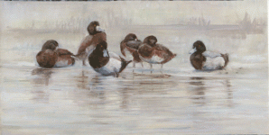
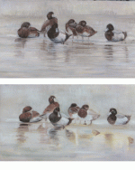
thanks guys for the feedback and comments, new one is coming along, will post when it's done...

Funny how sometimes a mistake becomes right, turns out I cannot enter the portrait where I thought I could 2 shows overlap by one day. So I think I can rescue the first one, my experiment to put more tooth on the board worked, and I don't have to have such a likeness, so I'm going back the the ruined one.

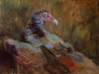
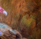
And remember the turkey vulture....I have the second one of it, the "unfinished drawing thing, I think with just a bit of work I can have it done too, the second show is local one, the other a regional thing I've never entered, and I had to send in a CD. But with the second one all I had to do is enter with media so the new images would not be an issue....I promised myself I would do more to get my work out this year, otherwise, I would just keep painting and not bother with shows, but it would be nice to meet other artists now and then, and there is only so much room in my closet for all the paintings:-O
 
Wonderful work on the Scaup, Colleen. To my untrained eye this looks absolutely bang-on. The birds have loads of form, proportions have been nailed but the composition really does it for me - just like some of the local waters last winter, even though I didn't see any scaup! Replacing these with teal or wigeon would have just the same effect. Masterful.

Russ

Ps Never in my wildest dreams would I know where to start!
 
Been down with a terrible case of bronchitis, finally had to go see a doc( always a last resort!) so haven't done more that work here and there...the Scaup are still in progress, and I went back to this one....

It's up to all of you loosey semi abstract types here to alert me before I go too far...I've never treated a pastel with such disrespect :)

so strange, I have this second version which suddenly I need, I entered two shows that overlap by one day, and I cant do my plan to move the pieces from one show to the other and need 2nd versions of the Emma portrait( I managed to save the one I lost, by some very fancy footwork) and now is this one I remember people wanted me to stop early in the drawing.

I did a watercolor freeflow with some salt for the ground then put pastel over and painted that in with water, used some more pastel on the wet board and pushed it around with my fingers, it looked like finger painting, then washed parts off, layered on more pastel, the another layer of watercolor, then scrubbed back to the board, and let some egdes of wet seep around some of the forms.. then with water on a long flat acrylic brush pulled up some thick deep tones into the grasses like paint. Since the top surface is now all pastel, it would still qualify for that in a competition....now I'm working up the bird.
 

Attachments

  • splendor wip 1_2267.jpg
    splendor wip 1_2267.jpg
    147.2 KB · Views: 49
  • splendor detail_2270.jpg
    splendor detail_2270.jpg
    186.7 KB · Views: 42
Last edited:
Well, if it's fingerpainting, it's very professional-looking fingerpainting. I really like this "almost real, but not quite" kind of background. Don't over do it.

Hope you are feeling better.

Sid
 
Very much like how the picture is 'now' Colleen....:t:

ps...i will leave further thoughts and advice to those more expert and practiced in the arts.....!

pps....the only 'doctor' i really like is Doctor Who....;) :smoke:

ppps...get well soon...:t:
 
Warning! This thread is more than 8 years ago old.
It's likely that no further discussion is required, in which case we recommend starting a new thread. If however you feel your response is required you can still do so.

Users who are viewing this thread

Back
Top