Follow along with the video below to see how to install our site as a web app on your home screen.
Note: This feature may not be available in some browsers.
Welcome to BirdForum, the internet's largest birding community with thousands of members from all over the world. The forums are dedicated to wild birds, birding, binoculars and equipment and all that goes with it.
Please register for an account to take part in the discussions in the forum, post your pictures in the gallery and more.
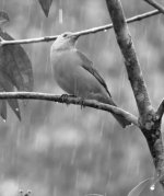
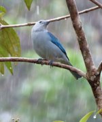
This I believe is a Blue-gray Tanager though I am open to the fact I could be wrong. One picture is normal colour the other is black and white which I think emphasises the rain and damp. Which one do you think is better?
I like the color one better:
in the color version the eye is to some extent drawn to the blue on the wings
in the BW one, the eye is drawn to the birds eye which unfortunately is out of focus
I agree with Niels that the image being out of focus is the main problem. But I also think you could achieve a better crop - there is a lot of empty space under the bird, and with the bird looking up this is just dead space.
Don't get me wrong - I'm not saying that one should always crop close to the bird, but in general the picture is more pleasing to the eye if the empty space is where the subject is looking. I can see the idea you have, with the rain showing up as streaks, but I think it would work better if you had the space to do that above the bird.
I tend to prefer colour to black and white most of the time - I think one needs a really dramatic photo for the monochrome to do something. I can see where you're coming from with the `all grey' idea, but I think that just gives you a flat looking image.