• Welcome to BirdForum, the internet's largest birding community with thousands of members from all over the world. The forums are dedicated to wild birds, birding, binoculars and equipment and all that goes with it.

    Please register for an account to take part in the discussions in the forum, post your pictures in the gallery and more.
ZEISS DTI thermal imaging cameras. For more discoveries at night, and during the day.

Mabel's Moment (1 Viewer)

Cool thread Mabel!

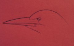
I love your first entry, nice to see so many different painting styles and techniques on the art forums nowB :)

Keep it up!!

Matt
 
Thank you, Matt and Wendy for your input. I still cannot get the effen proportion right at all, but I'm destined to fail so it seems. As dire as my sketches are, these are the ones I am not utterly ashamed to show you.
Nevertheless, I have a good medium, music and Scotch on the rocks. I am simply going to launch into it and hope for the best. Poxy Herons!
 

Attachments

  • IMG_3241.JPG
    IMG_3241.JPG
    161 KB · Views: 94
  • IMG_3242.JPG
    IMG_3242.JPG
    164.7 KB · Views: 103
  • IMG_3243.JPG
    IMG_3243.JPG
    165.5 KB · Views: 96
  • IMG_3244.JPG
    IMG_3244.JPG
    166.8 KB · Views: 99
Last edited:
these are good, you have the same problem as me - the beak, start with the gapeline, the gape starts just under and behind, the eye, draw a long line out from this to the tip of the beak, the lower mandible curves up a bit to meet it and the upper mandible is mostly straight curving down towards the tip. Hope this helps, but certainly keep on the scotch! Is always good, it's just the bill length, otherwise, these are good! Keep at it!
 
these are good, you have the same problem as me - the beak, start with the gapeline, the gape starts just under and behind, the eye, draw a long line out from this to the tip of the beak, the lower mandible curves up a bit to meet it and the upper mandible is mostly straight curving down towards the tip. Hope this helps, but certainly keep on the scotch! Is always good, it's just the bill length, otherwise, these are good! Keep at it!

Like so...sorry about the pink post it paper, but it was close to hand. As Nick points out the gape line runs below the eye on herons and egrets. You will find that if you keep practicing on one species, Grey Heron is an excellent choice of subject by the way, that you will get very familiar with that species and as you do your sketches will improve noticeably. This in turn gives mre confidence to tackle other species. Hope this helps and keep belting out them sketches!
 

Attachments

  • aheron.jpg
    aheron.jpg
    29 KB · Views: 77
Thank you all for your replies.
Dave, B :) B :) THE FEUL OF THE GODS!!

Nick, you know something? I never noticed that in Herons about the gape. Thanks for bringing that to my attention.
Buzzard, that was an excellent lesson. I don't know if I know any better but I done a few more sketches.
To be honest, I am getting itchy to just do it. So I think I will after dinner tonight. I'll just lash into it and see what happens.
Thank you guys, I am learning as I go!
 

Attachments

  • IMG_3245.JPG
    IMG_3245.JPG
    161.5 KB · Views: 69
  • IMG_3246.JPG
    IMG_3246.JPG
    170.4 KB · Views: 78
  • IMG_3247.JPG
    IMG_3247.JPG
    147.6 KB · Views: 70
  • IMG_3248.JPG
    IMG_3248.JPG
    146 KB · Views: 85
Thank you all for your replies.
Dave, B :) B :) THE FEUL OF THE GODS!!

Nick, you know something? I never noticed that in Herons about the gape. Thanks for bringing that to my attention.
Buzzard, that was an excellent lesson. I don't know if I know any better but I done a few more sketches.
To be honest, I am getting itchy to just do it. So I think I will after dinner tonight. I'll just lash into it and see what happens.
Thank you guys, I am learning as I go!

You see. improvement already. I'm going to step to the side now before the paint starts flying!
 
Well, here it is. A bit unsure of it... I wasn't really going for a totally realistic setting, but... And I'm not making excuses, I know I can't paint water!
 

Attachments

  • Heron_Done.JPG
    Heron_Done.JPG
    239.5 KB · Views: 80
I love the colours, they work very well together. I'm wondering if trying to create a realistic image is a bit contrary to your technique, your application of the paint is abstract and I think that if you think abstract from the start, you will create something stronger. As for 'not being able to paint water', all you need to do is fill in the gaps, as it looks like the water is going around the heron, rather than behind it. I hope you don't mind me saying this, I see something very promising in your art. You have a very exciting way of painting, and the more you paint, the more things will click and come into place.

Have you thought about working directly on your picture without doing an outline first? Just dive in with blocks of colour and then sort out some sort of outline - have a look at some of the works by Raoul Dufy to see if this sort of approach may pay dividends.

Keep them coming!
 
Nick speaks wisdom. You are seperating the heron from the environment. If you are making this a piece of realism, the perspective is too clumsy. I concur with the advice to create shape and abstract from the scene. Also look to the chinese style, (for design ideas) and to the pure impressionists fro approach. Paint edges into edges - not leaving large gaps of 'un-painted' canvas between the subject areas.
Enjoy the process - I think there's a lot you can offer.
 
I love the colours, they work very well together. I'm wondering if trying to create a realistic image is a bit contrary to your technique, your application of the paint is abstract and I think that if you think abstract from the start, you will create something stronger.

Completely agree with this

To hell with ''realism''!! ..go wild and enjoy it:t:

Matt
 
hi Mabel

Love your painting and love your style too. Love the colours and most of all it is your unique style how you express yourself, your view of the world, and what you see around you.

Your sketches are lovely too, and your red picture sketch is spot on in my eyes. :t:

I believe as long as you enjoy what you are doing and you feel a sense of achievement in completing your task whatever it is, that is what counts here.

Like you, I enjoy painting and have painted some pictures based on snippets from magazines or postcards anything that looks nice, or I can work off in any way. I also do painting of scenery outdoors when I have the time.

I feel embarrassed to say this but I painted a blue tit one time (from a photo) and I made this bird look a little fat around the middle.
Proportion is a problem and it takes lots of practice to get around this problem. I had to disguise this with difficulty, and there is still a blemish to show that the blue tit has a weight problem (I still have this picture to this day)

As I have already said, proportion is a problem. It takes lots of practice to feel a difference in what you do and hope to achieve here. Any form of art work is also a wonderful hobby, and a great way to relax at the end of a day. It is so therapeutic too.

So I am in agreement with everyone here - first and foremost, enjoy what you are doing. Improve your technique, and take it step by step. Everything will fall into place at the end of the day. Most of all do not be too hard on yourself.

If you feel you are getting nowhere for what ever reason, take time out and go back to what you are doing. You are more likely to get the end result that you want.

After all it is what you enjoy, and makes you happy so keep on at it.

Let us know what you do next :t:

Peewit
 
Nick: Thanks. I agree with you as usual. Of course I don't mind what you say, it's always spot on. As for the outline, I always do one. Perhaps I need to break that habit. It really does make my work so rigid looking. As for the water, as I look back on it, water indeed does not go around things! I shall fill in the gaps in future, but for now, the painting is eefectively done, so I'll move on from here. Thanks a bunch dude!

Tim: Advice from a master! Thank you for the compliment. You are the second artist to have suggested I use Japanese/Chinese style. Something I should definitely investigate methinks!

Matt: I think my next piece will be a bit surreal loking, so hopefully realism will be utterly chucked out the window. Thanks!

Kristina: Hi there! :) I'd love to see some of your stuff if you have any. Thanks for the compliment and hopefully shall chat to you soon!

Peewit: Thanks for such an honest post. Hope to see your stuff too. By the way, my next pic will involve a Pheasant.
 
Warning! This thread is more than 17 years ago old.
It's likely that no further discussion is required, in which case we recommend starting a new thread. If however you feel your response is required you can still do so.

Users who are viewing this thread

Back
Top