buzzard12
Well-known member
More Redpolls...
Have been watching Redpolls for two weeks now, in fact I am starting to see them in my sleep! Have pages of sketches and a cold as a result!
Anyhow, have been indoors due to the cold and am on the mend. Used the time to go through my fieldwork and get some black and whites done at the desk. Really pays off too spend time on birds like these in the field, really falls into place in the studio when you have become familiar with the birds. Nice to be able to sit down and take time to get the drawings right.
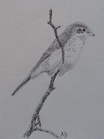
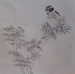
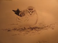
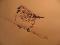
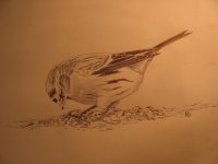
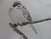
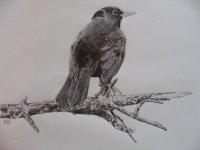
First drawing of a female Arctic Redpoll, possibly a second winter bird that has been at Årstafältet for the last 5 days. Second image is a first winter Mealy Redpoll, whilst the last is a male Mealy Redpoll feeding on the ground.
These were all done with black ballpoint pen, though a slightly fancier one than normal with a 0.7mm point! Also done on decent quality cold press paper, makes a great deal of difference for those fine details.
Have been watching Redpolls for two weeks now, in fact I am starting to see them in my sleep! Have pages of sketches and a cold as a result!
Anyhow, have been indoors due to the cold and am on the mend. Used the time to go through my fieldwork and get some black and whites done at the desk. Really pays off too spend time on birds like these in the field, really falls into place in the studio when you have become familiar with the birds. Nice to be able to sit down and take time to get the drawings right.
First drawing of a female Arctic Redpoll, possibly a second winter bird that has been at Årstafältet for the last 5 days. Second image is a first winter Mealy Redpoll, whilst the last is a male Mealy Redpoll feeding on the ground.
These were all done with black ballpoint pen, though a slightly fancier one than normal with a 0.7mm point! Also done on decent quality cold press paper, makes a great deal of difference for those fine details.
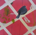
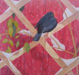
Attachments
Last edited:
")