Hi Peter and all,
I was dimly aware of the long European tradition of bird artist/scientists but never spent much time studying the history other than happening across examples. Thank you for the list I’ll certainly be digging into it.
“This is another area where I feel the lack of formal art training; my pictures are designed to look ‘right’ to me but don’t always work, and sometimes I’m caught out by errors in the planning stage that only become apparent to me well down the track”
Its interesting that you are focusing on improving the “art” aspect of your work while I obsess about the science. We both aspire to that in which we had no formal training. I am grateful that my own art training has made the ability to build structure, planes, volume and weight fairly straightforward. Now if I can just get the science right.
“Just thinking about a 7 x 18m canvas gives me vertigo.”
We’d stretch the canvas on a plywood floor covered in plastic sheeting.. There’s something freeing about being able to walk around on a painting. We would often use mops and soft nylon scrub brooms as brushes. The vertigo kicks in when having to climb tall ladders to get an overview of the work.
“Thanks you! I am a fan of Bateman’s work. He seems to get straight to the right values in his painting, something I struggle with coming from my watercolour background. I looked hard at the ways he paints snow before getting into my Monal painting. In fact my first view of the species was in a shaded gully full of snow-covered conifers, but I felt that was beyond me to paint”
In the all day classical painting classes my second drawing master in LA presided over we learned to start an oil painting like a water colour but in oil with a medium providing the transparency rather than turpentine which by itself breaks down the chemical bonds if used too freely.
He made a convincing case for any shadow in a painting to be executed in many thin layers of pure browns and ochres with no white added. While highlights and lighter tones were built up in solid opaque paint. Perhaps you are aware of this method. I was not and it was an eye opener for sure. Seems to work just as well in digital painting as in oils.
“Just by the way, what do you think of David Hockney's suggestion the Ingres used a camera lucida extensively?”
I suspect Hockney was merely speculating but nonetheless I disagree with him on this. I recall discussing his comment at the time with my first drawing master in Winnipeg and he maintained that if Ingre did use Camera Lucida his students and assistants would have been aware of it and they certainly wouldn’t have hesitated to use it when they themselves eventually came to teach Ingres methods. I was 6 generations of drawing masters away from the methodology Ingre developed and I don’t think its use would have been ignored by any of those students and assistants, his process was very well sorted and produced tangible results but I don’t think there was any magic involved.
In Canada the word Commonwealth means former colonies of the British Empire that are now a loose conglomerate of sovereign states which is how I took your meaning. I was unaware of its use in the context of Australia. So I guess the CSIRO is off the hook for any nagging I might do on behalf of the project.
Your paintings and drawings from post 31 are of course superb and I hope will help me make the argument to my project partners (who voted it down once before) to include silhouettes of the different shapes a species can exhibit.
The plate showing the various moults and stages has a wonderful visual conciseness. All the information is there to help with field work and id but is rendered in a satisfyingly spare way. I don’t just see a plate but art.
The work shown in post 38 is quite bold and takes a successful risk with composition. You’ve succeeded in imbuing it with the Oriental aesthetic you mention. It has much to say about one single moment in a single place.
I have a personal thing these days about the over use of saturated colour and appreciate the constraint shown here.
It also has a very nice use of negative space which the Japanese excel at. These days I think the phrase “negative space” is slowly being replaced by the digital artist phrase “white space”. Not an entirely apples for apples replacement but there it is.
The scratchboard drawings in post 39 are accomplished. I particularly like the Treecreeper for its brevity.
Rather than clog up this thread topic with paintings and drawings whose subjects are other than birds I’ll provide a link to my gallery. The mythology set is in there somewhere.
https://www.bryanpollock.com/browse
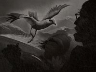
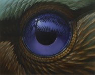
I have a small group of monochromatic drawings I will occasionally add to that are loosely based on personal encounters I’ve had with individual birds so I include one of my favourite moments.
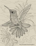
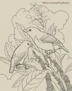
The second drawing is from a colouring book my project partners currently have me working on.
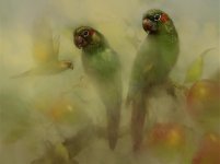
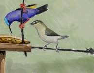
The third painting is an example of what happens when I take one of the finished paintings from the books and rework it with a more arty approach. The hard bit with this exercise is avoiding affectation.
Cheers,
Bryan


")