


-
Welcome to BirdForum, the internet's largest birding community with thousands of members from all over the world. The forums are dedicated to wild birds, birding, binoculars and equipment and all that goes with it.
Please register for an account to take part in the discussions in the forum, post your pictures in the gallery and more.

You are using an out of date browser. It may not display this or other websites correctly.
You should upgrade or use an alternative browser.
You should upgrade or use an alternative browser.
How to tell apart the EL 8x32 versions? (1 Viewer)
- Thread starter aCuria
- Start date
More options
Who Replied?Gijs van Ginkel
Well-known member
aCuria, post 1,
The shape of the body differs, I have no photographs right now, but when you see it, it is obvious.
Gijs van Ginkel
The shape of the body differs, I have no photographs right now, but when you see it, it is obvious.
Gijs van Ginkel
aCuria, post 1,
The shape of the body differs, I have no photographs right now, but when you see it, it is obvious.
Gijs van Ginkel
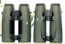
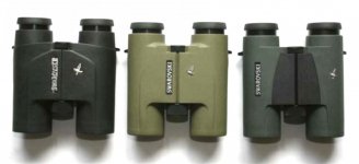
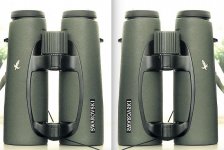
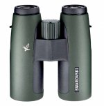
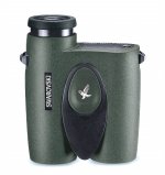
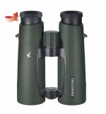
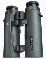
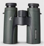
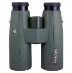
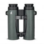
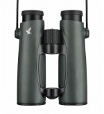
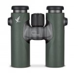
I attached some pics:
Its certainly not version 3 "fieldpro". How does the body shape of the first 2 versions differ?


I am wondering how to tell the EL 8x32 WB "version 1" and the EL 8x32 Swarovision "version 2" bins?
Is there an easy way?
They are both listed in Allbinos 8x32 binocular section if you would like to compare them.
https://www.allbinos.com/1458-Swarovski_EL_8x32_WB_Swarovision_-binoculars_specifications.html
https://www.allbinos.com/272-Swarovski_EL_8x32_WB-binoculars_specifications.html
Bob
Last edited:
Rotherbirder
Well-known member

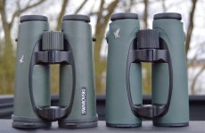
The binocular in the photographs is 'version 1' as you describe it. As has been said, the tubes are subtly different in shape, the armouring is a slightly different colour covers more of the tubes and the position of the badging is different.
RB
RB
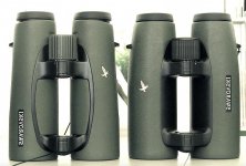
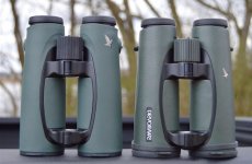
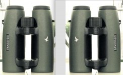
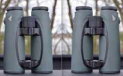
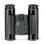
As has been said, both design and badge placement are clear sings, however, the black area on the inner part of the tubes is pretty telling to my eyes. I don't know if I'm the only one using this simple method to tell them apart, but I just look at this:
V1. The black part on the inner side is large and solid (no green/sand patch).
V2. SV There is a patch of rubber inside the black area, so the black area appears actually like an arc.
V3. FP There are no classic lugs, but the new round little studs.
I hope this helps.
V1. The black part on the inner side is large and solid (no green/sand patch).
V2. SV There is a patch of rubber inside the black area, so the black area appears actually like an arc.
V3. FP There are no classic lugs, but the new round little studs.
I hope this helps.
John A Roberts
Well-known member

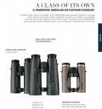
The x32 EL chronology is:
- mid 2003 to late 2011 - EL
- late 2011 to mid 2015 - EL Swarovsion (new optics and body)
- and from mid 2015 on - EL FieldPro (Swarovision with new covering and accessories)
For more detail as to the differences, see my recent posts in this thread: https://www.birdforum.net/showpost.php?p=3857648&postcount=3
The differences for the x32 EL's are the same as those described for the x42 ones
And for quick visual identification (the images are of x42 EL's):
- firstly, the EL vs the EL Swarovision
- secondly, the EL Swarovision vs the FieldPro update to the Swarovision
And finally, a listing of the Swarovision optical changes
John
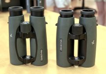
p.s. I've also attached an alternate view of an EL x42 (right) and an EL SV x42 (left) that better shows the slimmed body of the latter
it's from: http://600birds.blogspot.com/2008/08/new-swarovski-els.html
- mid 2003 to late 2011 - EL
- late 2011 to mid 2015 - EL Swarovsion (new optics and body)
- and from mid 2015 on - EL FieldPro (Swarovision with new covering and accessories)
For more detail as to the differences, see my recent posts in this thread: https://www.birdforum.net/showpost.php?p=3857648&postcount=3
The differences for the x32 EL's are the same as those described for the x42 ones
And for quick visual identification (the images are of x42 EL's):
- firstly, the EL vs the EL Swarovision
- secondly, the EL Swarovision vs the FieldPro update to the Swarovision
And finally, a listing of the Swarovision optical changes
John
p.s. I've also attached an alternate view of an EL x42 (right) and an EL SV x42 (left) that better shows the slimmed body of the latter
it's from: http://600birds.blogspot.com/2008/08/new-swarovski-els.html
Attachments
Last edited:

pre-swarovision, swarovision, field pro
This is a response of mine to another thread. The pictures explain the difference between the three.
https://www.birdforum.net/showpost.php?p=3451012&postcount=8
This is a response of mine to another thread. The pictures explain the difference between the three.
https://www.birdforum.net/showpost.php?p=3451012&postcount=8
John A Roberts
Well-known member
Graphic Design and the EL Series
SZ (post #8)
Thanks for drawing attention to your previous post. As the images clearly show the external differences between the models, I certainly would have made use of them if I’d been aware of them
They also reminded me of something that I’ve thought about before. That is, notwithstanding:
- the changes to the rubber armour and the bridge areas between the EL and the EL SV versions, and
- the additional changes to the EL FieldPro rubber armour
the changes to the placement of the Swarovski label and the hawk badge were clearly done to enable easy distinction between the 3 versions
Origins
The original use of the Swarovski label on the left, and the hawk badge on the right - when looking at a binocular front on (as for example in a store display) - dates back to the mid 1990’s
From 1994, the label and badge were used on the SLC, Pocket and traditional Porro prism models
And on all 3, the label was located either near or on the axle e.g. see the first 2 SLC's in the attached image
(it’s from Gijs van Ginkel’s history of Swarovski Optik; for the link, see around 2/3's down the page: https://www.houseofoutdoor.com/verrekijkers/verrekijkers-testen-en-vergelijken/ )
In terms of graphic design, the placement and orientation of the badge and label were considered choices - it’s not accidental that both the label and the hawk are facing inwards
The EL
When the EL was introduced in 1999, the label was moved away from the centre line, which seems to make for a stronger effect (in the first image, compare the SLC neu of 2005 to the earlier models)
And although the combination is successful as a pair of graphic elements, I’ve always thought that the effect would have been stronger if the two were reversed
i.e. with the label on the right, and the badge on the left (and with both adjusted so that they were facing inward)
- see the attached horizontally flipped image from my previous post
The flipped version follows a simple compositional device often used in photography:
- providing a lead in line (or point) on the left, to allow the viewer’s attention to flow into the image, and then
- redirecting the attention from exiting the right of the image, by the use of either a vertical or an inward curved shape on the right of the image
This arrangement works especially well on those long experienced in - and therefore conditioned to - reading texts from left to right
But regardless of my observation, the original combination is clearly much more effective than what follows with the EL Swarovision
The EL Swarovision
Compared to the orientation on the EL, the EL SV’s outward facing branding, tends to make it more difficult for a viewer to comfortably concentrate on the detail of the binocular
- compare the two in both the first and last images in post #7 (usefully, the models are on different sides in each photo)
I’m surprised that at a minimum the Swarovski label was not turned upside down, so that at least both it and the badge were facing to the viewer’s left, so as to resolve some of the visual tension
And the flipped version of the EL Swarovision seems to work better than the original!
- the low placement of the label seems to provide a lead in function, and
- the badge then redirects attention from exiting the right of the image (as the hawk faces to the left)
The EL FieldPro
Clearly it’s not an improvement over the original EL, and it’s debatable if it improves on the EL SV (see the second image in post #7). But it is distinct from the 2 previous versions
Again I’ve provided a flipped image of the FieldPro, and as the hawk faces to the left it would act to redirect one’s attention from exiting the right side of the image
Well those are my musings about the graphic design elements. As we have a membership with a wide variety of knowledge, skills and experience, I'd be interested to hear the thoughts of others
John
Attachments
Last edited:
John A Roberts
Well-known member
And a more useful set of comparison images (I should have originally thought of this):
- EL as is and reversed
- EL SV as is and reversed
- EL FP as is and reversed
John
- EL as is and reversed
- EL SV as is and reversed
- EL FP as is and reversed
John
Attachments
Last edited:
John A Roberts
Well-known member
Progression of Binocular Coverings and Branding
I thought it would be useful to expand on my previous post and provide a quick visual summary of the commonalities and variations in the appearance of recent Swarovski roof prism binoculars
As can be seen, there is a shared appearance (an easily recognisable brand identity) and a generally orderly progression to the changes
A) Forrest Green covering, combined with black bridge area
1999 - EL (the image is from Allbinos: https://www.allbinos.com/144-binoculars_review-Swarovski_EL_10x42_WB.html )
2005 - SLC neu (the only change to the existing SLC line was an upgrade to the rubber armour covering; and the black portion is RA rather than blackened metal like the EL)
- - - -
2010 - all new SLC HD (with reversed badge and label placement, which is also on B) and C) below)
B) Streamlined use of black contrast
2009 - EL Swarovision
2011 - EL Range
2011 - CL Companion
C) Atypical models
2013 - CL Pocket (the styling of the black areas is similar to A) above; necessary due to the dual hinge construction?)
- - - -
2013 - upgraded SLC (with one piece, dual texture covering and no contrasting black; an economy measure vs the EL line?)
D) FieldPro features (includes lighter colour RA, and changed badge and label placement - the label is now on the side of the left barrel)
2014 - EL Range FieldPro
2015 - EL Swarovision FieldPro
2017 - all new CL Companion
n.b. all the introduction dates are based on observed serial numbering
John
See attached:
- the A) versions from above, and for the sake of completeness
- the Laser Guide monocular rangefinder introduced in 2004 (using SLC 8x30 optics), which also had the A) version style of covering and branding, and
- the original Pocket model dating from 1989, which was also offered from 2000 in Forrest Green - as an option (the image is from a 2016 eBay listing by didoll)
Attachments
Last edited:
John A Roberts
Well-known member
John A Roberts
Well-known member
John A Roberts
Well-known member
Jerry,
I can understand the reasons for your question, but . . .
As I’d say if under oath:
‘I’m not now, nor have I ever have been, a member of the optics industry. Nor have I ever had any contact with Swarovski Optik, or it’s current or former employees, or associates’!
Around 5 years ago I had a renewed interest in binoculars, initially the Nikon EII’s and then the Swarovski Porro’s
Looking around the ‘net, I was surprised at how little detailed basic information was available about the Swarovski's
It soon became clear that much of the information was ambiguous, incomplete or contradictory (and that much was from a few sources and then increasingly garbled in repetition)
My interest in the Porro’s led in turn to Swarovski’s other binoculars, and from there to the rest of the Swarovski products
And in the long run, a lot of the things I’ve worked out about the binoculars were only possible by studying the full product line
In some ways Swarovski’s products were relatively easy to research:
- they’re popular and most have been in production for long periods, so there’s usually a large number of units
- they often go for long periods without external changes, and there is information available about other changes
- most have visible serial numbers (and there's also numbers on the packaging), and since 1991 all numbers include a dating component, and
- the ‘net provides access to a much larger number of specimens than even the most dedicated collector could possibly acquire
As I’ve recounted before, I went through a tedious initial period of searching sales and other sites, downloading images and sorting them into serial number order
And after a while patterns emerged and I could starting compiling and refining tables
So all the information that I’ve acquired is from public sources. And with the exception of a few books and magazines, all the information is from the ‘net (99.9%+)
I’m somewhat surprised at how successful I've been
John
Last edited:
Jason Bugay Reyes
Well-known member

Jerry,
I can understand the reasons for your question, but . . .
As I’d say if under oath:
‘I’m not now, nor have I ever have been, a member of the optics industry. Nor have I ever had any contact with Swarovski Optik, or it’s current or former employees, or associates’!
Around 5 years ago I had a renewed interest in binoculars, initially the Nikon EII’s and then the Swarovski Porro’s
Looking around the ‘net, I was surprised at how little detailed basic information was available about the Swarovski's
It soon became clear that much of the information was ambiguous, incomplete or contradictory (and that much was from a few sources and then increasingly garbled in repetition)
My interest in the Porro’s led in turn to Swarovski’s other binoculars, and from there to the rest of the Swarovski products
And in the long run, a lot of the things I’ve worked out about the binoculars were only possible by studying the full product line
In some ways Swarovski’s products were relatively easy to research:
- they’re popular and most have been in production for long periods, so there’s usually a large number of units
- they often go for long periods without external changes, and there is information available about other changes
- most have visible serial numbers (and there's also numbers on the packaging), and since 1991 all numbers include a dating component, and
- the ‘net provides access to a much larger number of specimens than even the most dedicated collector could possibly acquire
As I’ve recounted before, I went through a tedious initial period of searching sales and other sites, downloading images and sorting them into serial number order
And after a while patterns emerged and I could starting compiling and refining tables
So all the information that I’ve acquired is from public sources. And with the exception of a few books and magazines, all the information is from the ‘net (99.9%+)
I’m somewhat surprised at how successful I've been
John
Excellent!
John A Roberts
Well-known member
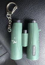
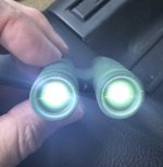
And on a light note (?), yet another example of Swarovski roof prism binocular markings
- this time on a keychain flashlight
It's by far the cheapest way to own a Swarovski binocular, even more so than the Swarovski Crystal one that I use for my avatar
And as can be seen in the second photo it has outstanding transmission! Surely something Gijs needs to test
It can be found on that well known bay of e-ness, at: https://www.ebay.com/itm/Swarovski-...406625?hash=item3b37830fe1:g:PCEAAOSw0VZdWcm8
- so yet another example of a Chinese counterfeit on the site? . . . 'I'm shocked, shocked I tell you'
John
Attachments
Last edited:
Gijs van Ginkel
Well-known member
John post 18,
Thank you for the suggestion to test this exciting new Swarovski: we immediately started and were shocked to find 149,846 % light transmission, we were flabbergasted. In the meantime one of my colleagues has written a proposal to our government to build an array of these instruments in order to face our national energy problem since we are running out of natural gass. We hope to publish details later.
Gijs van Ginkel
SeldomPerched
Well-known member
And finally the FieldPro versions:
Thank you for all the info, John: I shall no longer throw around terms such as SV, EL, FP interchangeably. One more thing to clear up if you have a chance, please. I also see WB mentioned at times, which is most likely, going by Zeiss etc, 'weitwinkel' for wide-angle, and 'Brille' for spectacles. Which of the models does this apply to: all the flat field versions, all the versions, or some other category?
Tom
Similar threads
- Replies
- 12
- Views
- 902
Users who are viewing this thread
Total: 2 (members: 0, guests: 2)