• Welcome to BirdForum, the internet's largest birding community with thousands of members from all over the world. The forums are dedicated to wild birds, birding, binoculars and equipment and all that goes with it.

    Please register for an account to take part in the discussions in the forum, post your pictures in the gallery and more.
ZEISS DTI thermal imaging cameras. For more discoveries at night, and during the day.

Critique please! (1 Viewer)

MrsBoris

Member
Hi everyone!

It has been ages since I have logged on to bird forum - I've missed 1.5 million new posts! I was just wondering if anyone would be so kind as to critique my photos?
I am an amature who loves taking photos of birds and animals, especially close ups. I have chosen three photos that I think are a fair representation of the kind of 'style' I am going for. I am eager to improve my technique through better understanding of the technical side of photography. I am still in the experimental stages and wish to be quicker off the mark when it comes to making decisions about ISO, exposure, white balance, etc.

These were taken in Australia with my Sony A330 and a 55-200mm lens. Specifics:
Great Egret; f/10; 1/200 sec; ISO 100
Juvenile Grey Butcherbird; f/4; 1/160 sec; ISO 100
Darter; f/8; 1/500 sec; ISO 200

Thanks in advance!
 

Attachments

  • DSC01241c.jpg
    DSC01241c.jpg
    204.5 KB · Views: 223
  • DSC07088c.jpg
    DSC07088c.jpg
    270.8 KB · Views: 211
  • DSC07470c.jpg
    DSC07470c.jpg
    298.4 KB · Views: 202
No expert myself, and have no experience with your camera equipment, but very good detail in all three pictures, I would just try constructing the shot better. My that I mean placed in centre of frame, all three shots cut in half.
 
second my favourite. Third, the head and beak seems to be out of focus. Otherwise agree with above. Either go for a head image, or capture the entire bird
 
These are nice pics............
.............but the 1st is probably 2 stops over exposed.The white is "burnt out". There is no detail left in the plumage With a subject like this with garish white on a very dark background, much like a wedding pic., set your exposure level at least 2 stops under. Always remember you can retrieve info from the pic if under exposed but not when it's lost by being over exposed and burnt out. I'd also remove the grass at the bottom of the pic, too distracting. As for composition, you said these were your style, so be it but to many the bird lacks poise and balance and looks as though it could fall over.
The 2nd is also over exposed but not as much.
As for composition, with a forward facing shot like this you will have trouble with depth of field and need to give as large an aperture as possible, especially as the bird is sufficiently away from the background. F8 at least, so look to, in this case, raise the ISO to 400 that would pull 2 stops back and give you F8 from F4. Again composure is not to everyone's taste here, it's always nice to see when passerines are comfortably perched and gives a more natural feel to the pic.
No. 3 looks peculiar in that the head doesn't look to be a part of the rest of it and again slight over exposure. Remember what I said earlier about exposure.
But all in all nice shots, they'll never be record shots for the simple reason the whole bird is not seen. It's important for identification purposes to show as much of the bird as is possible, tail, legs etc.
Joe :t:
 
I'd agree with lobas - I think the composition could be improved slightly in the first and third. The second is perfect - nice angle to the bird leaning to one side and then looking back in to the space. The others are just too tightly cropped on the body, either leave a little bit more space (I presume these are crops rather than originals based on the 200mm lens) or go a bit tighter still.

I actually think you've handled the exposure very well on the Egret, a white on black subject is very difficult and there doesn't seem to be too many blown out highlights (though admittedly there are some). I certainly don't think the 3rd is over exposed whatsoever!
 
My initial thought was that overall these are pretty good, but possibly aren't the best crops of the originals. I then read through the other comments.

One thing I agree with joespy on is the depth of field on #2 - but then only partly agree. F-stop is always a compromise between getting what is necessary to be in focus but keeping the unnecessary background out of focus. The important thing is for the focus to be on the eye, which it is. I can see detail in pretty much all the parts of all the photos. Yes, there is a case for slightly underexposing with digital (as burnt out highlights can't be retrieved) but 2 stops is too much most of the time. The trouble is that, in preventing the highlight problem, noise can become a nuisance in the shadows.

Where is the right crop for any photo? I believe it depends what the photo is for. If it's for "scientific" purposes then a different crop is often needed than when it's for purely "photographic" delight. As joespy says, it would be quite easy to lose the distracting blades of grass from #1.
 
Hi,

Thanks to everyone who looked at and commented on my photos - all feedback is most appreciated.
It looks like the main areas of comment turned out to be exposure, aperture, and composition.

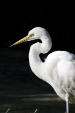
In terms of exposure, I would agree that they are a little over exposed, especially the egret. It is definately an area I need to work on, although I am still quite pleased with how the egret turned out (my previous attempts at a white bird on a dark background have been less successful than this one). Blown highlights seem to go hand in hand with the strong sunlight in Australia! Everything seemed to look glowy. But, it's useful to keep in mind that slightly under exposed is better than slightly over.

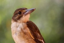
In terms of aperture, changing the f stop would have given me more of the bird in focus in the second shot. I was probably playing it a bit too safe in order to keep the background nice and out of focus. The background actually wasn't as far away as it seems. As a result, the back of the bird's head, and tip of his beak is out of focus. I don't find this too distracting, but it would have been better if they had been sharp. I actually took loads of photos of this little fella, including shots where he is completely in focus, but for some reason, this shot remains my favourite of the group, even though it is technically not as good. Perhaps I just like his cheeky expression? I am hesitant to raise the ISO to 400 as my camera is very fussy and can make a photo appear suprisingly noisy at such low ISO. I am hoping to upgrade to a better model soon and I think I will have more scope to play with ISO.
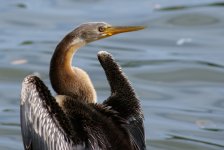
Joespy - I love that you think bird number 3 "looks peculiar in that the head doesn't look to be a part of the rest of it". So true! It looks totally weird and that's why I love this photo. It's neck is like an uncoiling snake! Kennethwfd - The head and beak are actually in focus, but for some reason, the plumage of Darters always seems to make them look a bit fuzzy.

In terms of the composition, I am experimenting a bit. Obviously, they are not what is regarded as 'normal', and are not everybody's cup of tea, but as Peter Jones kindly points out, they make a "nice change from side on portraits and headshots", and that was basically my intention. I am trying to find a way of photographing birds without getting stuck in a rut early on in terms of framing. I am exploring whether I can create a photo that is aethetically pleasing without adhearing religiously to established conventions. I promise I am not trying to be difficult! I am just testing the waters. I have the usual close up headshots and full length shots too but I chose not to post them here because you have seen that sort of thing before, right? And done much better too!

With the egret, I didn't like the little tufts of grass at the bottom of the picture originally, and cloned them out. But the picture actually felt more unbalanced without them, and so I put them back in! I found that the tufts of grass kind of mirrored the little tuft of feathers on the back of the bird.
Joespy and DaveAitch: Yes, these photos would make poor record or scientific shots. I am more into capturing the character of a bird. I think I frame them the way I do because (broadly speaking) I find a headshot to be a bit stiflingly close, and a full length shot to be too far away and impersonal.

So here's the question... Is it of any benefit to play around with the rules of photography? Do I stick with my odd framing technique at the risk of the photo looking 'wrong' to the majority of people, or do I need to become more conventional? (I can't decide).
 
So here's the question... Is it of any benefit to play around with the rules of photography? Do I stick with my odd framing technique at the risk of the photo looking 'wrong' to the majority of people, or do I need to become more conventional? (I can't decide).

There is always a benefit to play with composition rules, or better call it guidelines. Depending on how an image is cropped its impact can be quite different. Not better or worse, just different.

However, established criteria for image composition (rule of thirds (golden ratio), leading lines, lead room etc.) work for a reason in 99% of cases, and not only in landscape or architectural photography.
Not because they are conventional, they became convention because they work.
Other compositions (subject dead center in a square frame, reversed leading room etc.) can work for some images.

One advice is to look at images of other photographers, analyse why you like them (or not) and why they work for you (or not).

Then take your own work and be self critical and trust your gut feeling. If it doesn't look right the day after you composed it -and you need this creative distance- it is probably not working for a reason. Analyse and try to find out why .....

As someone once said: Before you can successfully break the rules you will need to know and to work them.

Ulli

P.S. don't expect honest "critique" on "photography" forums. This is becoming increasingly rare as people are overloaded with images and don't take the time to look at them (or don't know how). So "Great Shot" is a safe way to comment and to stay out of trouble, but with very limited feedback value. Here one still often gets the kind of valuable feedback (see posts above).
 
Last edited:
So here's the question... Is it of any benefit to play around with the rules of photography? Do I stick with my odd framing technique at the risk of the photo looking 'wrong' to the majority of people, or do I need to become more conventional? (I can't decide).

I think the answer is yes. Like art, wildlife photography is subjective and one man's perfect exposure and composition, may not score top marks with the next. I know that I often struggle with deciding myself and I often go with my early impression of what pleases my eye.

I have a friend who takes great landscape images but which have high artistic value but don't appeal to my eye as I believe they don't look "real". His view of my wildlife images, often taken in challenging circumstances in terms of movement and low light, are that they aren't sufficiently artistic.

This is a blog of a young photographer I follow who I believe takes some really good images and also pushes some of the conventions at times.
http://dansbirdingblog.blogspot.co.uk/
 
Warning! This thread is more than 11 years ago old.
It's likely that no further discussion is required, in which case we recommend starting a new thread. If however you feel your response is required you can still do so.

Users who are viewing this thread

Back
Top