A2GG
Beth

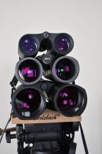
Recently I had the opportunity to look through Ultravid Plus, Zeiss FL & Swarovski CL (original version) over the course of a couple of weeks. I wasn't intentionally comparing these three, but I eventually noticed the differences in color presentation between the 3 after using each on separate days. I used them on the weekends at the same local park. As the rather distinct color presentation of each became apparent it made me
appreciate the different qualities and character of the views I found in each of them . Certain beautiful images from each are burned in my mind from the few outings at the park in town.
With the the FL I noticed rather strong greens when looking at Pine trees and greenery while other colors seemed normal. This is something I hadn't noticed before with the FL. The Pines looked striking and splendid and I wondered if there could be some color bias happening. I recalled discovering (by accident) a subtle yellow color cast in the Cabelas branded Meopta Meostar hd I had briefly a couple of years ago. I came across this when looking through the Meopta indoors for the first time at night when I first opened the box. Looking at a picture on the wall near a lamp with "daylight" bulb shining against the off white wall, I thought I saw slight tint of yellow or cream color. I grabbed the Ultravid to quickly compare and confirmed a very slight color cast in the Meopta. I've heard this before about the Meostar so I wasn't surprised and it was quickly forgot about when I used it for a weekend. Great binocular btw, but couldn't keep it due to ER a touch too short with my glasses.
So, after noticing intense greens in the FL I checked the wall again to see if I could see any color tint like I did in the Meopta. I did not see any type of color tint.
I was just curious and never had any problem with how greens looked in the FL. I actually thought it looked great and, overall, felt the color presentation in the FL very nice. The light gray coloring of a tufted titmouse looked especially pretty on that day.
After using the CL last weekend on a sunny day I finally realized why I find the view so pleasant. It's the colors.
Light tone colors are illuminated and look just beautiful.
Whites seem super bright and light toned purple, pink, yellows and blues look especially lovely in the CL. It has an overall very pleasing and relaxing color presentation to me.
A Red-bellied Woodpecker looked resplendent with its white brightened by the strong sun and slightly different shades of red on its head and belly. The pink legs and light blue eyering of a mourning dove was another image that stuck with me. A nearby house with a faded light yellow paint, a light purple children's plastic pedal car and other objects with lighter toned colors are what struck me.
The very next day I decided to take out the Ultravid+ to see its distinct color presentation in comparison . With the other 2 bins I wasn't intentionally looking at their colors...they just came to me and I eventually noticed their distinct/unique rendering of colors. But now I wanted to look to purposely see the differences with each and I needed to go back to the same park with the Leica. First look was dramatic (!) compared to the CL used just the previous day. Again, a sunny day which became cloudy later. Colors were obviously deeper, more saturated and boosted edge contrast created an impressive and a bit more intense image . CL has a gentler view and seems less harsh if that makes sense; a bit less dramatic.
Now I have just the Ultravid and CL. The FL was temporary and is gone. I didn't get rid of it for the optics (they're fantastic), but more for ergonomic and other personal considerations.
CL has good contrast and resolution; good separation of tones and is very bright (for 30mm) with wonderful colors. Uvid+ has deeper, richer colors and more contrast. Someone recently (can't recall who) on the forum said Leica is like oil paintings, Swarovski like pastel and Zeiss like watercolor. I generally agree with this and it seems a very good way to describe the different qualities of each IMO. I find the CL to be the closest to neutral than the others.
This is how I see it, but others may see things very differently and please remember the above are only my personal observations and opinions.
Pastel (colors) ... from Wikipedia:
"The colors of this family are usually described as "soothing", "soft", "near neutral", "milky", "washed out", "desaturated", and lacking strong chromatic content. Pink, mauve, and baby blueare commonly used pastel colors, as well as magic mint, periwinkle, and lavender."
Color brightness vs saturation (google search):
"Hue is therefore the actual color. Brightness refers to how much white (or black) is mixed in the color while saturation indicates the amount of grey in a color. A saturation value of 0 indicates mostly grey while 100% luminosity (or L = 255) is white (see charts)."
Last edited by a moderator:
")