• Welcome to BirdForum, the internet's largest birding community with thousands of members from all over the world. The forums are dedicated to wild birds, birding, binoculars and equipment and all that goes with it.

    Please register for an account to take part in the discussions in the forum, post your pictures in the gallery and more.
ZEISS DTI thermal imaging cameras. For more discoveries at night, and during the day.

New Zeiss Victory SF !!!!!! (6 Viewers)

All commercials about the SF stress the fact that the weight balance has been shifted from the objective area to the ocular area. This indeed should be useful when the bins are held in a horizontal position, as hunters often hold them; but birders often times look at birds up in the trees and so my perhaps naive question: is this shift of weight useful in such cases where the bins are held almost vertically? It looks like they might have a tendency to push onto your ocular orbits.
Peter
(if this question was not raised before, then likely it's not an issue; on the other hand if it was raised then there must an answer to it somewhere in this thread, but Google could not handle its size....)

Peter:

This is a good point, and I believe it is just a marketing thing.

The Swarovski Swarovision is the competition the Zeiss SF is trying to compete with.
They even hired Dobler, who developed the original Swarovski EL.

I do not see those that use and enjoy the Swarovision finding any
issues in balance, but Zeiss has to come up with a few things to
distinguish their new model.

I have not heard of anyone offer any numbers on how any differences
between those models may vary from front to back.

Here is what I have found with objective covers removed and using
a precision scale.

Swarovski SV 8.5x42 -- Ocular - 13.6 oz. Obj. 14.6 oz.
Nikon EDG 10x42 -- Ocular - 13.8 oz. Obj. 13.5 oz.

Both are very close to 50:50, and handle very well.

Jerry
 
It seems implausible to me that those curved lines around the open-hinge between the barrels, or the placement of the focus knob and design of its surrounding hinges, was motivated by an effort to reduce the bin's weight. It seems such a trivial savings. I think the design was motivated by the effort to make the bin look artful and stylish. In fact, there's something about the SF and the SV too for that matter, that reminds me of a Georgia O'Keeffe painting. Were she alive today to weigh in on the issue, she might deny it, but I see a certain similarity to some of her flower paintings, such as her famous Black Iris III (1926).

--AP


Those open hinged binoculars all end up looking like the grill on an Edsel.:smoke:|8||
 
Last edited:
Jerry:

Interesting info. I have no idea how you measured the weight of only a part of the bins....can you please explain.
At any rate, does anybody have the corresponding figures for the SF?

Peter.
 
I am aware of the second hand report were a vendor sent some back to Zeiss. The discussion is about if any customer (buyer) has returned a unit because they were not satisfied with it. As far I know, none have. This is counter to the gloom and doom tone of your posts. I still have not figured out why you are going to such efforts to besmirch a binocular that you have never seen and others have given good reports from first hand experience.


I did not detect any rolling ball in the Zeiss SF 10X and only a very slight amount in the 8X. I also do not detect any rolling ball in the 10X Nikon EDG. The rolling ball in the 8X Zeiss SF was significantly less than what I see in the 8.5X42 Swaro EL SV and also slightly less than what I have seen in a Swaro 8X32 EL SV. Another person I was with did not detect any rolling ball in the Zeiss SF 8X.
It sounds like the Zeiss just gets rid of RB and still has sharp edges. Could be good.
 
Jerry:

Interesting info. I have no idea how you measured the weight of only a part of the bins....can you please explain.
At any rate, does anybody have the corresponding figures for the SF?

Peter.

Peter:

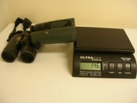
My method is simple, I just put the binocular parallel to the scale
and one end is on the edge of the scale, while the other edge is
balanced on a stable object. I just reversed it and weighed both ends.

The results are somewhat variable but the general weights are
going to prove close. The weight distribution front to back is
somewhat accurate.

Both of these binoculars weigh around 28 oz.

Jerry
 

Attachments

  • DSCN1020.JPG
    DSCN1020.JPG
    64.1 KB · Views: 129
I am aware of the second hand report were a vendor sent some back to Zeiss. The discussion is about if any customer (buyer) has returned a unit because they were not satisfied with it. As far I know, none have. This is counter to the gloom and doom tone of your posts. I still have not figured out why you are going to such efforts to besmirch a binocular that you have never seen and others have given good reports from first hand experience.


I did not detect any rolling ball in the Zeiss SF 10X and only a very slight amount in the 8X. I also do not detect any rolling ball in the 10X Nikon EDG. The rolling ball in the 8X Zeiss SF was significantly less than what I see in the 8.5X42 Swaro EL SV and also slightly less than what I have seen in a Swaro 8X32 EL SV. Another person I was with did not detect any rolling ball in the Zeiss SF 8X.
" I still have not figured out why you are going to such efforts to besmirch a binocular that you have never seen and others have given good reports from first hand experience."

I really wanted to buy the Zeiss 8x42 SF so I started researching reviews and feedback and that stuff is what I found a lot of it here on Bird Forum. I would assume it iS from actual owners of the binocular or I don't know how they would know the eye cups stick and they didn't get the correct objective covers. What I am saying is this new product may have some teething pains and it might be wise to wait awhile before purchasing one. I am not trying to besmirch them. I am sure they are fine binoculars.
 
Thanks Andy, good answers here. :t:

Just to answer:
Lee - FOV isn't an issue to me for what I want from a binocular. I just thought others might appreciate a very basic comparison using both bins seconds apart and looking at the same objects. I'm more than happy with the Swaro SV FOV and on some occasions prefer a more limited FOV.

Bruce:
Strange as it may sound the colour saturation of both the SF and SV are fine for me, and if I had to choose any one I'd be content with either. But.....and for me....my real preference is the extra bit of saturation offered by the SV. I just think the SF is more neutral and 'realistic' - which is absolutely fine and many may seek that - but I prefer just that richer edge offered by the SV.

You can imagine the decisions between myself and my wife as to who is going to use which one when we go out.

I think in the end and avoiding any glamourising or exclamations that may be occurring for one over the other, they are both superb binoculars and any choice between them I'm sure will in the end be quite subjective. Maybe we should leave them as just being at the very top end of what's available, rather than one being 'better' than the other. I doubt if anyone would be disappointed owning either.

Hope that helps.
 
FWIW,

The weight issue didn't count when the SV got a full rubber housing as where the EL had not at the fingertip side.
The only reason was (as I was told at the launch of the SV) that there were complaints from users of the EL that they got cold fingertips touching the unprotected magnesium housing.
Sorry to spoil the fun of any female marketing approach.

Jan
 
Alexis:

Those lines may be a natural break in the armor. It is not seamless
all the way through, as that would make it impossible to replace without
a complete disassembly. I have not seen the other side however, so that
may lend a clue.

The Swarovision has a natural curve there also, and you can see how
the armor is attached.

Jerry

Jerry and Alex

Those lines are where the armour thickness is reduced to produce a design 'graphic'. This is also seen at the top of the SF tubes at the strap lugs and down at the bottom next to the objectives. This idea is also found on the HT and Conquest HDs and Terra EDS and together with the smooth armour (instead of the heavy looking bars of the FL and Dialyts) are what give the three Zeiss lines their 'family' appearance.

I think we have KISKA Design to thank for this elegant appearance. They announced a couple of years ago that they had signed a design deal with Zeiss.

Lee
 
It was post 2132. They said al 6 units were returned. Here it is.

"Has anyone had any problems with the SF focus.???


I was on my way to test the SF at my local supplier, but apparently they had to send all six of their units back due to focus problems.

Cheers Tim"

OMG we will just have to hope that Zeiss hasn't got the same focuser problems that have dogged Swarovski for 15 years :eek!:

Lee
 
...I think we have KISKA Design to thank for this elegant appearance. They announced a couple of years ago that they had signed a design deal with Zeiss....

Sure enough. I went to the KISKA Design home page http://www.kiska.com/ and among other featured products and clients, Zeiss binoculars feature prominently. In their portfolios on each of the main pages they have a synopsis of what they have done for Zeiss with respect to design and brand postioning. I note that one of their mottos, on the flashing banner on the home page is "At the Sweet Spot of Purity and Progress, KISKA Designs Desire" and elsewhere they emphasize "Anatomy Inspired Design". Makes sense to me!

--AP

Alex

I could also add that Zeiss's Senior Director of Marketing, Simone Zaha, used to work for KTM Motorcycles, another KISKA customer, so will be very familiar with the way KISKA works.

Lee
 
Mmmmmm...........

Lets talk about optics in order to help those people that are thinking to buy or to check the SF........

More findings with my SF 8X42.

Well, what can i say now after more days playing with it is that color reproduction is Very neutral, when i say neutral i mean NEUTRAL. Almost perfect.

Don't expect same color cast like on HT or older Zeiss, true colors with no over boosted ones.

Is very well know that eye_ brain combination use to like what is use to see,which is accustomed so when i change from my SV or my Ultravid agains SF i found some issues with SF like washed colors, less contrast etc etc.

So keeping apart leicas due to his strong and oversaturated colors i focus my attention on Sarovision vs SF.

After hours and hours looking with them and them move closer to the subjects to see it in direct view ,naked eye 8 times closer.......what can i say is that on SF everything looks absolutely natural, real life, if a black is not absolutely black its not blacker thru SF, same can be say about other colors except for red ones.

No surprise here the SF have a strong red pink coatings so are designed for terrestrial views who has contain more blues and greens than reds, so in the country side is perfect.

Another thing........i would like to be very clear, is brighter !!!!!! for sure, but you notice via small margin late evening looking shadows and not affecting during daytime because birds agains bright clouds still birds not flying shadows with no info at all, the interior or this binocular in painted with a very very dark coating, nothing shines like on Leicas or swaros.

And for Sharpness, here the bad or good news, don't expect stellar resolution like leicas or swaros, the view is more subtle very real like, where to notice this......easy looking at distant letters, traffic signals etc the letters are not as sharp like the other two, you can read it but they are not so defined like on swaros and leicas.

This is a very honest review, i have the other bios and the SF as well so i don't have any special preference.

I hope this is gonna help to future users and of course we will see what good reviewers say in the future.

Cheers.
 
Last edited:
Mmmmmm...........

Lets talk about optics in order to help those people that are thinking to buy or to check the SF........

More findings with my SF 8X42.

Well, what can i say now after more days playing with it is that color reproduction is Very neutral, when i say neutral i mean NEUTRAL. Almost perfect.

Don't expect same color cast like on HT or older Zeiss, true colors with no over boosted ones.

Is very well know that eye_ brain combination use to like what is use to see,which is accustomed so when i change from my SV or my Ultravid agains SF i found some issues with SF like washed colors, less contrast etc etc.

So keeping apart leicas due to his strong and oversaturated colors i focus my attention on Sarovision vs SF.

After hours and hours looking with them and them move closer to the subjects to see it in direct view ,naked eye 8 times closer.......what can i say is that on SF everything looks absolutely natural, real life, if a black is not absolutely black its not blacker thru SF, same can be say about other colors except for red ones.

No surprise here the SF have a strong red pink coatings so are designed for terrestrial views who has contain more blues and greens than reds, so in the country side is perfect.

Another thing........i would like to be very clear, is brighter !!!!!! for sure, but you notice via small margin late evening looking shadows and not affecting during daytime because birds agains bright clouds still birds not flying shadows with no info at all, the interior or this binocular in painted with a very very dark coating, nothing shines like on Leicas or swaros.

And for Sharpness, here the bad or good news, don't expect stellar resolution like leicas or swaros, the view is more subtle very real like, where to notice this......easy looking at distant letters, traffic signals etc the letters are not as sharp like the other two, you can read it but they are not so defined like on swaros and leicas.

This is a very honest review, i have the other bios and the SF as well so i don't have any special preference.

I hope this is gonna help to future users and of course we will see what good reviewers say in the future.

Cheers.
The SF's sound good but what do you mean by not as sharp? Do you mean the SF has a more natural sharpness without being overly sharp? Usually when a binocular is not as sharp it is not s good thing but it sounds like you are saying the Zeiss is sharp but just in a different way.
 
Zeiss, please, bring back the "Z" logo, the SF is diminished without it!

Alex

I could also add that Zeiss's Senior Director of Marketing, Simone Zaha, used to work for KTM Motorcycles, another KISKA customer, so will be very familiar with the way KISKA works.

Lee

While we are on the topic of styling, I want to bring up something (again; I think it came up before a long time ago) that most will regard as trivial but which I find disappointing about the SF--the lack of the Z logo on its hinge. Some will think me crazy for caring about this, but I'm going to say my peace now and just hope someone at Zeiss takes note.

One of the big messages on the KISKA site was brand recognition through common elements in the styling/design of its products. They write "Dials, buttons and lenses are functional elements of a product, but they must speak for a brand. To achieve this, a distinct design language is defined and applied to each product. The result: a design that speaks only for Zeiss." and "You should not have to have eyes like a hawk to see the essence of a brand reflected in a product. Optical precision, premium quality and innovation; these are the promises all Zeiss products, VICTORY, CONQUEST and TERRA, must clearly promote." Images on the KISKA site highlight common style elements, many of them extremely subtle (despite the assertion that one should not need eyes like a hawk), across each of the three Zeiss binocular lines and Zeiss scopes. One of those elements is the "Z" logo, seen on the binocular hinge end-caps and on the end-caps of the rifle scope adjustment knobs. The SF lacks that Z.

Styling is less important to me than engineering and design for (other than aesthetic) function, but I don't deny the appreciation that can develop around the aesthetics of functionally superb products and the brands that make them. I appreciate the elegantly simple/understated designs of premium binoculars compared to the designs of some lesser brands that are covered in hyperbolic labels and sometimes have colors and styling that make them look like the futuristic weapons and battle armor portrayed in video games. I liked the look of the old Zeiss BGAT/Classic bins, the very different (but unfortunately less functional) styling of the Design Selection era Zeiss bins, and the hybrid (between Classic and Design Selection, and fortunately very functional) styling of the Victory FL series. Despite their radically different appearances, one thing all those lines had in common, and which (as you will see on the KISKA site) continued in the new integrated look of the Victory HT, Conquest, and Terra lines, was the Z logo on the hinge end-cap. For those of us who have long admired Zeiss bins, it is the most recognizable common style element across designs. It is beautiful in its graphical simplicity, more interesting and at least equal aesthetically to Leica's red dot in that respect, and superior in that respect to Swarovski's hawk. The blue Zeiss logo is nice too, but not nearly as sexy as that Z, with its graphical simplicity and intriguingly slightly cryptic meaning to first-time viewers.

But now, the SF departs from long tradition and instead has the word "ZEISS" on the end cap, and even worse, the font is some non-descript sans serif type (yes, I know this or similar font has been used in the past by Zeiss on cameras etc, but it has always been more of a label, like "Made in Germany", not a logo). The font is not the same style as the old "ZEISS" logo or that used within the blue Zeiss logo. I'm not old enough yet to be a cranky old-timer, but I must say that SF lens cap looks cheap and based on my own reaction, I suspect it does nothing to conjure up nostalgic feelings in young and old members of the Zeiss faithful. It has no pedigree, and its substitution for the venerable missing Z is actually jarring.

I can only think this change was meant to improve communication of the Zeiss name to viewers of product images. If so, I think that motivation is misguided. I suspect most folks who are setting out to spend several thousand dollars on a bin spend enough time considering the options that they don't need the brand emblazened on the product in order to consider it in the first place or to remember which product goes with which brand. And I don't think the brand name in that position is of much importance for increasing brand visibility when birders are looking to see what others have around their necks. It's really only seen by owners. I submit that its primary function is to promote recognition by owners while bonding with their beloved binoculars as they turn them over in their hands while carrying them, cleaning them, etc. Now, instead of seeing that elegant venerable Z, which imparts a very subtle touch of brand labeling and doesn't call attention to the cover it is marked upon, we get a hinge end cap that, with the written Zeiss name and contrasting border, calls attention to itself as a graphically-uninspired cheap-looking button that may as well say "Made in China" for all the mystique it evokes. Yuck.

--AP
 
Yes is sharp but not exaggerates or overly sharp, i mean the end of objets are not sharp agains foreground for example letters on a distant traffic signal you can still reading it but they are not perfectly defined.

More easy, like the letters of on a FULL HD tv agains Normal tv, you can still reading on a normal tv but more difficult.
 
Warning! This thread is more than 6 years ago old.
It's likely that no further discussion is required, in which case we recommend starting a new thread. If however you feel your response is required you can still do so.

Users who are viewing this thread

Back
Top