• Welcome to BirdForum, the internet's largest birding community with thousands of members from all over the world. The forums are dedicated to wild birds, birding, binoculars and equipment and all that goes with it.

    Please register for an account to take part in the discussions in the forum, post your pictures in the gallery and more.
ZEISS DTI thermal imaging cameras. For more discoveries at night, and during the day.

Watercolours (1 Viewer)

Vectis Birder

Itchy feet
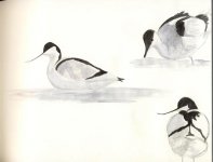
I am attempting some watercolour painting, of a Woodpigeon in the garden at home. I have seen the excellent w/colour feld sketches by the likes of Sczabolcs Kokay, Nick D, Tim W, and others and would like, if I can, to be able to emulate that degree of brilliance - getting a great impression of the bird without getting bogged down in too much detail. I love the field sketch type of painting, it's my favourite part of bird art.

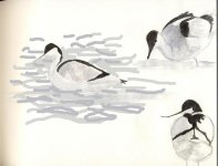
I am finding with watercolours that the result is looking a little weak on the page - is a case of building the thing up as you go? If so how do you avoid the hard lines that often result?
Also, how not to make it look too one dimensional? Getting the depth and roundness isn't that easy.

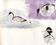
I'll scan my efforts in later for critique/savaging/help.
 
Last edited:
If it's looking weak, don't 'build up' get the big guns out and put darker patches in first. Hard edges are hard to avoid, and can often look good. Depth and roundness is hard to get but comes from looking at where tones lie on the bird, don't be tempted however to just put a darker line on the underside of the bird, look at how light and shadows play over the birds surface.
These are just a few ideas, I'm sure there will be many more to come, just enjoy practicing and don't be too shy with the paint - bang it on there and see what happens!
 
Cheers Nick. I am actually doing a couple of Avocet pictures, which are a bit of a cheat as I'm doing them from photos I took earlier this year.
Ok, here they are. I could have done a much better job on them but I haven't painted (sketched yes, painted, no) for quite a few years now so I am way out of practice. As you can see, water is not a strong point of mine.
Over to you Wildlife Art subforum people, for savaging/critique/words of encouragement...
 

Attachments

  • avocet_pntg.jpg
    avocet_pntg.jpg
    45.2 KB · Views: 158
Last edited:
Savaging? Hee hee, I may live like a savage but I don't savage others, these are showing a lot of promise indeed, you've got the head shape and the colours are elegant, reflecting the bird. As for the water, remember it goes behind the bird aswell! I've taken the liberty of scribbling in a bit of water on paint (sitting suffering from a mancold, so not much else to do!) to show this. Hope this helps and comes under the encouragement category rather than savaging!
 

Attachments

  • avocet_pntg.jpg
    avocet_pntg.jpg
    34.8 KB · Views: 134
Great start VB - and we all need one of those. The top right bird really has it, difficult 3/4 pose and strong lighting, just perfect treatment for this little character. Nick's point is on the button - even when sketching from life, try and add the salient habitat details which 'site' your subject in the environment. To continue Nick's appraisal, if you were to sloosh a couple of colours round on your palette (alizarin and cobolt, for example) giving a deep, rich, purpley liquid - fairly quickly run this tone around the top right bird (or another version of it) and you'll see the whites really glow.
Look forward to the next installment.
 
Hi Vectis,

I love watercolours but never find them easy and got to agree with tim and nick on the avocets, nowt wrong with your portrayals of the birds, but darkening the surrounds will bring them up a treat.
 
Once again, Tim and Nick give good advice.
I also like the 3/4 view the best. The shadows/light are good.
Get some more environment in there and I think they will take off...well, hopefully they won't actually 'take off'. I think you need some kind of magic paint for that.
 
Over to you Wildlife Art subforum people, for savaging/critique/words of encouragement...

Savaging not! This forum has some of the most pleasant, encouraging, affirming, sage and all-round-good-egg people around. Sometimes it amazes me how positive everyone on this forum seems to be, while at the same time remaining honest!

So to add ... great start VB, I'm looking forward to seeing the results after applying some of the advice given below!

Dave
 
Your sketches are lovely Vectis, painting I can't really comment on because I'me still learning. My last Avocet was so luminous I thought it had been reared in Sizewell Power station.Keep dabbling and enjoy it I do. Everything you do is a learning curve even at my old age.
 
Hi Vectis birder. Great to see you doing some bird painting. There is certainly plenty of inspiration on this forum. Making birds three dimensional comes down to an effective use of tone. Avocets can be difficult as they are black and white but actually if you look closely this is not totally so. Depending on the light from the surrounding habitat, from the sky and water there will be plenty of blue/purple shadows in those whites and surprisingly in the blacks too. Black is a colour that should never be used on its own or in isolation. Mix shadows colours into it or underpaint the same colours and they will come through. Your blacks are rather too matt. Take a good close look and notice where the light hits. There the colour will be much paler. Take a brush and carefully lift out some of the black paint and i promise you will see it come to life! Keep up the excellent work.
 
Ok, following the advice given, I have made a few alterations. I have made a few minor alterations to the blacks on the birds (except the bottom right 'cos I forgot!), plus put some water in round the left hand bird.
I have also done as Tim suggested and put in an alizarin/cobalt wash round the top right bird although to be honest I am undecided if it looks good or if I've f****d it up! Not that it matters if I have because practice and experimentation is what this is all about!
Please keep the advice and suggestions coming. I will paint and upload something else when I get a chance to do so.

Many thanks, so far, everyone!
 

Attachments

  • avocet_pntg1.jpg
    avocet_pntg1.jpg
    65.1 KB · Views: 129
Last edited:
I don't think you've f*cked it up at all. The birds now belong to their habitat. One piece of advice, and perhaps a question, are you using a big enough brush charged with paint? - it's much better to do a patch with one big sweep rather than bit by bit (helps keep it looking clean). Looking forward to seeing more.
 
Cheers Nick. I must admit I don't have a big brush, and I'm going to have to go into town after work Thursday (I finish at 3 so can get to the shops) and get one. In fact, I'll get a big round one and big flat one. Can you make any suggestions as to size?

Cheers
 
if you're getting a flat brush, make it a big long one, they're easier to control than round and can leave a good lozenge (it's a bit like calligraphy) a half inch one should be sufficient.
 
And if you were to buy a round one - at least a 12, 14 is better but they aren't cheap. Look for one that tapers to a half-decent point - you can still control a heavily charged brush with these. Buy both (if finances allow) the flats are great for certain types of washes and structural backgrounds and the rounds add a different quality. Whatever you buy - look after them - when finished painting, re-flat the flats and re-point the rounds (shouldn't advise sticking them in your gob, but it's what I do. . .)
With regard to the revised pieces - I really like. Maybe the two different background washes could have harmonised a little more closely, and I would certainly suggest they vignette slightly more subtlely (is that a word?) - but a very good start - continued . . .
 
Last edited:
Maybe the two different background washes could have harmonised a little more closely, and I would certainly suggest they vignette slightly more subtlely (is that a word?) - but a very good start - continued . . .

And do the whites glow? I have to say that following your advice has certainly made a big difference the the pictures.
 
Yes - they now have that structured feeling. I also like the way you amended the 'blacks' as Annette referred to. Keep at it (does this sound like deja vu? ;) )
 
The simple wash looks great to me as it really helps to bring the bird forward. With watercolours though I would advise that as much as possible you do not use colours in isolation. Painting colours straight fromt he pan can look a little flat. Experiment mixing colours or just mixing small amounts of other colours in with them. They will subtly show and just add more depth and interest to the finished wash. The lifting out of the black on the head no matter how small does make a difference and gives more of a roundness to the head.
Not messed up at all as you should view everything you do as an experiment/work in progress. It is how we all learn. Keep up the excellent work.
 
I missed this thread entirely!

You've already had some great advice Vectis so there's not much I can add really, but I will anyway!

As a personal preference I never use black paint in watercolour or acrylic. My standard 'black' is burnt umber and ultramarine blue, and I've recently discovered the joys of dioxazine purple in the mix. Although it looks black it isn't flat like a black from the tube and it's possible to swing the colour towards blue in places to liven it up a little more.

Keep going.

Woody
 
Warning! This thread is more than 17 years ago old.
It's likely that no further discussion is required, in which case we recommend starting a new thread. If however you feel your response is required you can still do so.

Users who are viewing this thread

Back
Top