• Welcome to BirdForum, the internet's largest birding community with thousands of members from all over the world. The forums are dedicated to wild birds, birding, binoculars and equipment and all that goes with it.

    Please register for an account to take part in the discussions in the forum, post your pictures in the gallery and more.
ZEISS DTI thermal imaging cameras. For more discoveries at night, and during the day.

Field sketching and illustration (1 Viewer)

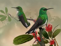
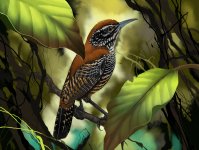
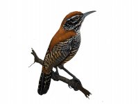
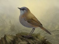
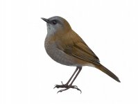
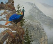
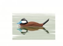
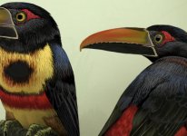
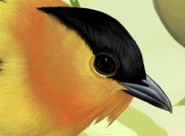
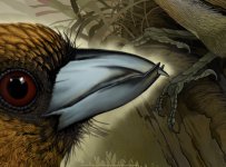
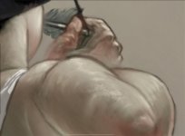
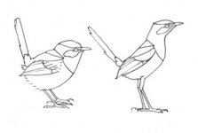
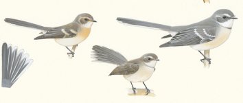
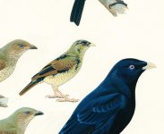
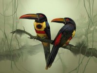
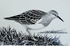
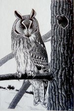
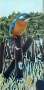
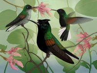
Hi Bryan, no apology needed for a detailed reply! And first off I’m very impressed with the set of illustrations in sequence. You have some fabulous spcies to paint and to my eye have done a fine job - I only know some of these birds from photos but your images look ‘right’. I like the detail you have achieved in the heads, a focus of attention for all birders (since we are human and read faces); really good job on the soft light in the eyes.
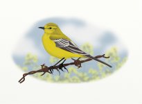
Thanks for your feedback on putting shadows on yellow. I used it as an example of the sort of colour issue that I have trouble with, and your thoughts on minimising shadow align with mine.
Interested to hear that you think the artwork is your project’s worst enemy; I think this comes down to the artist wanting to do the best possible job and you are fortunate to have tolerant collaborators. Even painting the conventional plates for the Aus Bird Guide took far longer than we anticipated and caused some tensions with the rest of the team, but the end result was as good as we could make it and I think benefits the project in the longer term.
Producing comprehensive regional guides is a balancing act - scope, production time and cost, bulk etc. - though it looks as though the demand is there, and eBooks or apps are one way of keeping information portable. There seems to be no way round the time needed to produce decent artwork needed for a comprehensive guide. I’m interested in your thoughts on using digital guides in the field; I’ve yet to see a device - tablet, phone, whatever - that allows comfortable viewing of the artwork outdoors under natural light. It’s the way of the future but we are not there yet.
You asked about using specimen skins for reference. At the risk of stating the obvious, skins are not much like the living bird, typically consisting of the skin itself and the bones of the wing, lower leg and front of the skull plus bill. The rest is replaced by stuffing, and individual preparators may produce quite differently shaped skins of the same species. The bits you can generally rely on are dimensions of legs and feet and bill (although soft parts shrink), wing length from carpal bend to tip, and tail length. Feather colour and pattern and the arrangement of feather tracts are usually preserved too. Soft part colours are usually noted on specimen labels but tend to be a bit vague, e.g. Iris: brown. Bill: grey. I have painted one extinct species from specimens and descriptions alone, and that process made made appreciate our current access to photography. If you do have access to a collection, make friends with the curator, it’s always good to have an expert to answer your questions on the spot. Note that some collections preserve one spread wing of a bird specimen which is a great help to illustrators.
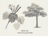
I do paint subjects other than birds, but the botany and landscapes I paint tend to be the supporting cast for the main subject. I’m very aware of being ignorant about botany, and indeed painting, but I’m working on it. When I have access to my computer I could post some examples.
I am indeed painting the Monal in oils and learning a lot, often the hard way.
Always keen to see more of your endemics!

Cheers, Peter
 
Thanks Peter, the good word of a scientific illustrator of your calibre carries a lot of weight with me. Noel and one or two ornithologists I’ve connected with on Instagram help of course but the more input from different sources the better.
Yes there are some great birds to see and paint here in Costa Rica but needless to say as you yourself know Australia is no slouch in the interesting bird department! I hope someday to visit and indulge myself.
The attention to detail on the head and eyes was intentional because of the ability to zoom in with ebooks and apps. I usually make the pupil a circle and not an ellipse. Within a classical art context it means the bird is generally making eye contact with the viewer which I hope brings some intimacy to the portrait.
The “worst enemy” comment was in jest as these paintings are not intended to compete with traditional plates which will always win on keeping page counts low. As well, if one is focused on id then even a change in pose from one bird to the next can along with the backgrounds be a distraction in the field.
These days big publishers and labs such as Cornell are moving the whole field in directions that make boutique projects such as ours if not obsolete then certainly less significant. Who will mess around with obscure guides built by small teams with limited resources like ours when the big fellas are producing amazing tools such as eBird and Merlin. We do see the writing on the wall but still, why should they have all the fun to themselves.

I agree that the current crop of digital devices in bright sunlight is problematic. We usually manage by ducking under shade (if its even available) not perfect but workable. The marine (yachting) industry has solved viewing a lcd chart screen in bright daylight but I think smartphone manufacturers are avoiding that solution due to the large battery drain those marine screens are guilty of. A chart screen is usually supplied from the yachts battery bank so can afford to be somewhat of a power hog.
Perhaps oled screens may change the daylight viewing experience for the better.

Thank you for the description of the pitfalls and advantages of working with a collection. I will take your advice about getting chummy with the curator, who better to know the idiocyncrancies of their own collection. Having that kind of access would be very helpful. Unfortunately with travel being so problematic I confess to pinning my hopes on Moore Lab of Ornithology’s virtual collection software coming online someday soon.
I too know little of botany except for a few anecdotal tidbits. There is much to learn in this part of the world since the flora is breathtakingly diverse. Its hard to know where to start so I tend to rely on Noel’s knowledge.
I’ll be interested to see you efforts with botany painting. I had to do a half dozen botany illustrations for the book and found it enjoyable. I include a sample botany image with a question. Going monochromatic was thought to be cleaner and would help emphasize shape. Now I’m not so sure. What do you think?
Included here are a few images, two endemics, Riverside Wren (Cantorchilus semibadius), and White-tailed Emerald (Elvira chionura) Also the botany painting as well as a species sample page from the book.
You can see the potential layout problems associated with the kind of painting we’re using in these field guides. Fortunately with these being ebooks the painting and maps are expandable by double tapping. The feedback we’re getting from folks who have bought the ebooks is that they like the familiar field guide book look but with the added bonus of calls and songs at their fingertips.
As a standard field guide pocket book of around 5x7 inches (13x9 cm) it wouldn’t be as satisfactory. As mentioned before perhaps there is a future for them in a coffee table/reference book.

Anyway, I didn’t mean to steer the conversation to the project, I admit its a consuming topic for me so I hope I can be forgiven my enthusiasms. Picking someone's brains who knows a thing or two about the business is hard to resist.
Cheers,
Bryan
 

Attachments

  • 8A18A626-52A5-4296-B5E3-D81477FCFEDD.jpeg
    8A18A626-52A5-4296-B5E3-D81477FCFEDD.jpeg
    918 KB · Views: 21
  • DC91DAA6-81FD-4653-A947-6DCCA68F351C.jpeg
    DC91DAA6-81FD-4653-A947-6DCCA68F351C.jpeg
    933.7 KB · Views: 22
  • 27A83DB9-7613-4B83-960A-8BCDE6E69A7D.jpg
    27A83DB9-7613-4B83-960A-8BCDE6E69A7D.jpg
    126.4 KB · Views: 15
  • 602A69CF-F4BA-46BD-AC32-20838986645B.jpeg
    602A69CF-F4BA-46BD-AC32-20838986645B.jpeg
    631.3 KB · Views: 18
  • 765B6747-78CE-4B77-8E85-E49181794BCF.jpg
    765B6747-78CE-4B77-8E85-E49181794BCF.jpg
    185.6 KB · Views: 9
Going botanical

Hi Bryan
Lots to talk about here.
Your comments on pupil shape and the bird's gaze are interesting; one of the exercises I set my advanced students is to draw the head of a Goshawk looking 'outward' (sideways) and forward, which really changes the shape of the pupil and indeed the whole eye.
Regarding the "worst enemy" comment, jest or not, it’s a fact that most publishers are reluctant to recognise and accept the time, effort and resources needed to produce good ID artwork.
It's possibly inevitable that the big players like Cornell will corner the bird ID field, but maybe it's a loss of diversity that we'll regret. Diversity is important! And personally I still like the challenge of finding birds and working out identifications for myself, and think there will always be room for boutique projects that are driven by enthusiastic individuals. It seems that the "New Approach" to birding in the UK was originally driven by a few gun birders like Peter Grant and Killian Mullarney but it has changed the way birders approach fieldwork, and the kind of guides they want.
Once again, thanks for some cracking images, full of light and life. I do envy you the ability to blend and layer; my efforts in oil painting constantly run up against problems with edges and how to sit them in the scene. it's actually good to be back to square one after years of using gouache in a particular way, where i knew how to solve most problems. I think the monochrome botanical image works fine, assuming the foliage isn't some characteristic colour - you are targeting beginners?
It would be a shame if you couldn't eventually publish your bird images in a larger format, but funding that will always be the issue.
Back to the topic of botanical paintings, here are a couple I did for a book project with a naturalist friend of mine, a seasonal natural history of the Australian Capital Territory where I live. this was a deliberate effort to get away from 'straight' bird illustration and play with other media and styles, though the botanicals were pretty conventional part from incorporating some stronger light and shade. Also attached is a bird painting from the same book, incorporating a bit of botanical info. Feedback welcome as always.

cheers, Peter
Mistletoe ABCY.jpg

Bulbine glauca ABCY.jpg

Glossy black cockatoo.JPG
 
Last edited:
Hi Peter,
Firstly, I like the paintings from your last post particularly how the needles cross in front of the body of the bird, it really helps tell the story about location. Noel narrows his eyes whenever I do that as a leaf or branch can cover important details of the birds colour or markings. So far I’ve got away with it because I demonstrated a judicious use of that device by only covering that part of the bird that won’t hurt id or any interesting markings.
The subtle backgrounds are appealing as well.
Your botany paintings are of course lovely and your delicate but crisp colour has me wondering still about my exclusion of colour in our botany illustrations.
For the botany paintings we were targeting beginners to the region but the birds are targeted more towards ornithologists and advanced birders.

Interesting lesson to set your students. I’ll occasionally have the female or adolescent in the painting looking elsewhere. In a painting I did of the Grey Hawk I do have the male looking at the branch he is about to land on as it would be silly to have him gazing elsewhere at that point in time.
Foreshortening or any other classic positional points of view have been weaned out of me over time in the interests of a correct and easy to identify general shape.

This is where the style I’ve developed for the needs of the project align more with the traditional plates we are all familiar with. This necessarily means I fight a constant battle with what I call stiltedness. I make up for it in any way I can. A head turned 180 degrees or a posture that suggests action while still respecting the shape of the bird. Interesting backgrounds or light help of course.
When I build these paintings I’ll take advantage of some of the more ready digital tools such as layers. One way I do this is to paint each individual bird on its own layer. This gives me the opportunity to isolate that bird. So if I ever need to use it sans background I can, very cool asset.

When I moved to the iPad there was enough of a similarity in the new tool to oil painting that I adapted with little angst. The ability to layer and control translucency in oil painting transferred readily over to the digital medium. I might add that I feel that digital painting shouldn’t try to copy the “look” of oil painting, it can and there are no rules, just that it’s not always a good idea. Digital painting is its own medium and doesn’t need to be skeuomorphic.

With regards to your comment on edges in oils. I find the challenges of any new (to me) medium to be mostly engaging because not knowing many of the rules for that medium gives me licence to really screw up and just push paint around.
My drawing master in LA also taught an all day class in classical oil painting (with the paint and panels we created in the paint making class of course) One of the first things he taught us about was edges. When the shape was basically finished and while the paint was still wet one would take a dry round brush of appropriate size and “outline” or draw the edges of that shape. You had to keep the brush dry and clean for the technique to work. The more crisp and detailed the shape the finer the brush. He explained that you could control how readily the viewers eye wanders across and through the shape by how soft you dry brush the edges out. This technique transfers brilliantly to digital painting as well.

I agree with your comments with regards to big players and the need for diversity.
With that in mind gentle rant on;
In the long lonely watches of the night I sometimes for fun like to think of Cornell and their ilk as the Borg of the ornithological world. In case you’re unfamiliar with the Borg they were a technologically advanced race of hive mind cyborgs of Star Trek fame. Their shtick was to absorb other cultures, technologies and races to “Service us” as they were wont to say just before they folded you into the collective.
I kid of course but building and strengthening alliances with groups other than the big boys is a needed antidote to the dominance of organizations such as Cornell. Their marketing dept have done a wildly successful job of cornering the mind share here in the Americas and they have to be given full credit for that. Don’t misunderstand me they all do good work and we need them to exist, even Audubon 😉 I guess I’m just a sucker for the David and Goliath story. For me scrappy small labs and independent researchers working in obscurity always win out over the Disney approach.
Gentle rant off;


Its true what you say about publishers although I sometimes think the rascals hope things just sort of happen by turning a convenient blind eye to all the “extra” off the clock work that gets put in. Of course this happens in many fields of endeavour so the publishing industry isn’t all that special.
We are thinking about different size formats such as large reference or coffee table books. We’re looking into crowd funding that.
I do sell the occasional print but try to encourage the client to stay close to the actual size of the species. I once was able to see a print of my American Pygmy Kingfisher painting in the flesh that was 150 x 90 centimetres (5 x 3 feet). This particular kingfisher species is tiny so it was odd to see them the size of footballs. The client insisted on that size and she was happy so there ya go.

Thanks for pointing me to Peter Grant and Killian Mullarney (and Rosemary Grant as well). Interesting work on the Finches of Daphne Major.
Out of curiosity what is the name of the book you mention in your last post? Was it backed by a publisher or some other organization such as a gov dept or biological reserve?
Another question, what sizes canvas have you worked in the past and whats your preferred sizes now?
I don’t often have a chance to talk with other bird artists so this conversation so far has been a real pleasure. I’m wondering what any other artist’s thoughts are on the topics we’ve touched on.
Either way Peter, I’m happy to keep exchanging thoughts and observations as long as you care to.

Cheers,
Bryan

Attachment note;
I include here a jpeg of the Riverside Wren from the painting sans background to demonstrate the ability to isolate layers effectively with digital painting. The painting of the Black-billed Nightingale Thrush (Catharus gracilirostris) I include along with its removed background version to show how much closer to traditional plates these paintings are than appear at first blush. You can also see how even with a simple and clean background how things can busy up pretty quickly.
 

Attachments

  • CED0498B-E1D3-4B40-9785-056035E778B6.jpg
    CED0498B-E1D3-4B40-9785-056035E778B6.jpg
    117.4 KB · Views: 14
  • CE3EDCC5-D07D-48EA-8EE5-5612C251BD04.jpeg
    CE3EDCC5-D07D-48EA-8EE5-5612C251BD04.jpeg
    747.8 KB · Views: 17
  • 8B1F88D3-EA69-4351-B707-1F1777095010.jpg
    8B1F88D3-EA69-4351-B707-1F1777095010.jpg
    88.7 KB · Views: 18
Hi Bryan, and thanks

Another lengthy reply here; this time I’ve tried to put my thoughts alongside your text:


Firstly, I like the paintings from your last post particularly how the needles cross in front of the body of the bird, it really helps tell the story about location. Noel narrows his eyes whenever I do that as a leaf or branch can cover important details of the birds colour or markings. So far I’ve got away with it because I demonstrated a judicious use of that device by only covering that part of the bird that won’t hurt id or any interesting markings.
The subtle backgrounds are appealing as well.
Your botany paintings are of course lovely and your delicate but crisp colour has me wondering still about my exclusion of colour in our botany illustrations.
For the botany paintings we were targeting beginners to the region but the birds are targeted more towards ornithologists and advanced birders.


I think the inclusion of habitat details in illustrations can be very useful (and beautiful), but easier to justify where you are showing species or groups in particular detail, as in some of Forshaw and Coopers’ big portfolios (Parrots of the World; Kingfishers and Related Birds etc.). Often the visiting birder just wants a quick summary and comparison to get a handle on a new fauna, and presumably this model drives most field guides.

Interesting lesson to set your students. I’ll occasionally have the female or adolescent in the painting looking elsewhere. In a painting I did of the Grey Hawk I do have the male looking at the branch he is about to land on as it would be silly to have him gazing elsewhere at that point in time.
Foreshortening or any other classic positional points of view have been weaned out of me over time in the interests of a correct and easy to identify general shape.


This is where the style I’ve developed for the needs of the project align more with the traditional plates we are all familiar with. This necessarily means I fight a constant battle with what I call stiltedness. I make up for it in any way I can. A head turned 180 degrees or a posture that suggests action while still respecting the shape of the bird. Interesting backgrounds or light help of course.
When I build these paintings I’ll take advantage of some of the more ready digital tools such as layers. One way I do this is to paint each individual bird on its own layer. This gives me the opportunity to isolate that bird. So if I ever need to use it sans background I can, very cool asset.


Likewise for me: anything but the explanatory side view usually needs to be justified in the illustration process. I’m never going to move to digital but envy you the ability to turn the background on and off!

When I moved to the iPad there was enough of a similarity in the new tool to oil painting that I adapted with little angst. The ability to layer and control translucency in oil painting transferred readily over to the digital medium. I might add that I feel that digital painting shouldn’t try to copy the “look” of oil painting, it can and there are no rules, just that it’s not always a good idea. Digital painting is its own medium and doesn’t need to be skeuomorphic.

With regards to your comment on edges in oils. I find the challenges of any new (to me) medium to be mostly engaging because not knowing many of the rules for that medium gives me licence to really screw up and just push paint around.
My drawing master in LA also taught an all day class in classical oil painting (with the paint and panels we created in the paint making class of course) One of the first things he taught us about was edges. When the shape was basically finished and while the paint was still wet one would take a dry round brush of appropriate size and “outline” or draw the edges of that shape. You had to keep the brush dry and clean for the technique to work. The more crisp and detailed the shape the finer the brush. He explained that you could control how readily the viewers eye wanders across and through the shape by how soft you dry brush the edges out. This technique transfers brilliantly to digital painting as well.


You have clearly learned painting thoroughly, the hard way, and that pays off. I know a little about this softening process but find myself still defaulting to working like an illustrator, filling in hard outlines. I’ve struggled to put some lost edges into my Monal painting (draft attached below)

I agree with your comments with regards to big players and the need for diversity.
With that in mind gentle rant on;
In the long lonely watches of the night I sometimes for fun like to think of Cornell and their ilk as the Borg of the ornithological world. In case you’re unfamiliar with the Borg they were a technologically advanced race of hive mind cyborgs of Star Trek fame. Their shtick was to absorb other cultures, technologies and races to “Service us” as they were wont to say just before they folded you into the collective.
I kid of course but building and strengthening alliances with groups other than the big boys is a needed antidote to the dominance of organizations such as Cornell. Their marketing dept have done a wildly successful job of cornering the mind share here in the Americas and they have to be given full credit for that. Don’t misunderstand me they all do good work and we need them to exist, even Audubon 😉 I guess I’m just a sucker for the David and Goliath story. For me scrappy small labs and independent researchers working in obscurity always win out over the Disney approach.
Gentle rant off;


My rants about dominant organisations are less gentle but I see exactly what you mean; the bigger and more dominant the organisation the more commercial imperatives take priority, and birding really isn’t (shouldn’t be) primarily commercial. To me this feeds into the big picture of trying to impose financial values on nature to bring it into the commercial fold, which has always seemed like the thin edge of the wedge to me. I see a lot of value in specialist publishers like Helm, bringing out guides to particular groups of interest, but I assume funding these relies on large sales of regional guides..
Rant off.

Its true what you say about publishers although I sometimes think the rascals hope things just sort of happen by turning a convenient blind eye to all the “extra” off the clock work that gets put in. Of course this happens in many fields of endeavour so the publishing industry isn’t all that special.
We are thinking about different size formats such as large reference or coffee table books. We’re looking into crowd funding that.
I do sell the occasional print but try to encourage the client to stay close to the actual size of the species. I once was able to see a print of my American Pygmy Kingfisher painting in the flesh that was 150 x 90 centimetres (5 x 3 feet). This particular kingfisher species is tiny so it was odd to see them the size of footballs. The client insisted on that size and she was happy so there ya go.


There seems to be a movement in ‘serious’ art that finds it exciting to paint small things big and vice versa. I get the idea but once is enough, surely. Maybe we are learning to expect the infinite detail in artwork that we are used to in photography.

Thanks for pointing me to Peter Grant and Killian Mullarney (and Rosemary Grant as well). Interesting work on the Finches of Daphne Major.

My careless wording, but the late Peter (J.) Grant mentioned in my previous post is quite another ornithologist, not one of the ‘Daphne Major’ Grants who absolutely deserve huge respect for their work on evolution, not to mention years of very hard field work. You may have read the great account of the Grants’ research in The Beak of the Finch by Johnathon Weiner (which won a Pulitzer Prize).

Out of curiosity what is the name of the book you mention in your last post? Was it backed by a publisher or some other organization such as a gov dept or biological reserve?

The book was A Bush Capital Year (2011). The writer and I applied separately to the Australian Capital Territory Dept of Environment for small grants to fund our time, and I pushed the project to the Publishing arm of the Commonwealth Scientific and Industrial Research Organisation (CSIRO) here in Australia. Part of the CSIRO Publishing brief is to publish books with scientific merit but small chances of making a commercial profit. It may have helped that I was already on the CSIRO books as one artist for the Bird Guide project. It had a small print run (2000), picked up a minor award and faded away, but the project was fun and I was able to sell most of the artwork.

Another question, what sizes canvas have you worked in the past and whats your preferred sizes now?

On the whole I work quite small. The Aus Bird Guides plates were painted so that they could just fit on an A3 scanner; I occasionally paint larger works e.g. full 22 x 30” watercolour boards, rarely larger because covering so much real estate freaks me out, especially in the early stages. The attached Monal image is 20 x 24” which is daringly large for me.

I don’t often have a chance to talk with other bird artists so this conversation so far has been a real pleasure. I’m wondering what any other artist’s thoughts are on the topics we’ve touched on.

Likewise, this exchange has been fascinating for me, and has taken us well away from my original question about field sketching. It would be great to hear from other bird artists to broaden the conversation further.


And looking at your attachments: seeing your detailed birds isolated from their backgrounds looks like magic from my very analogue perspective. You could certainly put either of the isolated images straight into a conventional field guide plate. Lots of good ID information in these images, a good mix of explanation and portraiture. You clearly understand structure well – was it a deliberate choice to show the Nightingale Thrush undergoing a crash moult of the greater secondary coverts? This is something we often see in Australian passerines as they finish breeding and it gives the birds a subtly odd look for a while until the feather tract grows back down.

And two attachments from me:
The first is my nearly-complete oil of Himalayan Monal in habitat, with some persistent issues around edges and placing the bird in the scene convincingly. Still playing with it…

Second is a detail from Hans Hobein’s portrait of Sir Robert Cheseman, 1533. This is how I’d like to be able to paint birds

Cheers, Peter
 

Attachments

  • Monal draft 2.jpg
    Monal draft 2.jpg
    264.1 KB · Views: 26
  • Holbein lanner edited-2.jpg
    Holbein lanner edited-2.jpg
    286.8 KB · Views: 24
Absolutely fascinating and most revealing to read your thread. It gives great insight into how bird illustrators work.

I don't wish to hijack your thread but would like to contribute in a small way, if that's OK? Firstly, I'm very envious of the work shown here but it is also very inspiring and makes me want to push on with my own efforts.

I've been illustrating local & county bird reports and scientific journals for many years, specialising in pen-and-ink, but in recent years I have moved to working digitally, with a tablet and desktop computer. So far the results have been encouraging and I would be interested in your comments. No large-scale 'commercial' work as such, but good for keeping my hand in and developing my style. Not sure that they're in the same league as you guys but I would value your input.

Best wishes,

RB
 

Attachments

  • YW-2.jpg
    YW-2.jpg
    96.9 KB · Views: 27
  • RY-2.jpg
    RY-2.jpg
    58.3 KB · Views: 23
Welcome

Hi RB,
I can’t speak for Peter since its his thread but I don’t think you could hijack it. Some folks on these forums prefer we behave like we’re in a business meeting and stay on topic, I’m not one of em. I view it more as conversation over coffee so welcome.

Firstly very nice illustrations. With regards to this mythical league you mention I think I can safely say we’re all colleagues here. You evidently are already accomplished and are merely pursuing excellence at this point.

Your work has a clarity and seductive minimalism which I wish my own work had more of. May I ask what applications you’re working in? You mention a tablet so I’m curious.
Is there a name to some of your published efforts? I wouldn’t mind seeing more.
How did you find the move over to digital? Was it fraught with struggle or was it easy and painless?
I’m assuming these are organic pixel based digital works and not vector, is that correct?
If you are working digitally then you must see some aspects of it that work well for you, any thoughts on what those might be?
Anything you miss from the analog world and whats changed in how you work and research a painting?
Lots of questions and I’m curious to hear your thoughts.
Cheers,
Bryan
 
Hello again Peter,
I will take your approach to answering and commenting, seems cleaner and less rambling which as you now know I’m prone to.

”I think the inclusion of habitat details in illustrations can be very useful (and beautiful), but easier to justify where you are showing species or groups in particular detail, as in some of Forshaw and Coopers big portfolios (Parrots of the World; Kingfishers and Related Birds etc.). Often the visiting birder just wants a quick summary and comparison to get a handle on a new fauna, and presumably this model drives most field guides.”
I would agree with this assessment about the requirements of visiting birders. One thing I’m enjoying about this conversation is the wonderful name dropping thats going on. Names such as Forshaw and Cooper have me happily scampering off to scour the net. I’m sadly ignorant of the names and history of bird illustrators and authors so am grateful for anything. I suspect that it is a field of study in itself.


”Likewise for me: anything but the explanatory side view usually needs to be justified in the illustration process. Im never going to move to digital but envy you the ability to turn the background on and off!”
I like that aspect of the process. Applying the same sort of hard ass aesthetic questioning to what will be in the painting as well as line, shape, colour and negative space.


”You have clearly learned painting thoroughly, the hard way, and that pays off. I know a little about this softening process but find myself still defaulting to working like an illustrator, filling in hard outlines. Ive struggled to put some lost edges into my Monal painting (draft attached below)”
With the bird illustrations I too tend to harder outlines. Softening happens in other ways such as similar tone and hue values on adjacent shapes as edges are approached. Its what I call the Jean Dominique Ingre approach. He was and is my primary master and is a font for all my thinking about art.

”My rants about dominant organisations are less gentle but I see exactly what you mean; the bigger and more dominant the organisation the more commercial imperatives take priority, and birding really isnt (shouldnt be) primarily commercial. To me this feeds into the big picture of trying to impose financial values on nature to bring it into the commercial fold, which has always seemed like the thin edge of the wedge to me. I see a lot of value in specialist publishers like Helm, bringing out guides to particular groups of interest, but I assume funding these relies on large sales of regional guides..Rant off.”
Again, agreed.
Projects like ours are expensive to fund and we’ll never see a return on any of the (for us) huge financial investment we’ve made so far. Not why we do this of course and applying for arts or science grant funding would be nice. Local Costa Rican funding was never an option and being Canadians applying for a grant through any of Canada’s funding bodies won’t work because although we’re Canadians the focus is not so thats out. To us even Helm seems huge, thats how small we are!


”There seems to be a movement in serious art that finds it exciting to paint small things big and vice versa. I get the idea but once is enough, surely. Maybe we are learning to expect the infinite detail in artwork that we are used to in photography.”
It is a trope that does seem prevalent these days. Giant nail clippers or a fork abound even in theatre design. I think the digital world and its tools are partly to blame. Producing serious art based on a blown up photograph has never been easier so naturally plenty of folks are doing it. Hopefully we grow out of it as I’m sure we will since art is fashion after all.


“My careless wording, but the late Peter (J.) Grant mentioned in my previous post is quite another ornithologist, not one of the Daphne Major Grants who absolutely deserve huge respect for their work on evolution, not to mention years of very hard field work. You may have read the great account of the Grants research in The Beak of the Finch by Johnathon Weiner (which won a Pulitzer Prize).”
Only brief accounts of their work but it was down this interesting rabbit hole where I spent an enjoyable afternoon exploring their accomplishments. It seems my google foo was faulty as I didn’t cotton onto there being more than one Peter Grant and is a lesson in paying attention to initials in a name. Trying to find a copy of “A New Approach to Identification” is going to prove difficult I think.


”The book was A Bush Capital Year (2011). The writer and I applied separately to the Australian Capital Territory Dept of Environment for small grants to fund our time, and I pushed the project to the Publishing arm of the Commonwealth Scientific and Industrial Research Organisation (CSIRO) here in Australia. Part of the CSIRO Publishing brief is to publish books with scientific merit but small chances of making a commercial profit. It may have helped that I was already on the CSIRO books as one artist for the Bird Guide project. It had a small print run (2000), picked up a minor award and faded away, but the project was fun and I was able to sell most of the artwork.”
Thats interesting. It must have been an enjoyable project to do and as for fading away that seems to be a given in this field but that’s an acceptable risk. Never heard of the CSIRO. Being Canadians I wonder if we can become a thorn in their side over the Endemics of Central America. Not having a topic that can relate in any way to the Commonwealth may be a strike against us unless these days they’re Commonwealth in name only.


”On the whole I work quite small. The Aus Bird Guides plates were painted so that they could just fit on an A3 scanner; I occasionally paint larger works e.g. full 22 x 30 watercolour boards, rarely larger because covering so much real estate freaks me out, especially in the early stages. The attached Monal image is 20 x 24 which is daringly large for me.”
Having been a painter and designer in the theatre world I’m comfortable working on large canvases of up to 7 x 18 meters and perhaps thats why I find small works so charming and intimate. Its feels more like a conversation over coffee than not. Certainly working on the iPad up close is very similar to drawing in a sketchbook.


”And looking at your attachments: seeing your detailed birds isolated from their backgrounds looks like magic from my very analogue perspective. You could certainly put either of the isolated images straight into a conventional field guide plate. Lots of good ID information in these images, a good mix of explanation and portraiture. You clearly understand structure well was it a deliberate choice to show the Nightingale Thrush undergoing a crash moult of the greater secondary coverts? This is something we often see in Australian passerines as they finish breeding and it gives the birds a subtly odd look for a while until the feather tract grows back down.”
Good spot. To be honest I didn’t give it much thought and as you say very common with passerines. Perhaps Noel could see the direction I was going with this and decided there was enough information in the painting to hang a hat on id wise that the state of the moult didn’t matter. At the time I was relying on Noels and my curated photographs and in both sets it seems this particular moult prevailed. Needless to say my build process for the birds these days is markedly different to this early example.


”And two attachments from me:
The first is my nearly-complete oil of Himalayan Monal in habitat, with some persistent issues around edges and placing the bird in the scene convincingly. Still playing with it”

Wonderful! It very much reminds me of Robert Bateman work which trust me is a compliment. He too loved panoramic and sweeping vistas. I can see what you are saying about hard edges but you’ve solved all the possible shortcomings of that approach by paying attention to hue and tonal values which helps the eye travel across the surface of the canvas in a satisfying way.

”Second is a detail from Hans Hobeins portrait of Sir Robert Cheseman, 1533. This is how Id like to be able to paint birds”
I wholeheartedly agree with you on this, to be able to paint like that!
Theres an interesting visual texture to the feathers that helps provide a sensation of what it might be like to touch them. This is a whole other level of painting.

Regarding the business of hard outlines since both you and I seem to favour a harder edge in our bird illustration. To that here are a few heavy crops of several that demonstrate the idea. For interest and comparisons sake I also include a heavy crop of a painting from my classical (non bird) mythology series. As you can see the dry brush outline is used extensively and is appropriate to the piece but for the bird stuff I feel crisper is better within the context of my particular style.
Cheers,
Bryan
 

Attachments

  • A184D341-8199-4EFC-9976-8E8FBC877AC3.jpeg
    A184D341-8199-4EFC-9976-8E8FBC877AC3.jpeg
    848.9 KB · Views: 13
  • FC3E2BC3-F378-41A5-81B0-4DFDFBA0CC78.jpg
    FC3E2BC3-F378-41A5-81B0-4DFDFBA0CC78.jpg
    132.2 KB · Views: 16
  • D15931B2-5D64-452A-AE0F-D1B75FC624B3.jpeg
    D15931B2-5D64-452A-AE0F-D1B75FC624B3.jpeg
    275.1 KB · Views: 13
  • 97A5A8AD-9599-40D5-9273-94A5573ACA49.jpeg
    97A5A8AD-9599-40D5-9273-94A5573ACA49.jpeg
    297.9 KB · Views: 13
  • 4ABE4A54-6AF8-4A98-8E7E-9D804BEED10E.jpg
    4ABE4A54-6AF8-4A98-8E7E-9D804BEED10E.jpg
    88.3 KB · Views: 19
Beautiful pictures!

I have no time to draw anymore. But I hope that competition with Cornell/Lynx and such will spun creativity into showing birds and bird books in a way not seen before.

For example, often a local subspecies in the country is not illustrated, some plumages are not illustrated, characteristic behavior is also not done. Also, photos poorly capture a character of a bird seen in poor conditions - during my first time in South America, long ago, I struggled to identify a tinamou from a ground dove, when seen briefly flushed.

About individuality - one can show indefinite number of fresh poses of a bird which is still technically standing in profile. Crouched or raising head, walking or standing, etc. etc.

I also wonder how one can adapt to people increasingly watching images on a smartpone, with necessarily low resolution? People under 30 rarely use paper books anymore.
 
Hi RB,
I can’t speak for Peter since its his thread but I don’t think you could hijack it. Some folks on these forums prefer we behave like we’re in a business meeting and stay on topic, I’m not one of em. I view it more as conversation over coffee so welcome.

Firstly very nice illustrations. With regards to this mythical league you mention I think I can safely say we’re all colleagues here. You evidently are already accomplished and are merely pursuing excellence at this point.

Your work has a clarity and seductive minimalism which I wish my own work had more of. May I ask what applications you’re working in? You mention a tablet so I’m curious.
Is there a name to some of your published efforts? I wouldn’t mind seeing more.
How did you find the move over to digital? Was it fraught with struggle or was it easy and painless?
I’m assuming these are organic pixel based digital works and not vector, is that correct?
If you are working digitally then you must see some aspects of it that work well for you, any thoughts on what those might be?
Anything you miss from the analog world and whats changed in how you work and research a painting?
Lots of questions and I’m curious to hear your thoughts.
Cheers,
Bryan

Bryan,

Thanks for the kind words and for the welcome. Lots of questions indeed; I'll try to answer some but may have to come back to you as I haven't much time to respond fully at this point.

I have drawn and painted for almost as long as I have been interested in birds so, 50+ years. I think both disciplines are mutually beneficial. Having an artists eye makes you look at birds in a different way to non-artists and helps greatly when it comes to identification. Conversely, watching birds helps the artist with structure, posture and behavioural aspects which are useful when creating accurate artworks. Birding & drawing seem to 'fit' together for me more easily than birding & photography which I found well nigh impossible to do together, so I have the best of both worlds!

My digital set-up comprises a 21.5" iMac and a Wacom Intuos3 digitising tablet. As for software, I predominantly use Artrage but also have Krita and Paintstorm Studio in my arsenal, which I use for certain tasks as not all programmes offer the same functions. It is possible to switch between programmes fairly easily as most share certain file formats and can be imported/exported from one to the other without loss. Once I got over the hand-eye co-ordination problems, the switch from 'analogue' was surprisingly smooth and painless. You are correct that all the digital pieces are raster- and not vector-based, though more of the painting packages are now offering a vector alternative. I haven't tried working on a tablet computer yet but I'm sure it will happen at some time in the fairly near future. Procreate looks like a fantastic package for the tablet artist and that is the one I would be keen to try first.

The main advantages of digital over analogue that I have found are of convenience - no cleaning of brushes or 'messy' working areas; the ability to delete or 'undo' stages to make corrections; working in layers with different blending modes to create useful effects such as depth of field 'blurring' etc. Of course, once you have the appropriate hardware & software, there are no further material costs after the initial outlay. Saying that, Krita is also free to download & use and is developing rapidly into a very worthy alternative to the prohibitively expensive (for me, at any rate) Photoshop, so would make an even more cost-effective choice.

I find myself returning to Artrage most often as the tools are intuitive to use and emulate traditional media quite closely, with oils being particularly impressive, though I don't use them much. It may be worth Peter having a look at them as a frequent user of that medium?! I suppose I miss the tactile aspect of analogue art sometimes - the feel of wet brush & paint on watercolour paper or pencil on heavy cartridge paper. Latterly I was using coloured pencil on polyester film which I also enjoy but the sheer convenience of digital does tend to attract me more these days. I try to post some more art soon. In the meantime I'll follow the thread with great interest.

Best wishes,

RB
 
Last edited:
(Post 26 Rotherbirder)
Hi RB, and thanks for posting – the whole aim of this thread was to start a conversation about the way people approach illustrating birds. I agree with Bryan that there is no league, just a bunch of starving artists interested in painting birds.

You may have gathered that I don’t do digital (too old a dog to learn new tricks) so over to Bryan for that, but your images are beautiful – showing key features but clean and minimal in the best way, and I wonder how hard you found the move from pen and ink. Your digital images remind me a little of the work of Eric Ennion, telling a lot with a minimum of apparent effort. I knew him when he was in his 80s and I was a teenager, and he could still draw a bird in a few lines – a genius with no need to work from photos.
It’s hard to paint without good drawing skills, which you obviously have – do you have a background in science, art, what? …and it would be interesting to see some of your ink work.


Post 29 (Jurek)
Hi Jurek, and thanks for your kind words. It sounds as though you used to draw, so will you post some work too?

I fully agree that there is room for bird guides to show more variety; the views we get are not often perfect spotless specimens perched side-on in good light. The Australian bird Guide did try to address this; the attached image of Mangrove Fantail includes a typically worn and ‘tatty’ bird, because this species forages in the salt and grit of Mangrove habitats. The image of a spotty sub-adult male Satin Bowerbird serves the same purpose. The artists on the project would have would have been happy to do more of this sort of work, it adds interest as well as ID value, but space and time are always an issue.

Your point about using a variety of side-on poses is good, though in my experience the text authors resist anything too extreme. The attached sketch is from my observations of Superb Fairy-wren, a common bird here in Australia – on a cold morning they can switch shape from a ball to a skinny creature in a second, but the field guide calls for something in between.
Bryan had some thoughts on viewing images on a smartphone or similar earlier in the thread; this seems to me to be the biggest limitation on using digital guides in the field at present.

Post 28 (Bryan)
Once again, lots to talk about in your post! Thanks for the images; I’m going to be on the road for a few days and will have to delay relying in detail but I will get back to this.

Cheers, Peter
Attachments: Fairy-wren extremes of posture; worn plumage Mangrove Fantail; sub-adult male Satin Bowerbird
 

Attachments

  • Fairy-wren extremes.jpg
    Fairy-wren extremes.jpg
    16.8 KB · Views: 18
  • Mangrove Fantail ABG.jpg
    Mangrove Fantail ABG.jpg
    111.4 KB · Views: 22
  • Sub-ad male Satin ABG.jpg
    Sub-ad male Satin ABG.jpg
    215.1 KB · Views: 22
Beautiful pictures!

I have no time to draw anymore. But I hope that competition with Cornell/Lynx and such will spun creativity into showing birds and bird books in a way not seen before.

For example, often a local subspecies in the country is not illustrated, some plumages are not illustrated, characteristic behavior is also not done. Also, photos poorly capture a character of a bird seen in poor conditions - during my first time in South America, long ago, I struggled to identify a tinamou from a ground dove, when seen briefly flushed.

About individuality - one can show indefinite number of fresh poses of a bird which is still technically standing in profile. Crouched or raising head, walking or standing, etc. etc.

I also wonder how one can adapt to people increasingly watching images on a smartpone, with necessarily low resolution? People under 30 rarely use paper books anymore.

Hi Jurek,
We pay attention to sub species on our patch because as you know they can suddenly be deemed a separate species. That’s happened a few times in our neck of the woods the Plain Wren being one example by being split into the Isthmian and Canebrake Wrens.

Your comment about smart phones is interesting. Smart phone resolution has been steadily climbing and the ability to pinch and zoom a painting in very close without losing clarity and detail has required me to pay attention to minute detail in ways that I never had to deal with when painting in oils and printing on paper. In post 28 I include attachments that show some close up samples.

I was curious about your statement that the under 30 crowd don’t use paper books anymore. Is that something you are seeing in the field in your region? I can’t speak to other parts of the world but here in Costa Rica the under 30 Tico birders (and there are a lot of them) all use paperback field guides. It is true when we come back from a day in the field they dig out their phones and stare at the screen but its for different reasons, social media, connecting with friends etc.

Poor full sunlight performance of device screens is also why field sketching is almost entirely practiced with traditional pencil, watercolour and sketchbooks. I’m fully ensconced in the digital world but when I do any field sketching its not with the iPad.
Cheers,
Bryan
 
Hi,
I don't have now any of my old illustrations, in fact I given most away to my family and friends. But your are better.

Re: smartphones. I don't recall seeing young birders with a bird book in the field, so I am a bit unsure if they read everything on the screen, or make an exception to paper bird guidebooks but don't take them out in the field. What I can say that after looking at a first bird app (Sibley for North America) within few years I stopped using paper bird guides in the field. Even books which are only in the paper form (like New Guinea or Where to Watch Birds in Switzerland) I photo and put into a library of photos on my smartphone. It is so much d**n convenient. No carrying, no opening and closing the backpack. Direct link to sounds. Ability to carry tens of books with no weight. I didn't find that sun glare is a problem. I am quite used to use shade of my own body to view the smartphone, although I have not been recently to the famously sunny Australia. I have the paper book only as a backup if the smartphone gets broken, but on a group tour even this is not necessary.

I think a smartphone and a tablet is a new medium which has new possibilities and limitations, and can be adapted. One is - no space limits. One can carry 50 pictures of one bird species and 100 sound files. Another is that the concept of the page disappears. The artist working on paper had to fit the birds within a rectangle. For example, paint a female slightly crouched or partially obscured by the male. On the tablet, the best approach is 'Sibley style'. Do not worry how much white space is left around.

I still see that electronic bird books did not make full use of possibilities of the electronic medium. For example, a natural thing for me would be to touch a picture of a juvenile gull, and make all similar juvenile gulls appear in a column for comparison (but no immatures or adult gulls - they look different, And select only characters which are relevant for distignuishiuing from that particular gull species). Or merge several books, seeing one species from several books in one go.
 
Hi RB,
Reply to post 30,
No worries this is supposed to be fun after all and not a class assignments to be handed in.

I don’t recall ever trying a Wacom intros but have given a Wacom tablet a go. I quickly lost interest as the pen lag at the time was unacceptable. Pencil latency is very distracting for me. The iPads back then were marginally better so I went with that. I’m sure things have improved since then with Wacom’s tablet line. The iPad pro and Apple pencil currently has a latency/lag of 9ms which is close enough to zero for me to not notice it.
I have and use Artrage as well as a few of the others you mention and agree with your comments regarding Artrage’s ability to emulate oils.
I will have to give a look at Krita, sounds interesting. Don’t get me started on Adobe, Autodesk and some of the other big dogs in this field, just don’t. 😉 at least Adobe is leaving the PSD format alone but I don’t trust them.
Procreate is pretty nice and the developers have turned it into a professional tool while still providing the closest experience to analog painting. The tools are front and centre and you don’t need to learn any secret handshake or send away for a secret decoder ring to figure the app out.
My non bird digital work still leans heavily towards that same oil paint surface quality. What I don’t think digital medium should do is artificially emulate the 3 dimensional aspects of oil paint. Some of the early iPad painting apps would show light reflecting off an imagined raised “edge” of a palette knife stroke. I thought it was a bit cheesy and a little too skeuomorphic for my tastes.

I think vector drawing best illustrates my thoughts about how digital medium sensibilities can have qualities all its own when needed. When I’m playing hooky from work I somethings take one of the bird paintings and in “Graphic” (a vector app for the iPad) build something new based on that painting. If nothing else skipping work in this productive way has taught me how to work with vector. I include a sample of a pixel based painting and the vector drawing that resulted from it. Not sure where it fits in the project and it probably doesn’t but thats ok.
The painting on the left is the original and the one on the right is the vector version.

I too at times miss the tactile aspects of analog painting. For me though the benefits out weigh the disadvantages. We travel a solid 6 to 8 months a year (or did) and I can’t imagine being able to accomplish anywhere near my current output with watercolour or oils in that situation.

Any chance of seeing more examples of your work? when you have time of course.
Cheers,
Bryan
 

Attachments

  • 6F9BC9E6-0044-4060-8286-3F23B216B7C9.jpeg
    6F9BC9E6-0044-4060-8286-3F23B216B7C9.jpeg
    979.5 KB · Views: 20
  • DB40F267-528E-49C0-8038-956B3BAC32BF.jpeg
    DB40F267-528E-49C0-8038-956B3BAC32BF.jpeg
    941.3 KB · Views: 26
(Post 31)

Hi Peter.
It's very flattering to be mentioned in the same sentence as Eric Ennion and I'm not quite sure its warranted. His economy of line and depictions of birds 'in action' are, I agree, peerless and I envy you having met him; however, I think it was Charles Tunnicliffe who really turned me on to developing my skills in black & white, mainly for illustration. His scraperboard work in particular is out of this world and has been a great inspiration to me over the years.

You are correct, my background is in both science and art and my analytical, scientific nature comes across clearly in my artwork - too much sometimes perhaps! I find it difficult to work loosely and can be constrained by striving too hard for accuracy.

I don't hold with the 'old dog, new tricks' excuse when it comes to working digitally. I was hesitant and lacked confidence when I started out but it soon became second-nature and the adage 'you're never too old' is more applicable; why not give it a try?

(Post 34)

Hi Bryan,

I think Krita is almost ready for release on tablet if it isn't available already. I think you'll like it but how it compares practically with Procreate I don't know. I agree, the PSD format is the only thing I rely on Adobe for and it would be catastrophic if they did away with it or even just changed it to prevent compatibility with other software packages. Creating vector art looks like fun and gives a whole new slant on bird illustration (no pun intended). Dividing the subject into basic, less organic and more geometric shapes could be an interesting exercise and I will give it a try sometime. I imagine it forces you to work more simply and economically though you are obviously extremely proficient at it as, from a distance, your raster and vector examples of the same piece look pretty comparable.

Both,

I have enclosed a few examples of my ink and coloured pencil pieces as requested but be aware that they were photographed - some through glass - and haven't been corrected in any way so they are not ideal. They are also quite old (90s) so are not a fair representation of what I am doing now. Hope they interest/amuse!

Best,

RB
 

Attachments

  • Grey Wagtail.JPG
    Grey Wagtail.JPG
    489.5 KB · Views: 15
  • Hawfinch.JPG
    Hawfinch.JPG
    739.5 KB · Views: 18
  • Pectoral Sandpiper.JPG
    Pectoral Sandpiper.JPG
    555.9 KB · Views: 18
  • Long-eared Owl.jpg
    Long-eared Owl.jpg
    280 KB · Views: 19
  • Kingfisher.jpg
    Kingfisher.jpg
    114.3 KB · Views: 17
Hi RB
To your post 35
I did a bit more digging into Krita. Interesting that its an open source model like Gimp and Blender. Unfortunately that usually precludes any development work for mobile devices and I couldn’t find any reference to a mobile build on Krita’s website but here’s hoping. Those open source folks usually have their hands full building and maintaining for Windows, Linux and Mac OS.

I agree that old dogs can learn new tricks but although opinions may almost always be wrong, preferences are almost always right. If folks have a preference then I usually don’t try to talk them out of it, at least not too much. Having said that I have slapped a tablet in front of an old dog or two (not always that old chronologically) handed them a stylus, pointed at the brush, colour and eraser tools and without any further instruction had them painting up a storm in 5 minutes. Its actually a lot easier and quicker than most folks think.

Very nice pen and ink drawings, clean and deliberate with nicely considered line character. They have in varying degrees the texture quality of scratchboard or a finely wrought wood cut. I know we tend to dismiss our earlier efforts but the merit is still there.
Regarding your comment about “too precise sometimes” as you yourself know your method and approach has as much legitimacy as any other method out there. Its how we capitalize on those qualities that counts.
My true drawing master is and was Jean-Auguste-Dominique Ingres. If ever there was one for disciplined unaffected precision it was him.
A side note; when I was 16 my first drawing master was in direct methodological descent a pupil of Ingres. His master studied in Paris whose master was taught by direct line by an assistant and student of the great man himself. At the time my 16 year old self didn’t pay too much attention to how special that connection was but I certainly value it now.
Prior to all that I started out with an expressionist ethos. That original ethos emerges still in my work on a macro scale. At first I fought it and tried to eliminate any traces of it. I understand now that it merely contributes to what I do so don’t sweat it much anymore.

Looking at Eric Ennion and Charles Tunnicliffe (both of whom I had never heard of, a sad state I know) I’m struck by their ability to compose in interesting ways. Tunnicliffe particularly seems to have combined a wonderful Japanese aesthetic with some of the qualities of the early century American illustrators such as N.C. Wyeth. Precisely what I strive for and rarely achieve. Eric Ennion had a charming way of working from a middle tonal ground and capitalizing on what that brings to the table for a painting.
Thanks to yourself and Peter for bringing them to my attention.
Perusing their considerable folios I can see I have a long long way to go.
I say that not out of modesty but from an awareness of how short is the time I’ve spent studying and painting birds compared to you and Peter. You both have the advantage of having strong and long standing backgrounds in science and I’m keenly aware of that advantage. I always feel I have my hat in my hand when talking to scientist or scientist artists but thats all to the good, helps keep my ears open if not my mouth shut.
My own art background has taught me that there are no hard borders anywhere in the broad spectrum of how or why art or illustration is made. Its perhaps why I see equal value in a primitive botany watercolour from an obscure scientist from the 18th century to, for example, Jean-Michel Basquiat work or Lucian Freud or Velasquez or that child's drawing. When you take this huge range of work out of the usual context we tend to ascribe to them and consider them for their own merits its breathtaking.

Below on the left is the Black-bellied Hummingbird (Eupherusa nigriventris) and is an example of my attempts at folding the flat qualities of Japanese block print art in with the complex structures, colour and planes of early American illustrators.
The middle is a close up of the Great Potoo (Nyctibius grandis) and is an example of the creeping expressionist ethos I mention further up post.
The attachment on the right is the full Potoo painting to give a sense of scale.
Cheers,
Bryan
 

Attachments

  • 2A7E1454-1D6D-4679-979E-3887536BE9FD.jpeg
    2A7E1454-1D6D-4679-979E-3887536BE9FD.jpeg
    964 KB · Views: 18
  • 1431E30F-FE83-4627-A7EB-511EC32D999D.jpeg
    1431E30F-FE83-4627-A7EB-511EC32D999D.jpeg
    955.7 KB · Views: 19
  • 3E572B5F-F3D4-443A-88A2-0EC91D53F62E.jpg
    3E572B5F-F3D4-443A-88A2-0EC91D53F62E.jpg
    150.4 KB · Views: 18
Hi Jurek,

“It is so much d**n convenient. No carrying, no opening and closing the backpack. Direct link to sounds. Ability to carry tens of books with no weight”

I agree with this thought, one other thing I do like about having everything packed into a phone is the ability to record sound. It can be crappy sound but like crappy photos are often good enough to make an id later.

“I still see that electronic bird books did not make full use of possibilities of the electronic medium. For example, a natural thing for me would be to touch a picture of a juvenile gull, and make all similar juvenile gulls appear in a column for comparison (but no immatures or adult gulls - they look different, And select only characters which are relevant for distignuishiuing from that particular gull species). Or merge several books, seeing one species from several books in one go.”

This is a really great idea and one I hope we can incorporate into the app version of the Regional Endemics book in some small way at least.
Cheers,
Bryan
 
(post 28, Bryan)
With apologies for the slow response...

I would agree with this assessment about the requirements of visiting birders. One thing I’m enjoying about this conversation is the wonderful name dropping thats going on. Names such as Forshaw and Cooper have me happily scampering off to scour the net. I’m sadly ignorant of the names and history of bird illustrators and authors so am grateful for anything. I suspect that it is a field of study in itself.

You’ll be aware that Britain and Europe have a long history of bird art and illustration. Just a few few other names name you might want to research if you don’t already know them, in no particular order: Peter Scott, Keith Shackleton, Robert Gilmore, Keith Brockie, Darren Rees, Michael Warren, Ray Harris-Ching. Lars Jonsson from Sweden transcends the illustration/art divide and I think his book Bird Island is a masterpiece. In Australia W T (Bill) Cooper was a prodigious wildlife artist and illustrator, collaborating with Joe Forshaw; I may be biased since he was my friend and mentor but he is widely regarded as a master. Another excellent Australian wildlife artist is Peter Trusler, who has both art and science in his background.


I like that aspect of the process. Applying the same sort of hard ass aesthetic questioning to what will be in the painting as well as line, shape, colour and negative space.

This is another area where I feel the lack of formal art training; my pictures are designed to look ‘right’ to me but don’t always work, and sometimes I’m caught out by errors in the planning stage that only become apparent to me well down the track.

With the bird illustrations I too tend to harder outlines. Softening happens in other ways such as similar tone and hue values on adjacent shapes as edges are approached. Its what I call the Jean Dominique Ingre approach. He was and is my primary master and is a font for all my thinking about art.

Another example where I see what you mean after the event, without having the formal training that might help me plan better from the start. Just by the way, what do you think of David Hockney's suggestion the Ingres used a camera lucida extensively?

Projects like ours are expensive to fund and we’ll never see a return on any of the (for us) huge financial investment we’ve made so far. Not why we do this of course and applying for arts or science grant funding would be nice. Local Costa Rican funding was never an option and being Canadians applying for a grant through any of Canada’s funding bodies won’t work because although we’re Canadians the focus is not so thats out. To us even Helm seems huge, thats how small we are!

See my comments below about CSIRO


Only brief accounts of their work but it was down this interesting rabbit hole where I spent an enjoyable afternoon exploring their accomplishments. It seems my google foo was faulty as I didn’t cotton onto there being more than one Peter Grant and is a lesson in paying attention to initials in a name. Trying to find a copy of “A New Approach to Identification” is going to prove difficult I think.

If you are interested I have an ancient photocopy which I could scan and send by email. PM me if want this.


Never heard of the CSIRO. Being Canadians I wonder if we can become a thorn in their side over the Endemics of Central America. Not having a topic that can relate in any way to the Commonwealth may be a strike against us unless these days they’re Commonwealth in name only.

No harm asking, but I suspect the “Commonwealth” in the name refers to the fact that it’s an umbrella organisation for all the Australian States and Territories. To date they only seem to have produced eBook versions of their hard copy publishing; not sure how they’d go with digital only. Take a look here: https://www.publish.csiro.au/books
the For Authors tab will guide you on preparing a proposal


Having been a painter and designer in the theatre world I’m comfortable working on large canvases of up to 7 x 18 meters and perhaps thats why I find small works so charming and intimate. Its feels more like a conversation over coffee than not. Certainly working on the iPad up close is very similar to drawing in a sketchbook.

Just thinking about a 7 x 18m canvas gives me vertigo.


Wonderful! It very much reminds me of Robert Bateman work which trust me is a compliment. He too loved panoramic and sweeping vistas. I can see what you are saying about hard edges but you’ve solved all the possible shortcomings of that approach by paying attention to hue and tonal values which helps the eye travel across the surface of the canvas in a satisfying way.

Thanks you! I am a fan of Bateman’s work. He seems to get straight to the right values in his painting, something I struggle with coming from my watercolour background. I looked hard at the ways he paints snow before getting into my Monal painting. In fact my first view of the species was in a shaded gully full of snow-covered conifers, but I felt that was beyond me to paint.


Regarding the business of hard outlines since both you and I seem to favour a harder edge in our bird illustration. To that here are a few heavy crops of several that demonstrate the idea. For interest and comparisons sake I also include a heavy crop of a painting from my classical (non bird) mythology series. As you can see the dry brush outline is used extensively and is appropriate to the piece but for the bird stuff I feel crisper is better within the context of my particular style.

I really like the dry brush look you have achieved in your mythology subject (more please!); thinking the Degas ballet sketches.

And in return here is a recent watercolour/gouache of a Latham's Snipe. We see these here in Spring and Summer, migrants from Japan. I was looking for a bit of an Oriental aesthetic here.

Cheers, Peter
 

Attachments

  • Marsack Snipe for email.jpg
    Marsack Snipe for email.jpg
    235.4 KB · Views: 24
(post 35, Rotherbirder)

Again, sorry for the slow reply, I've been travelling

Hi Peter.
It's very flattering to be mentioned in the same sentence as Eric Ennion and I'm not quite sure its warranted. His economy of line and depictions of birds 'in action' are, I agree, peerless and I envy you having met him; however, I think it was Charles Tunnicliffe who really turned me on to developing my skills in black & white, mainly for illustration. His scraperboard work in particular is out of this world and has been a great inspiration to me over the years.


I am a great fan of scraperboard myself, and really like what you have posted. Do you know the work of John Davis? He has some lovely scraper boards in Downland Wildlife. Also liked your Kingfisher image - what is the medium? The look reminds me of Michael Warren's paintings in Shorelines.

You are correct, my background is in both science and art and my analytical, scientific nature comes across clearly in my artwork - too much sometimes perhaps! I find it difficult to work loosely and can be constrained by striving too hard for accuracy.

My constant problem! these days I'm really trying to step back and use only as much detail as the image warrants; earlier said than done.

I don't hold with the 'old dog, new tricks' excuse when it comes to working digitally. I was hesitant and lacked confidence when I started out but it soon became second-nature and the adage 'you're never too old' is more applicable; why not give it a try?

Fair point, but beyond the whole business of starting something new while I'm still learning new things with familiar techniques is the issue of the end product being a digital file. I know it's irrational but I find something reassuring about the nature of a painting as a unique artefact, with its layers of drawing, underpainting, errors and all. And sometimes someone will buy it! Maybe that's the basis of my old dog comment.

Attached are a couple of my own scraperboards; one of a Brown Treecreeper which is the logo on my business card, and one of a Stag Beetle done as a teaching demo for an illustration class.

Cheers, Peter
 

Attachments

  • Brown Treecreeper logo.jpg
    Brown Treecreeper logo.jpg
    87.4 KB · Views: 17
  • Sabah Stag Beetle email.jpg
    Sabah Stag Beetle email.jpg
    79.9 KB · Views: 12
(Post 26 Rotherbirder)
Hi RB, and thanks for posting – the whole aim of this thread was to start a conversation about the way people approach illustrating birds. I agree with Bryan that there is no league, just a bunch of starving artists interested in painting birds.

You may have gathered that I don’t do digital (too old a dog to learn new tricks) so over to Bryan for that, but your images are beautiful – showing key features but clean and minimal in the best way, and I wonder how hard you found the move from pen and ink. Your digital images remind me a little of the work of Eric Ennion, telling a lot with a minimum of apparent effort. I knew him when he was in his 80s and I was a teenager, and he could still draw a bird in a few lines – a genius with no need to work from photos.
It’s hard to paint without good drawing skills, which you obviously have – do you have a background in science, art, what? …and it would be interesting to see some of your ink work.


Post 29 (Jurek)
Hi Jurek, and thanks for your kind words. It sounds as though you used to draw, so will you post some work too?

I fully agree that there is room for bird guides to show more variety; the views we get are not often perfect spotless specimens perched side-on in good light. The Australian bird Guide did try to address this; the attached image of Mangrove Fantail includes a typically worn and ‘tatty’ bird, because this species forages in the salt and grit of Mangrove habitats. The image of a spotty sub-adult male Satin Bowerbird serves the same purpose. The artists on the project would have would have been happy to do more of this sort of work, it adds interest as well as ID value, but space and time are always an issue.

Your point about using a variety of side-on poses is good, though in my experience the text authors resist anything too extreme. The attached sketch is from my observations of Superb Fairy-wren, a common bird here in Australia – on a cold morning they can switch shape from a ball to a skinny creature in a second, but the field guide calls for something in between.
Bryan had some thoughts on viewing images on a smartphone or similar earlier in the thread; this seems to me to be the biggest limitation on using digital guides in the field at present.

Post 28 (Bryan)
Once again, lots to talk about in your post! Thanks for the images; I’m going to be on the road for a few days and will have to delay relying in detail but I will get back to this.

Cheers, Peter
Attachments: Fairy-wren extremes of posture; worn plumage Mangrove Fantail; sub-adult male Satin Bowerbird
Hi Peter,

Great thread ! (which I can only admire and learn from rather than contribute to the expert level talent here ! Loved the whole scene showing the Black and Yellow Broadbill in your OP - the scenery is fantastic !)

As a kid I used to draw (trace) Big Cats, Fighter Planes, and Dinosaurs ! My art never really developed much beyond childlike, and studying Engineering it became rather technical and rigid - almost like living in Flatland (a novel of a 2-dimensional world that our Maths teacher used to read to us in high school). I think perhaps pursuing Architecture or Industrial Design would have been more beneficial !

I have always doodled, but recently started doing a little bit of beginner drawing as part of an unofficial art group among friends - trying to loosen up and bring more life to things ! I really admire artists who have that economy of line, flow, and life to their images.

Your mention of the different poses of birds gleaned through observation really rang true. It reminded me of a Superb Fairy Wren I saw once, and was lucky enough to get a photo of. He was doing the most amazing 'skyscraper' stretch - I'd never seen anything like it ! It was exactly as you had drawn. Here is a link to the photo of it in my gallery:-
https://www.birdforum.net/gallery/showphoto.php/photo/510209/ppuser/92780

Also in my gallery is an 'attempt' at developing my drawing using one of those kids 'learn to draw' books - very amateur - I'm pretty sure I've created an entirely new species of Falcon ! :-O
https://www.birdforum.net/gallery/showphoto.php/photo/564305/ppuser/92780

Also, a more recent attempt at capturing a more lifelike pose of a cruising Wedgie (copied from a photo) sketched in pencil (2B I think). The Wedge-tailed Eagle or Bunjil in Indigenous Lore, is a very important creator spirit of the Dreaming:
https://www.birdforum.net/gallery/showphoto.php/photo/649624/limit/recent


Thanks for sharing Peter :)


Chosun :gh:
 
Last edited:
Warning! This thread is more than 3 years ago old.
It's likely that no further discussion is required, in which case we recommend starting a new thread. If however you feel your response is required you can still do so.

Users who are viewing this thread

Back
Top