Hi Paula,
I have not read the other critiques so that I may give a more unbiased critique. So excuse me if some, or all, of what I say is repeated.
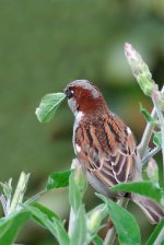
The crop on the right is much too close, resulting in part of the tail being clipped. I would have preferred more room on the left also, giving the impression that the bird look towards something. As is I do not "feel" a balance to the photo. DOF appears to have been well selected. Good job. The bud/leaf that has the bright spot around it is distracting, but easily dealt with by clone/rubber stamp tool. Other than this one particular spot, I think you choose correctly to go 1/3 exposure compensation. That was a good call. I would suggest taking those two white spots just below the shoulders (one on each side) and using levels to tone them down a little bit. It is very difficult when there is just a small part of white, yet one has to compensate for the whole photo. It also looks like the head feathers may have been sharpened just a tad too much (if no sharpening was done, then it is probably just JPEG artifects). I do like the range of colors/tones thoughout the photo. However, the main reason why I am giving it a one star rating is because of the positioning of the bird. Other than its eye, obviously no other part of its face is observable, something I always want to see in the photo, and which invariably will give a photo more character.
Please do not think I am being critical of you.