• Welcome to BirdForum, the internet's largest birding community with thousands of members from all over the world. The forums are dedicated to wild birds, birding, binoculars and equipment and all that goes with it.

    Please register for an account to take part in the discussions in the forum, post your pictures in the gallery and more.
ZEISS DTI thermal imaging cameras. For more discoveries at night, and during the day.

Zeiss 8x32 FL vs Leica UV HD+ 8x32 (1 Viewer)

^^^ I wish Gijs showed graphs (or at least published the tables of data) that go beyond ~450nm on the blue end and ~675nm on the red end. I understand that these capture the majority of the visible spectrum and especially those wavelengths to which we are maximally sensitive, but if they were 400-750 instead of 450-675 I think you'd see even more of a gap at the extremes

Assuming Allbinos spectrum graphs are at all trustworthy (even if not precise, they should be at least directionally accurate), they show a broader range that covers beyond the limits of the visual spectrum.

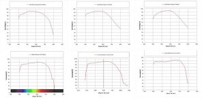
I made a quick composite of three Zeiss T* bins across the top (Conquest HD, Victory HT, Victory SF) and then Nikon Monarch HG and Leica UVHD and UVHD+ on the bottom.

All the measurements seem to show a similar trend where Zeiss transmission spectra show more of a "dome" shape with a very high center peak in the vicinity of ~550nm, and broadly sustain very high transmission from ~475-625nm. All good stuff that should yield bright views with excellent, balanced color for MOST things.

However the Zeiss bins all begin sloping downhill above ~575nm (something which Gijs' data corroborates), and have fallen off a cliff by 700nm. The Leica/Nikon high end models are "tilted" towards the red, but the overall spectra seems flatter and broader, especially at the red end where they don't hit their peak until ~650nm and maintain strong transmission out to 700nm and beyond.

I think that's where the magic happens with the deep red tones + the overall impression of depth/contrast from covering a broader color gamut. You may not notice it depending on what you're looking at, and it may not have a huge impact on "brightness", but I think the more complete coverage of the visual spectrum is what gives Leica (and, to a lesser extent, Nikon) their characteristic saturated, rich, contrasty feel. Older Leicas were way behind on the blue/green end though, which is why they also had a more "cream/warm" tone... but the UVHD/HD+ coatings have steadily improved things over time so the deficit below 600nm has shrunk, while their advantage >600nm is still there.

When I compare my 2012-2015 Trinovid (UV BR level coatings) to my UVHD, the deep blue tones have more of a "dingy" tinge to them whereas the UVHD blues feel deeper and more saturated, which also makes whites whiter (not as warm/creamy). I tend to feel that binoculars that have good overall transmission but don't have that oomph on the far red end feel a wee bit "colder, "flatter", and more "sterile". What do I know though :smoke:

EDIT: and for completeness, it appears that the best Swaros with recent coatings sort of split the difference, with peak transmission perhaps a hair lower than the Zeiss but a flatter shape, with high transmission maintained farther into the blue/red extremes (although the red end still lags behind Leica). I always perceive Swaros to be exceedingly neutral and and "accurate", with perhaps a touch of coolness or "analytical" feel compared to Leicas. This shows well in the Swaro SV vs Leica NV vs Zeiss SF graph from Gijs posted above... the Swaro SV has a clear advantage <500nm, and the spectrum is very flat all the way up to ~625nm. The Zeiss SF pulls a wee bit ahead in the ~550nm zone, but falls off more steeply than the Swaro SV above 600nm. The Leica NV (and, side note, but that graph made my jaw drop!) does not fall off >600nm, maintaining very high transmission (>90%) out to the right edge of the graph (~675nm) whereas both the Zeiss SF and Swaro SV have dropped to ~80%.
 

Attachments

  • zeiss leica nikon spectra.jpg
    zeiss leica nikon spectra.jpg
    47.6 KB · Views: 40
Last edited:
Transmission

The transmission for the EDG 8 and 10X42 is shown below, similar to those from Leica.

Andy W.
 

Attachments

  • 46400_nik_edg10x42_tran.jpg
    46400_nik_edg10x42_tran.jpg
    51 KB · Views: 20
  • 66072_nikon_8x42_edg.jpg
    66072_nikon_8x42_edg.jpg
    50.2 KB · Views: 16
Yeah the EDG seems to be even flatter overall than the Leica UVHD/HD+ and extend even farther into the deep reds.

It's a perfect example where if you just look at 500-550 range, they "only" have ~87-88% transmission which feels mediocre compared to a Zeiss at 93% if that's the only number you report.

But if you condense it down to just one number you are shortchanging the EDG, which seems to have a nearly unparalleled (until the Noctovid?!) flat and broad transmission which stays at a high level across virtually the entire visible spectrum. So, yeah, it's not QUITE as bright as the brightest, but it looks like it will present vibrant, saturated colors from the dark blues to the deepest reds.
 
That all sounds very scientific, but maybe overlaying some observer functions on the raw data would assist insight?

Edmund
 
That all sounds very scientific, but maybe overlaying some observer functions on the raw data would assist insight?

Edmund

Indeed. It is a fascinating topic but I don't think we are any closer to discovering whether, to many observers who like it, the Leica colour balance is more attractive, or is more realistic.

Lee
 
eitanaltman, post 41,
The sensitivity curve of the Human eye, light of 450 nm and above 675 nm do not play an impportant role in the color vision process of the human eye, see also "Color vision , brightness, resolution and contrast in binocular images", a literature review which I published on the WEB-site of House of Outdoor in 2013 in the section "Verrekijkers testen en vergelijken" . For light having a wavelength of less than 450 nm the sensitivity curve for the complete eye decreases rapidly due to light absorption in the lens. This increases with increasing age.
Gijs van Ginkel
 
Indeed. It is a fascinating topic but I don't think we are any closer to discovering whether, to many observers who like it, the Leica colour balance is more attractive, or is more realistic.

Lee

I don't think the question needs to be asked. The answer is in the common opinion that Leica binos have a warm/red bias and colors are 'rich' and saturated. Warm usually translates
into attractive and relaxed view and not so much true to life color match. Many here over the years have mentioned they find the colors attractive, pretty , deeply saturated, etc. It's not common to hear
about how realistic the color representation is through most Leica binos.
It's implied that Leica colors are appreciated for attractive qualities and not so much for reflecting colors as true to life as possible.

I don't recall too many binoculars in general being described as perfectly rendering true to life colors.
Zeiss are cool/greenish, Leica warm/reddish, Meopta warm/yellowish, Nikon warmish, etc.
Off the top of my head I can think of just the Nikon SE porro and Swarovski CL commonly perceived to have neutral color balance which means closer to true to life colors.
I'm not pointing to transmission graphs but just the overall comments and opinions
of binoculrs mentioned here in the forum over the years.

The real question may be which binocular models are enjoyed for their perceived realistic / true to life colors and I think the list may be relatively short.
 
Last edited:
eitanaltman, post 41,
The sensitivity curve of the Human eye, light of 450 nm and above 675 nm do not play an impportant role in the color vision process of the human eye, see also "Color vision , brightness, resolution and contrast in binocular images", a literature review which I published on the WEB-site of House of Outdoor in 2013 in the section "Verrekijkers testen en vergelijken" . For light having a wavelength of less than 450 nm the sensitivity curve for the complete eye decreases rapidly due to light absorption in the lens. This increases with increasing age.
Gijs van Ginkel

Gijs - we aren’t talking about an “important role”. We are talking about SUBTLE effects at the extremes, not gross differences. “Not important” isn’t the same as “irrelevant”. Every resource I found when looking into this indicates our perception of red extends up to at least 700nm.

Clearly it plays SOME role or our eyes would not see those colors. Although the worsening with age (along with other individual variation) could explain why some are more sensitive to subtle differences in color balance than others.


Also, side note, I truly appreciate the wealth of data you have provided BUT you really should provide links to your own work when you reference it. You have this odd habit of referencing things and then not linking them and making people who don’t speak the language in which the website is written have to dig it out. It’s YOUR work. Copy/paste. Link it.
 
That all sounds very scientific, but maybe overlaying some observer functions on the raw data would assist insight?

Edmund

That would be lovely but I spent a decent amount of time googling yesterday and struggled to find anything empirical, only theoretical discussion of human vision / color spectra. This topic is one which could be clarified with empirical observations and then correlating those when the raw data, perhaps such studies do exist in the technical literature that is available to academics / professionals.
 
Indeed. It is a fascinating topic but I don't think we are any closer to discovering whether, to many observers who like it, the Leica colour balance is more attractive, or is more realistic.

Lee

Forgive me, in all my rambling I never directly addressed your question.

I think it’s clearly subjective preference, ie it’s more “pleasing” not more “accurate”. But it’s a complicated topic, and “realistic” is a bit of a loaded term as it may or may not correlate with technical “accuracy”.

An analogy from the audio side where I am more familiar with the science and am aware of empirical studies.... One would assume that an audio system with a perfectly “flat” response would be deemed the most “accurate”. However our hearing is variably sensitive to different frequencies so a “measured flat” in-room response actually sounds “unnatural”. At the extreme treble (high frequency) and especially in the low frequency bass region our ears are far less sensitive, so boosting the bass response is perceived by listeners as “more natural”.

So you end up with a less “accurate” measured response (assuming accuracy is defined as faithfulness to the source being reproduced) but the “less accurate” measured response is perceived as MORE accurate subjectively by the test subjects. The flat response feels anemic and “thin” sounding.

Clearly there is a similar phenomenon happening with the visual spectrum where we also have variable sensitivity at different wavelengths. Is the “most accurate” transmission spectra the flattest one? Does a “flat” spectrum correspond with the subjective perception of “accurate”?? I don’t know!

Now with binoculars it’s a little easier to empirically address “accurate” since you can access the original source simply by removing the binoculars and using your eyes to look at the colors instead. Not as easy on the audio side when listening to a recording, you can’t pause and ask the musicians to play live instead. But with a binocular you can look at an object and quickly compare your naked eye perception vs the perception through the binoculars.

I will say that subjectively of the “big three” I perceive modern Swaros to be the most “accurate“ or “neutral” in the sense of not seeing any color shift when comparing to what I see with my eyes, and objectively they have the flattest, broadest transmission spectrum (with the only “flaw” being a drop off in the far red relative to Leica/Nikon). They look almost perfectly neutral to me, with perhaps a touch of “coolness” which is likely due to the slight additional emphasis on blue / drop off in extreme red.

I would say that Leica and Zeiss are both “less accurate” but in different ways. And it will depend on what you’re looking at. But I do think the preference there has much less to do with technical accuracy than it does with subjective factors.

Also it’s important to reiterate that we are nitpicking at SUBTLE differences. These modern alpha binoculars ALL have extremely high transmission that is reasonably flat across the majority of the visual spectrum. So they are all generally “accurate” but none of them are perfect, the differences are very slight and more about the unique “personality” it “character” of the binocular.
 
einaltman, post 48.
If you google the title "color vision, brightness, resolution and contrast in binoular images" it is likely that you get the paper I was referring to directly. It is writtten in English, so it must be an easy job to read it. I spent 6 years at the Gymnasium, a type of high school in The Netherlands, to learn English (next to French, German , Latin and Greek) and two years as a postdoc in Stanford, to use my English. So I suppose that it will not be such a difficult job for you learn a little Dutch .....
With regard to the very ends of the spectral sensitivity curve of the eye I have never seen effects of it on the color balance of the binoculars investigated.
Gijs van Ginkel
 
If you google the title "color vision, brightness, resolution and contrast in binoular images" it is likely that you get the paper I was referring to directly. It is writtten in English, so it must be an easy job to read it. I spent 6 years at the Gymnasium, a type of high school in The Netherlands, to learn English (next to French, German , Latin and Greek) and two years as a postdoc in Stanford, to use my English. So I suppose that it will not be such a difficult job for you learn a little Dutch .....

Respectfully, I did not criticize your English, which is perfectly fine, or the fact that your reports are not written in English. So there is no need to get defensive or patronizing.

My reference to the website being in Dutch was that it can make it difficult to navigate and find the specific article to which you refer, and that it would be MUCH easier if you simply provided a direct link. This should be trivial for you since it's your work, you can find it likely in seconds and then a few more seconds to copy/paste. I find it absurd that you seem to be implying this is an unreasonable burden, and that instead of you simply copy/pasting the link I should invest the time to learn Dutch!

Back on topic...


With regard to the very ends of the spectral sensitivity curve of the eye I have never seen effects of it on the color balance of the binoculars investigated.
Gijs van Ginkel

Is there any academic work on the topic? I will definitely read your paper, but is this something that's been formally investigated with proper controls and a decent sample of test subjects? I find it hard to believe that large differences in things we can see will have NO impact.

It may be *extremely* subtle, and perhaps it is overwhelmingly dominated to the 450-675 range you cover.

But when we are talking about the subtle extremes of things like "saturation" or "contrast", I find it hard to believe that there isn't SOME visible impact to the fact that a Nikon EDG or Leica UVHD+ or NV maintains ~90% transmission out to 700nm and beyond, whereas a Zeiss or Swaro has dropped well below 80% at 700nm.

Of course, with "real world" binoculars you can't fully isolate these variables, as you cannot equalize the rest of the visible spectrum as a control.
 
eitanaltman, post 2,
I was teasing you, a hard to resist and akward habit, I confess. With regard o the importance of the extremes of the eyes sensitivity: I have not yet seen effects with my eyes of the extremes of the eyes sensitivity curve. The overall color balance can be more to one of the main colors: violet blue (cool), green (tends more to cool-neutral) or red (warm). A flat transmission spectrum is generally leading to a color neutral overall image impression.
Gijs van Ginkel
 
Indeed. It is a fascinating topic but I don't think we are any closer to discovering whether, to many observers who like it, the Leica colour balance is more attractive, or is more realistic.

Lee

I meant superpose on the graph CIE colorimetric standard observer functions yadda yadda etc etc for our entertainment or enlightenment.
https://www.sciencedirect.com/topics/engineering/color-matching-functions

and actually, if one has a scene measured by a teleradiometer, or a decent multispectral cam, one can take the raw data from the transmission spectral measures and do a spectrum band by band product with the image data and derive a simulation of the way a scene would be seen through that instrument. Etc etc. eg see how a deer in foliage would appear in the early morning light, or a visiting canari doing a siesta on my neatly clipped and well watered french lawn at high noon.

numbers themselves are total sh*te until you contextualise them with the psychophysics of color perception, supplied in this instance by a fairly developed discipline called colorimetry.

Edmund
 
Last edited:
Roger that Gijs ;) I'm all fine with teasing! Speaking of subtle extremes, I think that those little nuances of subtle intent (like wry humor) are the hardest to communicate in your non-native language.

I'm reading through the paper know and it's very interesting, some of the basic I already knew but there's definitely some interesting new stuff.

One thing that was new which I found fascinating was the variable (inverse) relationship between the eye's "native" chromatic aberration and longer wavelengths. I had no idea our eye structurally had significantly more chromatic aberration in the blue end than the red end (which appears to have no CA at ~675nm?) and how that may influence the common phenomenon of the transmission dropping off a cliff as it approaches 400nm.

With respect to color sensitivity at the extremes, I would imagine that a subjective assessment of "equal change" would require a much larger marginal advantage vs the center of the visible spectrum. So for example, a 2% increase at 550nm would be easier to detect than a 7% difference at 650nm.

That's the way it works on the audio side with perceptions of "loudness" by frequency, e.g. a 10dB change at 25Hz might might be perceived as equal to a 4dB change at 1kHz.

Following that thought, a Leica having a 10-15% transmission advantage at 675-700nm would be swamped in many lighting situations and subjects by the much higher sensitivity lower down. And when the light levels get low, it becomes irrelevant as the rods take over more and more from the cones and we lose sensitivity >600nm.

BUT.... with bright light (e.g. daylight) and an object with deep red tones, that advantage can be perceived as "deeper", more saturated reds, and even with mixed subject matter it can lend a touch of overall "warmth" and "depth". Whereas the difference was only 2-3%, like between a Zeiss SF vs Swaro SV, it's too small to influence our perception much in this insensitive range.

This is my subjective experience when comparing good Leicas to their Zeiss/Swaro counterparts (and the Tract Toric UHD SchottHT which appears to have a Swaro-esque shape of the spectrum). So perhaps I'm just trying to retrofit my subjective impressions onto the objective science ;)
 
I meant superpose on the graph CIE colorimetric standard observer functions yadda yadda etc etc for our entertainment or enlightenment.
https://www.sciencedirect.com/topics/engineering/color-matching-functions

Oh, this reminded me of one final point I wanted to make while reading Gijs' paper.

The CIE-type chromaticity diagram is probably the best example of what I'm trying to communicate. Effectively, these variable rates of transmission at different wavelengths are changing the "color gamut" of what we see (to use display calibration terminology). There are certain shades of red that a Leica can reproduce that a Zeiss is literally incapable of fully reproducing. And vice versa at other colors.

For those who have compared calibrated video at the standard HD color gamut (rec709) vs the wider UHD color gamut (bt2020), for example the 4K HDR disc vs the 1080p disc, the wider color gamut yields subtly "deeper" colors that feel more saturated and vibrant. Red still feels red..... but it's REDDER. Video displays are also capable of adopting other color gamuts, as anyone who has done digital photo editing or graphics knows. None is perfect however, since no display can fully reproduce the complete chromaticity gamut of the human eye.

So my analogy is that, as with displays, none of these flagship binoculars are truly "accurate" (as to fully cover the gamut of the human eye would require 100% transmission across the board). So they are all capable of being *mostly* accurate for *most* colors, but at the margins the slight differences yield slightly different effective color gamuts, the impact of which will depend on the lighting, the subject matter, and your own physiology.
 
Einaltan,
I addition to my previous post 53: eyes can differ quite a bit in overall color sensitivity: womens eyes are more sensitive to different colors than men's eyes, color sensitivity changes with age, the frequent use of, for example microscopes with intense sources of light can bring about changes in the color sensitivity between the two eyes etc. etc. So it can be difficult to draw conclusions that are applicable to for every observer.
With regard to the wavelenght scale of our spectra: I have explained that already some times before: the spectrometer we use was orginally designed to measure spectra of single molecules in biological multi molecular structures and all that in a time span of milliseconds. To do that we use a prism mocochromator and by adding a few thousand spectra of that molecule in a very short time we can generate reliable spectra with a low rate of uncenrtainty. But that system limits the usable wavelength range from about 450 nm to 675 nm, outside that range the uncenrtainty grows rapidly . The system could be adapted of course, but measuring spectra of binoculars is a very small sidetrack of the research programme and more a service to society so to speak.
Comparison of our spectra with the ones from different binocular companies generally show identical results (unless we make mistakes or when binoculars are not perfectly clean inside as can happen with old historic binoculars).
Gijs van Ginkel
 
Edmund, post 58,
I am glad that you liked the review paper.
Einaltman, post 57,
For binocular makers it is a real challenge to design the optical system in such a way that the overall binocular image is as much as possible color neutral. To do so they use well established international standards for it. However sometimes they can also deliberately generate spectra that have a very strong yellow bias, as one can see in some military binoculars. Some also give their binoculars a slight "warm"color" impression with a very small bias on red (I think that is the secret of some Leica binoculars yielding a saturated color impression), others try to make the image as much as possible color neutral or give it a "c ool"image impression by a tiny small bias on blue. And all that to satisfy a large and mixed crowd of users of which each person has its own preference and eye characteristics.......
Gijs van Ginkel
 
Also it’s important to reiterate that we are nitpicking at SUBTLE differences. These modern alpha binoculars ALL have extremely high transmission that is reasonably flat across the majority of the visual spectrum. So they are all generally “accurate” but none of them are perfect, the differences are very slight and more about the unique “personality” it “character” of the binocular.
Absolutely. This is why the question of realism doesn't seem important to me, at least at this quality level. It's pure aesthetics.

Off the top of my head I can think of just the Nikon SE porro and Swarovski CL commonly perceived to have neutral color balance which means closer to true to life colors.
Oddly enough I instantly disliked the color of both Nikon SEs I tried. It was too long ago to recall in detail, but it seemed dull and oddly reddish to me -- in a different way than Leica, not "warm" but muddy, unsure how to describe it better. There must be a strong subjective aspect to all this as well.
 
Warning! This thread is more than 4 years ago old.
It's likely that no further discussion is required, in which case we recommend starting a new thread. If however you feel your response is required you can still do so.

Users who are viewing this thread

Back
Top