


-
Welcome to BirdForum, the internet's largest birding community with thousands of members from all over the world. The forums are dedicated to wild birds, birding, binoculars and equipment and all that goes with it.
Please register for an account to take part in the discussions in the forum, post your pictures in the gallery and more.

You are using an out of date browser. It may not display this or other websites correctly.
You should upgrade or use an alternative browser.
You should upgrade or use an alternative browser.
something different (1 Viewer)
- Thread starter birdpotter
- Start date
More options
Who Replied?birdpotter
Well-known member
Thanks Tim. I am going to revisit that painting. I see what you are saying. Gasp, but this means I have to repaint the water AND the trees!!! I also was questioning the little pier there. It had this curious bend to it that looks like poor line drawing on my part. But I like the angle it brings into the painting.
Yeah, Mike, the more I look at it the more I like the second one the best. Although, I am rooting for the last one that I haven't finished, just because it is going to have birds in it and the bright colors.
Okay, and Nick, there are two Brissonis. One is Jean, the landscape artist; her work is reaching over to the abstract, isn't it? I like it. The other is Sonja; very interesting work. Check her out.
I don't know why I am not on the birthday roster. I got my Birdforum happy birthday via my email last night. Oh well. Thanks for the birthday wishes!
timwootton
Well-known member
Not on the Happy Birthday roster???? Well that ought to be changed - surely.
Another HAPPY BIRTHDAY - in compensation!! B")
Another HAPPY BIRTHDAY - in compensation!! B
timwootton
Well-known member
You ARE on the list - I've just spotted you there!!!!! I don't know how I missed you earlier.
birdpotter
Well-known member
You're a true sweetheart, Tim. Thanks for the b-day wishes. I had a hankering for a frozen strawberry daiquiri(a Louisiana treat I used to get that was available at frozen daiquiri drive-thru stands), which was the only thing I could think of having for my birthday dinner. My hubby supplemented it with a variation of sausages (get your heads out of the gutter) and friends brought over appetizers. There were 15 adults and 5 kids, not bad for someone who just moved to the area, eh? That has to say something about my amiable disposition, right? :loveme:
I love the mellowing effects of rum. Good thing we have plenty left over!
Cheers to everyone!
Beth
I love the mellowing effects of rum. Good thing we have plenty left over!
Cheers to everyone!
Beth
birdpotter
Well-known member
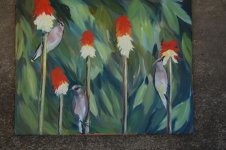
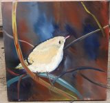
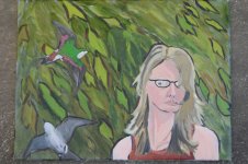
So here are a bunch of unfinished paintings I am working on. Actually, a couple, I think, are done, but if you guys want me to work more on them, tell me. I just wanted to get them out so you can see that I am actually doing SOMETHING with my very small amount of free time. I feel a little stuck with a couple of them. I might end up scrapping some of them. Most are from photos...I know, bad bad Beth--I deserve a spanking. But for a few I have used some sketches from real life as the main inspiration.
The first is definitely not done. Waxwings.
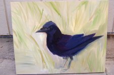
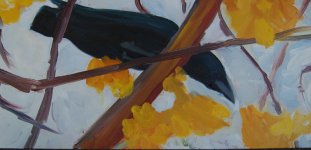
The second seems like such a cliched painting, but there you have it. The background is going to be darker and there will be some more foreground added AND the crow will be a just a little more defined. I don't think this one works though.
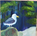
The third also seems like a cliche. I don't know why. I just wanted to try out a gull. But I have better sketches that I should be using.
I've been liking a more almost abstracted environment for the birds, which I think is better indicated in the last two, which I think I am done with.
Looking at them again, they all seem pretty childish. Sh*t, I have a lot of work to do. Oh and they look so blurry. ERG
But for a few I have used some sketches from real life as the main inspiration.The first is definitely not done. Waxwings.
The second seems like such a cliched painting, but there you have it. The background is going to be darker and there will be some more foreground added AND the crow will be a just a little more defined. I don't think this one works though.
The third also seems like a cliche. I don't know why. I just wanted to try out a gull. But I have better sketches that I should be using.
I've been liking a more almost abstracted environment for the birds, which I think is better indicated in the last two, which I think I am done with.
Looking at them again, they all seem pretty childish. Sh*t, I have a lot of work to do. Oh and they look so blurry. ERG
Attachments
birdpotter
Well-known member
timwootton
Well-known member
I think your self-analogy of these paintigs is pretty accurate - except, I would call the waxwings just about there. I think this design is spot-on and I love the approach to the birds. Yes, the others require more time devoted, but they look to be going in the right direction to me. However th crow in the branches is absolutely brilliant - the way you have used your paint, working the colour edges into one another is a very high technique and works splendidly. I love this one - the design is simple but very effective.
Your self portrait is also excellent (not that anyone has the faintest idea what you look like!!!! ) - and is very reminiscent of Lars Jonsson's in 'Birds & Light' - style and composition - in fact the birds you have painted in this piece are very successful because you haven't tried to make them the centre off attention.
Great selection - well done.
Your self portrait is also excellent (not that anyone has the faintest idea what you look like!!!!
) - and is very reminiscent of Lars Jonsson's in 'Birds & Light' - style and composition - in fact the birds you have painted in this piece are very successful because you haven't tried to make them the centre off attention.Great selection - well done.
EliS
Well-known member
The waxwing piece is wonderful, and such a refreshingly unique background for waxwings you've chosen!!! I usually see them depicted on snowy branches. And great self portrait!! The birds in the pic are a nice touch, maybe I should do the same and add birds to the self portrait to get it done.
Elina
Elina
nickderry
C'est pas ma faute, je suis anglais.
As Tim pointed out, the crow in the branches is wonderful, please call this one finished and a success! - its simplicity and boldness make it very exciting to me - childish perhaps, but why isn't this a good thing? Children make the best artists, they're so brutally honest with what they see and draw (I was making my pupils draw as much as possible to see how they did - the ones who said they couldn't draw had a great economy of line, much more pleasing aesthetically than those who had learned to 'shade' (ugly word!)."
The waxwings are very interesting - unique combination of birds and flowers, the first crow needs something to hold the bird to the ground perhaps, the bird is wonderfully angular, but the background looks to be concocted around it at the moment. The gull seems finished to me aswell, the lighting is wonderful. The kinglet needs just one more layer on the bird to change it from a negative space. The background is wonderful - great colour! All in all, unique and inspiring!
Love the portrait, do any of us look happy????????
birdpotter
Well-known member
Thanks guys. This is what I needed to hear.
You know the crow in the branches was my first one and definitely one I call done. There isn't as much contrast in the kinglet one; the background is a little more muted as is the bird, but I will take a look back at it and maybe mess with it some more.
As I've said before, I like simplicity and I want to keep that in form, line,composition, brushstroke, etc.
All right back to work...actually back to the dentist right now.
Oh, I also wanted to mention that the waxwings were on these flowers everyday for the whole time they were in bloom. Their faces were covered in yellow by mid-morning. It was really a great experience to sit and watch them, sketch them, and photograph them. I had ever only seen waxwings previous to moving to Oregon zipping through dense forests or hanging around berrying bushes.
Last edited:
buzzard12
Well-known member
Like the Waxwings personally, just a little more work and you have a winner! Its nice to see bold work like this, I spend my time bogged down in detail, a trend I am now trying to reverse, not so easy I can tell you. thanks for posting these...
Tremendous portrait by the way! (Waiting for a zit on my nose to clear up before doing mine, despite Cromwells paint it warts and all stance)
Tremendous portrait by the way! (Waiting for a zit on my nose to clear up before doing mine, despite Cromwells paint it warts and all stance
)birdpotter
Well-known member
I'm liking both crows and the gull especially. Loads of juicy gobs of paint applied with vigour and abandon!
Why do we see ourselves as such a miserable bunch, we can't be all that sad...Can we?
Mike
Thanks Mike! I was kind of liking the gobs too.
Sad? No, I think it is more of introspective, contemplative, insightful...our supreme intellect weighs us down...that's what it is...Right? At least that's the story I am sticking to!
Alan, my problem (and I don't know if it is a problem but an issue) is not tending to detail as much as maybe I should. I try and try, but I never get there, but that was years ago, I suppose; now I am just letting myself do what I know best. Maybe someday I will move on/forward/ to the side, whichever way it is.
Last edited:
Woody
Well-known member
Thanks Mike! I was kind of liking the gobs too.
Sad? No, I think it is more of introspective, contemplative, insightful...our supreme intellect weighs us down...that's what it is...Right? At least that's the story I am sticking to!
From one massive intellect to another; I like the way you think! :king:
Mike
birdpotter
Well-known member
It's been a long time
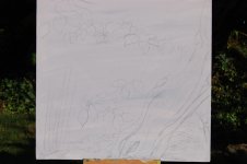
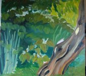
Well, I don't have much. I'm not even finished with the piece that I have to share. Why is it taking me so long to get anything done?!?!?! I am gearing up for school to start again. We have a Japanese artist teaching the painting class this term--it will be a nice change. I am trying to clean up the studio to leave space for school work, but all I do is make more of a mess. My kiln is officially broken and we haven't the money to get it fixed. I suppose I will leave the clay behind for a while. I was hoping to make a lot for shows for the winter, but it didn't happen. A little depressing, really.
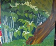
I have done a nice little landscape that I will share later and I will post the finished piece of this one. I took pictures of my process. It is good to look back and see what I have done. The nuthatch is the last little part that I am still working on. And I think something needs to be done to the upper right hand corner.
I am definitely seeing a style emerge from my work. I don't know if I like it really, but I am just going with it for now. My son recognized the spot, because it is his favorite place to hide in our backyard.
Be honest, brutally if you'd like.
My camera keeps leaving those strange lines, and the lighting sucks.
Best to all you wonderful artists.
Well, I don't have much. I'm not even finished with the piece that I have to share. Why is it taking me so long to get anything done?!?!?! I am gearing up for school to start again. We have a Japanese artist teaching the painting class this term--it will be a nice change. I am trying to clean up the studio to leave space for school work, but all I do is make more of a mess. My kiln is officially broken and we haven't the money to get it fixed. I suppose I will leave the clay behind for a while. I was hoping to make a lot for shows for the winter, but it didn't happen. A little depressing, really.
I have done a nice little landscape that I will share later and I will post the finished piece of this one. I took pictures of my process. It is good to look back and see what I have done. The nuthatch is the last little part that I am still working on. And I think something needs to be done to the upper right hand corner.
I am definitely seeing a style emerge from my work. I don't know if I like it really, but I am just going with it for now. My son recognized the spot, because it is his favorite place to hide in our backyard.
Be honest, brutally if you'd like.
My camera keeps leaving those strange lines, and the lighting sucks.
Best to all you wonderful artists.
Attachments
desgreene
Well-known member
I really like this. If you don't mind the opinion of a bit of a beginner, the top right area that you were looking to change, I think looks better in the earlier stage of the painting, where the lighter tone leads you through into an area behind the main subject.
Des.
Des.
birdpotter
Well-known member
I really like this. If you don't mind the opinion of a bit of a beginner, the top right area that you were looking to change, I think looks better in the earlier stage of the painting, where the lighter tone leads you through into an area behind the main subject.
Des.
Thanks Des. Yes, I think I agree with you. I've been looking at the first stage of painting on this (thank goodness I took pictures!)and I like the lighter tone in that corner more than what it is now. Just another thing to mess with I suppose!
Similar threads
- Replies
- 8
- Views
- 772
Users who are viewing this thread
Total: 2 (members: 0, guests: 2)