• Welcome to BirdForum, the internet's largest birding community with thousands of members from all over the world. The forums are dedicated to wild birds, birding, binoculars and equipment and all that goes with it.

    Please register for an account to take part in the discussions in the forum, post your pictures in the gallery and more.
ZEISS DTI thermal imaging cameras. For more discoveries at night, and during the day.

Des's Doodlings (3 Viewers)

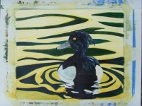
I'm not sure whether this experiment should be filed under "waste of paper". Apart from whether or not it even works, I've not been able to properly match any areas of the water where I've had to make changes.

If I was to have another stab at it, I think paying more attention at the start to the composition of light and dark shapes in the water would pay off.
 

Attachments

  • Web_SNV30261.JPG
    Web_SNV30261.JPG
    186.7 KB · Views: 89
Wateris definately one of the hardest things to paint convincingly. It is an organic thing so don't try to contain it too much. Just let it do it's own thing and the results will be more satisfying. The water in this one does perhaps look a little 'stiff', where perhaps you've been trying a bit too hard? 'Use the force Des'. There's no reason not to 'have another stab at it' either, what's to stop you?

Although you may not be happy with this one, no painting is a waste of paper. If it goes into a drawer never to see the light of day, (and I'm not saying it should), you have learned something by the very process of creating it.
This has a lot of potential for a nice swirling composition with some strong colour and an unusual angle on the bird so don't give up on it!

Mike
 
Mike, many thanks for taking the time to offer some advice on this. You are right of course, it is all part of the learning experience.

I'll stare at it for a bit longer and then decide whether to hide it away in a drawer or attack it with "the force" :t:
 
to save time (got to paint this evening) I do agree with what Mike says about water - two things I might do, go more abstract - paint most of the tufty in black, - there seems to be a lot of dabbing at the colour on his head - black with a sweep of paler tone for form and he's done. Also the reflection may be a little distracting, may be worth understating it or losing it completely. Just my thoughts.

Now, the praise, I really admire the bold composition and swirling nature to it, and the form of the tufty is great.
 
Interesting Nick. My missus told me off for adding the colour to the Tufty (was completely black). However, she pretty much hates the painting anyway!

Thanks, and enjoy your evening's painting!
 
I looked at this earlier and didn't have time to comment. I think there's a huge amount to commend this piece - in places you have created glowing highlights so very convincingly (the bird's right 'shoulder' and the crown, for instance), but I agree that the overall structure of the bird would benefit from a somewhat bolder approach. If you were to have painted the bird with the same degree of polarisation as you have used on the water, changing dark blues, and mauve highlights. I think you'd have a real winner. As it stands, I still think the painting a very good one, but is let down by these tentative elements.
Either work back into this or try another version - there's real mileage here.
 
Thanks Tim, for giving it the once over and coming up with those suggestions. I think I will press on with the polarised (good word Tim) version of this one.

Cheers,
Des.
 
I've not posted anything for a bit, so here's a couple of recent sketches.
 

Attachments

  • Web SNV30268.jpg
    Web SNV30268.jpg
    45.8 KB · Views: 80
  • Web SNV30270.jpg
    Web SNV30270.jpg
    70.4 KB · Views: 88
Thanks Elina & Arthur.

My latest "work in progress" is a bit of a laugh. I've been having a first play with some palette knives. It looks like a nursery school painting accident, but at least it's fun to do!

Whether I'm brave enough to show it or not is the question! :eek!:
 
Here's how "kindergarten paint fight" is coming along. It's due to cop for a Golden Oriole flying in amongst the trees, and some foreground brambles and vegetation if I get time over the weekend.
 

Attachments

  • Web SNV30273_1.jpg
    Web SNV30273_1.jpg
    241.1 KB · Views: 82
Latest version (or finished) not sure which. Who knows, a Dipper might come along?
 

Attachments

  • Web SNV30276.jpg
    Web SNV30276.jpg
    219.5 KB · Views: 79
finished!and a beauty it is too - wouldn't add more or it'll be too full, the oriole is a wonderful touch.
 
Warning! This thread is more than 15 years ago old.
It's likely that no further discussion is required, in which case we recommend starting a new thread. If however you feel your response is required you can still do so.

Users who are viewing this thread

Back
Top