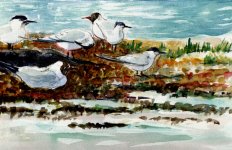
you're going to have to teach me how to get those colours, they're so full of light. Excellent piece!
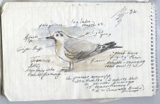
Cheap box of Reeves Nick - £12.99 for 18 large tubes of water colour! Tend not to rinse the palette much now and find all sorts of stray muted greys/browns/greens etc on the edges - my ''clean up'' colours (rather than washing them down the sink!). They are cheap paints and can only take so much mixing, too little and they are garish in the extreme. I think the light comes when I don't have the patience to fill in 'gaps' or complete an area. (low boredom threshold!)
Know you were kidding anyway - you're Master of water colour and I'm learning from
you!!! Stylewise, the Woodie is more my kind of style/taste tbh and I want to keep heading in that very loose direction with bold colours, but I am learning a lot by looking at your work (even though it might not show yet!) re: how not to overwork colours, overall compositions and structure of birds.
Joanne: Spot on observation - that's why I don't mind too much now posting the overworked stuff, but believe me, there's much more muddy sludge attempts behind some of the better watercolours on this thread that I couldn't possibly share!
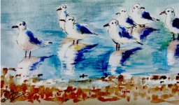
Steve, Andy, the thirsty family of Greenfinch were NOT impressed
")
- thanks for the comments
Cheers
Mouldy - I'm now thinking because of what you said, will have one more go at GI but maybe I should give this one to my Dad - it goes with their colour decor and that's a big big criteria for 'art' for my parents if it's going to be put on the wall!
Not sure about the colour of the Mount tho' - should it be white? Was always told to pick a colour from the painting but sometimes that just throws everything off balance - so if anyone's got any suggestions it would be welcome.
(missing you already
Wendy )