PaulCountyDurham
Well-known member

Hi all,
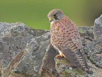
I took this picture over the weekend, the light was poor, there's not a great deal of contrast in the picture, the colours look washed out and there's a bit of a haze to the picture.
What editing features would you use to bring some life to this bird?
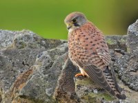
The original is the first picture and then I've edited as best as I can (second picture) using the haze removal tool, adjusting the levels a bit and adding a bit of saturation.
Any ideas?
Cheers.
I took this picture over the weekend, the light was poor, there's not a great deal of contrast in the picture, the colours look washed out and there's a bit of a haze to the picture.
What editing features would you use to bring some life to this bird?
The original is the first picture and then I've edited as best as I can (second picture) using the haze removal tool, adjusting the levels a bit and adding a bit of saturation.
Any ideas?
Cheers.