colleenc
Well-known member
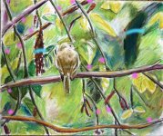
I looked this over and played with it in PS.....hope you don't mind some comments, IMO
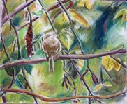
there are too many parallel lines, see pink dots, too many lines lead the eye out off the page, there are two dark shapes , see blue lines, that compete with the bird. The single branch the bird is on is one thickness across the whole work, making a sort of cut.. Where branches cross and make even Xs can be an element that makes flow harder.
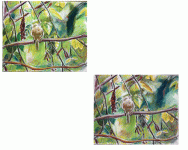
the last piece you did this way did not have these issues, and you balanced the light very well as well as integrating the elements in an elegant way....I think you have some of this well done, but it may be better to try it again rather than correct this one. I also tried cropping at different places to move the bird a bit off center more, but don't think that is as important as all the lines the branches make and where they are going...
This is only my view of things, and mostly we all cheer each other on here so hope I'm not out of step with a detailed crit, others may have a different view.
there are too many parallel lines, see pink dots, too many lines lead the eye out off the page, there are two dark shapes , see blue lines, that compete with the bird. The single branch the bird is on is one thickness across the whole work, making a sort of cut.. Where branches cross and make even Xs can be an element that makes flow harder.
the last piece you did this way did not have these issues, and you balanced the light very well as well as integrating the elements in an elegant way....I think you have some of this well done, but it may be better to try it again rather than correct this one. I also tried cropping at different places to move the bird a bit off center more, but don't think that is as important as all the lines the branches make and where they are going...
This is only my view of things, and mostly we all cheer each other on here so hope I'm not out of step with a detailed crit, others may have a different view.
")