• Welcome to BirdForum, the internet's largest birding community with thousands of members from all over the world. The forums are dedicated to wild birds, birding, binoculars and equipment and all that goes with it.

    Please register for an account to take part in the discussions in the forum, post your pictures in the gallery and more.
ZEISS DTI thermal imaging cameras. For more discoveries at night, and during the day.

Wings Over Winecountry, Colleen's place (1 Viewer)

thanks guys....it was better than the painting but I'll get better with more practice.....hope to go out today to try it out some more, this is my year to get more solid in the landscape-light thing..

Ken, I got this idea thanks to Sid, he started with an aluminium forms holder, but I thought that might dent and was too shallow, so went looking for the next step , called a portable desk..all the details are on that thread at wc including the thing to use for a tripod mount...here is the thread It was really no trouble at all, just drill a couple of holes, bend a wire, add a bit of velcro and fill it up with stuff.
 
Last edited:
Colleen,

The equipment is fog.

You are a brilliant, brilliant, brilliant artist!

An unsharpened charcoal, and the light side of some tree bark would do you well.

It is, IMHO, NOT the equipment you need.

It is PURELY you!


And I look forward to seeing more of your YOU!
 
Ha Phil had you been with me today you might have used less stellar descriptions of my work...

the thing for me is that this is giving me some freedom to explore several media at once in front of my subjects and not just pencil or paint or whatever. And when I get comfortable with the set up, then I can just work without futzing with equipment....takes a lot to do birds, the scope or bins, all my pockets full of pencils or sketch pads, a stool, ( back wont take 4 hours of standing up not to mention trying to draw that way....so all in all as it settles down I can be really more responsive to the scene without technical things in the way.....

Have to admit I did a very passable watercolor painting once with a weed when I forgot my brush...so maybe you have a point. ;)
 
Colleen,

No criticism of your practice.

I wanted only for you to be free of encumbrances...

You seem to do very well either way!

Much good wishes!

phil
 
I love the egret, Colleen. Character and jizz caught perfectly in minimal strokes. I find these birds an utterly absorbing but supremely difficult species to sketch (especially when they're moving) and very, very easy to over-do.

Russ
 
thanks Russ,

Phil I would bet the biggest emcumbrance I have is my own mind....maybe that's what you were pointing out8-P


Not many birds lately, once a year I do a portrait, which I always find an excruciating experience, near to torture. I do them because somewhere inside I feel the need to explore all kinds of art, and because the artists I admire are able to paint many kinds of paintings in multiple genres. Tho I'm no great shakes at it, I do find that it really sharpens my observational skills.

This is why the birds have been neglected...there's an animal in it but not too wild....it's close but not complete, having a time with the foreshortened arm, its the daughter of a friend of mine, and not a commission, so the only pay off will be the experience I get doing it. Pastel, 14x18. Just wanted you all to know I'm still here;)
 

Attachments

  • emma wip 14sm.jpg
    emma wip 14sm.jpg
    69.8 KB · Views: 42
thanks Russ,


Not many birds lately, once a year I do a portrait, which I always find an excruciating experience, near to torture. I do them because somewhere inside I feel the need to explore all kinds of art, and because the artists I admire are able to paint many kinds of paintings in multiple genres. Tho I'm no great shakes at it, I do find that it really sharpens my observational skills.

I was going to say something similar about sharpening observational skills after I'd looked at the painting but no read the post. Then I saw you beat me to it.

I'm sure whether it's you with this or Nick with some of his commissions from a few months ago that they all add grist to the creative mill. My guess is that your next bird painting will be a particularly strong one.
 
Nice capture of a "twitchy subject"!

From what you told me, she was a jiggly, sort of fidgety little thing?:eek!:

No, really very nice indeed. And proper painting skills to the fore!

Love the tonalities of light, the work on the fabric of the cushions, and what a realistic fluffy bunny! You certainly capture humans with astonishing expertise Colleen!

Bet you're glad it's over though!!!;)

Superb!
 
It's not over yet, I wish it was!....still have a pillow to do, and all the adjusting at the end....forgot to say it's in pastel

Promised Liam I'd post some color charts. I'm working out a palette for plein air, I tried my old one and also a very limited one and didn't like either, so this is what I'm going for, about 10 colors and black and white.

In this test, I saw that 2 reds are nearly the same the Aliz Crimson AC, and the Florentine Lake FL, the FL keeps rich color through the dilution with white. So I'll drop that AC. Across the top is the pure color out of the tube, and going down in 5 steps are the values with white added.

To do this I mix the tube with white guessing for the mid value , then mix 2 darker steps with the tube color and a bit of the mid value, and 2 lighter steps from the mid tone, with white added lighten it. When all 5 values are mixed on the palette, then I can make tweaks to get good steps between each value.
It took a couple of hours to do this, I used a clean brush and clean palette for each color and its values, so the colors did not get contaminated.

Colors are TS transparent sepia, VR Venetian Red, GOS Golden Orange Sienna, TBO Transparent Blue Oxide, CB Cobalt Blue, VG Viridian Green, VG Verona Green, TTur Transparent Turquouise, AC Aliz Crimson, FL Florentine Lake, CR Cad Red, CYD Cad yellow Deep, UYG Ural yellowish green.

Next I'll take each one and mix with all the others and do the value steps for that.

Benefits so far, I know my weak and strong tinters, which are innately transparent, how each holds up as it gets lighter and lighter. I could paint for a long time before I noticed all this in the mixes of a painting. Isolated this way it's so clear.
 

Attachments

  • color chart main_2145.jpg
    color chart main_2145.jpg
    63.9 KB · Views: 43
Last edited:
Thaks for that Colleen. I'm afraid your attempts are much more organised than mine, partly because my acrylics sketchbook isn't big enough to fit in a table with room for it! However, this is veru useful and will help loads with my own attempt, which I'm about halfway through at the moment.
 
Poor Liam, he probably just wants to have fun, and here I am asking for first year college student work work work:-O

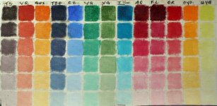
Liam you can run the table over several pages, but I suggest you try the "more organized" approach. These will be for more than exercise, they are a resource as you learn to paint, for colors that work and where to get them.

They also do the following:
Give you more info on color than a 100 paintings can
Give you lots of practice in mixing without having any other focus, this also gets you over lots of hurdles in a short time
Give you future reference for what colors you like, that work, so you don't waste money on buying colors easily mixed.

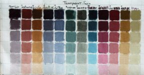
For instance here is my chart for Transparent Sepia, a color not found at the store in the usual brands. It's made by a very premium paint maker in NY. Should I add this to my palette or just add black to umber?
This is how you make a color chart for one color.

On the beginning side of my lined off canvas piece, is Trans Sepia by itself pure and in 5 values dark to light. the next rows are the TS mixed with each of my other colors. To do this you need to make sure your target color, in this case, TS dominates the mixture, so some you have to add more than 50% to the mix, like the Trans. Turquoise which is a modern color ( as opposed to the traditional pigments like sienna) and is very strong. At the top is the mix of the two tube colors mixed pure out of the tube and again the descending col. of 5 values of that mix.

What I can see here is the Golden Orange Sienna and the Cad yellow deep make the same colors, Cad is more useful, so I'll drop the GOS and won't buy another tube, saving money on that for the rest of my life, I'll use it for special items till it's gone.

For two years now I've bought colors as I can afford them in just " I think I want to try that" mode, this is not the way to go for a lot of reasons, but I just started back in oils after 30 years and I wanted to see what's out there.
I can't do really good work until I really know my colors, and getting a set palette sets me free to work without having to be wondering "how can I get that tone," after enough time with the main palette I can just mix it nearly without thinking.

For a beginner I suggest a more limited palette, like 2 reds, 2 yellow, 2 blues, in each group a warm and cool tone. Then white and bt umber and Bt. Sienna. That's 9 colors, to slightly expand and useful for wildlife, add yellow ocher and raw umber. Black is useful later, but deadly on a beginner palette, so suggest you leave that off, mix one with your cool blue and the bt. umber.

A more limited group but still useful would be Bt. Umber, Bt Sienna, Ultramarine Blue, Pthalo Blue, Cad yellow Med, Lemon Yellow or Azo, Perm Red, or Napthol red, and white. All the greens can be mixed from blues, yellows and Bt Sienna. All the oranges from the red and yellows and Bt. Sienna, all the violets from the blues and red.( note for acrylic painters a good violet is very hard to get from red and blues, so I suggest later a violet in the tube, in oils the mix will work splendidly) So that's 7 colors and white.

Remember you are doing this to save time and money, and get lots of experience with color fast, in a way you can reference later.

BTW I am adding Trans Sepia to my palette, it makes gorgeous mixes far superior to BT Umber and black, BU will be gone and replaced by TS
 

Attachments

  • color chart trans sepia_2146.jpg
    color chart trans sepia_2146.jpg
    75.2 KB · Views: 34
Last edited:
aw, I don't mind doing all the legwork if it helps my painting!

however, I didn't buy individual paints, I brought a beginner acrylics set with 24 colours (white, light yellow, medium yellow, deep yellow, yellow ochre, flesh tint, vermillion, brilliant red, crimson, violet, blue lake, phthalo blue, cerulean blue hue, ultramarine, light green, viridian hue, phthalo green, grass green, burnt sienna, raw umber, burnt umber, payne's gray, mars black)

I have a bit too many to fit in a table in my book, and anyway I have already started doing it a different way, but it still works well, I have a nice range of mixes already and can't wait to see it finished. Thanks for giving me the idea Colleen :t:
 
thanks Arthur,

Liam...well that's what's working so keep it up. Keep the list I gave for future ref, all those colors are not necessary, tho that's what they always do in those beginner sets. More tubes of color doesn't mean a better painting, really almost the opposite for beginners. Grass green for instance is just some mix of yellow and blue.( and if you really learn to see, you'll find grass is way more than green;)) Try to notice what colors tend to the cool side (blue) and which to the warm (yellow) that is a key issue, too complex to explain at this point just notice that a red can have a more blue side(crimson) or a more yellow( like vermillion)

I really suggest you take out the black, paynes will do nicely and give you better mixtures, it is a "cool" ( as in blue) black and will make nice muted blues and greys for the kinds of weather and light you have there.

BTW be interested to see you post some of the mixing pages
 
Last edited:
Hi Gretchen, a lot of people have helped me, so I always hope I can pass on something useful to others.

this is from a wonderful painter who's eletter I subscribe to, he's always got something useful and short to say and doesn't have an agenda or sales pitch. One of the best things I have to stay inspired.
here is where you can sign up

This came today re beginning painters, perfect advice, and a good reminder for the experienced like me as well
I've always noted a big difference between what students think they need to do and what they need to do. The production of art is a curious combination of childlike intuition and practical, often hard won, know-how. It's this practical know-how where a person like myself might be useful. Without too much rigidity in getting started with these unsullied artists, here are a few basics--in the full knowledge that they might be dropped later:

For opaque media--oil or acrylic--start with a toned ground. Don't fight white. A medium grey is good, but other, brighter colours are useful as well.

In planning your painting, rather than drawing outlines, use patches of colour whenever possible. No spidery lines crawling around the painting. Spidery lines feel good when you make them, but they run interference later.

When you're into the actual painting, keep your strokes direct and fresh. Try to leave your strokes alone. Don't sweep back and forth like a sleepy umpire dusting off the home plate.

When you're getting to the end, stop early. Don't be afraid to produce cursory, unfinished work. Let the viewer put in the last strokes. Overworking is a pitfall that many artists fall into and are never able to crawl out of. It's dark down there.

Most important of all I would ask students to try to actually see what it is they are looking at. Like aliens on their first Earth encounter, these unsullied folks need to be visually astounded and curious about how things work. The older we become, the more difficult becomes this ability. "Be Martians," I would say, "if only for this short landing."
 
that's all good advice I wholeheartedly agree with (though fighting white is a challenge that I enjoy). It's now a matter of putting what you know into practice and following the advice.
 
Warning! This thread is more than 8 years ago old.
It's likely that no further discussion is required, in which case we recommend starting a new thread. If however you feel your response is required you can still do so.

Users who are viewing this thread

Back
Top