• Welcome to BirdForum, the internet's largest birding community with thousands of members from all over the world. The forums are dedicated to wild birds, birding, binoculars and equipment and all that goes with it.

    Please register for an account to take part in the discussions in the forum, post your pictures in the gallery and more.
ZEISS DTI thermal imaging cameras. For more discoveries at night, and during the day.

The ultimate range maps (1 Viewer)

01101001

All-knowing Idiot
Opus Editor
Poland
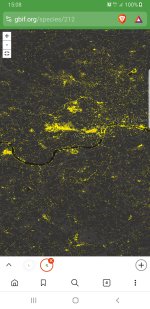
For those who (like me) didn't use to know that the Global Biodiversity Information Facility (GBIF) has its own range maps combining all available recording schemes, and very detailed ones, too (of course, some stray records of what may look like vagrants will be mistaken because the info is sucked directly from other databases).


EDIT: Who would've thought Bulgaria and Estonia are so well watched?

EDIT 2:
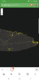
For the whole world:
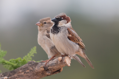
Interesting that out of a total of 228K pictures, 185.5K are from Macaulay Library (there are species for which, strangely, ML has three times more photos than the GBIF--that's probably because only iNaturalist and some smallish schemes supply photos to the database (?)).

Anyway, no matter where you report your data, they are not lost.
 
Last edited:
The first thing that I see is that Luscinia luscinia (Thrush Nightingale) is more common in Belgium and the Netherlands than in Ukraine.

Hrm.
 
I guess it operates based on the number of sightings in a given area, not frequency. Click the painting roller around the lower right corner -> 'Custom' -> 'Dark' + 'Points' + 'Classic', and the experience will be much better.

EDIT: Due to outdated taxonomy being used by some, certain maps will have mistakes indeed:

OTOH, it works especially well for things such as
or (for Europe)
 
Last edited:
Most of the ornithological GBIF data comes from eBird (e.g. that record of Common Nightingale on the most southerly point of the UK mainland is mine submitted via eBIrd). eBird actually offers you a lot more than GBIF in terms of granularity and detail - e.g. you can click on the individual records to get more info. Highly recommend a look of you are not familiar with it (though you do need to register)
 
Last edited:
I also submit my data to eBird, although the country-wide scheme still has more data (140.5K complete checklists vs 110.3K complete checklists), which is also the situation in other European countries, I think (probably even more in favour of local schemes), and the GBIF loses no such data. But, yes, in most cases and places, it's eBird that offers the more tailored statistics, not least due to its funding and technological background.
 
Last edited:
Interestingly, maps of Siberian vagrant songbirds like the Yellow-browed Warbler show them more common as vagrants in north-west Europe than on their breeding range in Siberia. I noticed the same in ebird.

In contrast, these maps are very good for species quickly increasing or decreasing, which regular books really lag behind. For example, Great Egret is much more common and wintering Shore Lark much rarer in Poland than any book will show . The same about naturalized birds like Egyptian Goose and Ruddy Shelduck in mainland Europe, which are ignored by the classic bird books.
 
Interestingly, maps of Siberian vagrant songbirds like the Yellow-browed Warbler show them more common as vagrants in north-west Europe than on their breeding range in Siberia. I noticed the same in ebird.
Artifact of differing levels of effort: lots in w Europe, not so much in c Asia etc
 
Click the painting roller around the lower right corner -> 'Custom' -> 'Dark' + 'Points' + 'Classic', and the experience will be much better.
Using these parameters and the map below, you can see the places that have been visited most frequently in a given area (if the eBird map is insufficiently developed or too cluttered with small hotspots):
 

Attachments

  • London.jpg
    London.jpg
    1.4 MB · Views: 13
  • Flamborough.jpg
    Flamborough.jpg
    292.7 KB · Views: 13
Last edited:
For me the ultimate maps are created by iNaturalist, which for some reason has yet to gain traction among birders.
Choose any species you like, go to maps and add the GBIF layer.
Doesn't get much better than this IMHO

Here's House Sparrow.

Of course these maps only show us where observations exist and to be meaningful would need to be processed further, e.g. combining them with habitat data.
That's indeed nice, although I wish we could get rid of Mercator once and for all.
Gall-Peters would be better as most species diversity is in the tropics.
 
For me the ultimate maps are created by iNaturalist, which for some reason has yet to gain traction among birders.
Choose any species you like, go to maps and add the GBIF layer.
Doesn't get much better than this IMHO

Here's House Sparrow.

Of course these maps only show us where observations exist and to be meaningful would need to be processed further, e.g. combining them with habitat data.
How are iNat maps better than eBird maps?
 
How are iNat maps better than eBird maps?
They seem a combination of ebird products. On the one hand you can see individual observations if you zoom in far enough (so better than "standard" ebird maps) but they don't distinguish recent ones (so less good than ebird "species" maps). OTOH, these should be actual locations cf ebird which shows you only roughly where the observation was (ambiguated by assignment of it to a "hotspot").
 
The layout is just cleaner, the way the sqares progressively divide into smaller squares (down to 1 km x 1 km (?) * ), not just 100 km x 100 km plus 20 km x 20 km, the map layers underneath showing the range and the green borders between regions, and, also, there's no sharp border between stading rectangles and lying-on-one side rectangles (around the upper tip of Newfoundland in the ABA area). Abundance is shown better in eBird, though, and the possibility of choosing a time frame is useful, too. I thought about mentioning the projection as well, though (apart from the GBIF), all schemes I know of use the Mercator one ** , unfortunately (otherwise, the tiles could've been more square, too).

* if eBird chose just the checklists that are less than one mile long, a similar thing could be done as well, separately from the main map. From what I understand, most eBird Science products have 9 km x 9 km tiles (the static/print ones and the animations, but you can zoom in as close as 3 km x 3 km in the other maps), which is quite good.

** apart from eBird Science products

Pro Tip: We recommend keeping Traveling checklists under 5 miles (8 km) and Stationary checklists under 3 hours for your sightings to make the biggest impact for science. However, limiting your checklists to less than one hour or one mile provides even more checklist precision!
+
 
Last edited:
(Good point, but I'm too lazy -- to the point that I record stationary checklists so that I don't have to adjust the track length.)
 
The layout is just cleaner, the way the sqares progressively divide into smaller squares (down to 1 km x 1 km (?) * ), not just 100 km x 100 km plus 20 km x 20 km, the map layers underneath showing the range and the green borders between regions, and, also, there's no sharp border between stading rectangles and lying-on-one side rectangles (around the upper tip of Newfoundland in the ABA area). Abundance is shown better in eBird, though, and the possibility of choosing a time frame is useful, too. I thought about mentioning the projection as well, though (apart from the GBIF), all schemes I know of use the Mercator one ** , unfortunately (otherwise, the tiles could've been more square, too).

* if eBird chose just the checklists that are less than one mile long, a similar thing could be done as well, separately from the main map. From what I understand, most eBird Science products have 9 km x 9 km tiles (the static/print ones and the animations, but you can zoom in as close as 3 km x 3 km in the other maps), which is quite good.

** apart from eBird Science products


+
Many iNat observations have accuracy circles far longer than a mile.
 
Many iNat observations have accuracy circles far longer than a mile.
Yes but at least you know what the accuracy is. I think they deliberately hide some locations in this way (e.g. when I was looking for Canarian endemics locations)
 

Users who are viewing this thread

Back
Top