Missy_MT_AK
Active member

I am new to bird photography.
Which is the better photo and why? Thanks!

Which is the better photo and why? Thanks!


I am sorry but I do not understand. The Cinnamon Teal photos above do not follow the "rule of thirds"?The immediate impression is that the images lack 'visual tension'. Techniques for good composition in image-making are universal (ie. bird photography isn't unique), and I suggest a good place to start is by studying the 'rule of thirds' - used by painters and photographers for decades, if not centuries... your compositions will improve almost instantly.
And don't just study bird photography - look at other genres such as portraiture and landscapes (painting and photography, even cinematography). Once you've gained an appreciation for what makes good composition, you can then go on to break the rules as much as you like... and excuse the pun... your bird photography will really take off.
Good luck.
.
I am sorry but I do not understand. The Cinnamon Teal photos above do not follow the "rule of thirds"?
Can you explain? Thanks.
I don't know if you realize it, but your responses seem condescending and have not been helpful to me.None of the pictures do. You need to research (Google etc) composition - it's too big a subject for people to cover it here.
.
I don't know if you realize it, but your responses seem condescending and have not been helpful to me.
Everyone at one time in their life was a newbie looking for some helpful suggestions...that is me!
Google it is not very helpful...
LOL I thought it was a rule Mono!!
In addition to your "rule of thirds", try to position the bird looking as if it has room to move or fly off. For instance, if he is looking to the right, adjust your crop so he is on the left and there is plenty of room on the right.
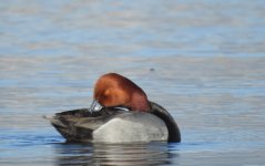
With the second Ring-necked Duck picture, the horizon isn't straight, so it looks like the ducks are "swimming uphill". If your photo-processing software doesn't have this facility, FastStone does, and it's a fee programme. I like the colours on that one, though it's unfortunate you've cut her tail off.
Thanks. I have some Redhead images I need to straighten out. Do you recommend FastStone ImageViewer, MaxView or Resizer to do that? Thanks.


Wow! Thank you!OK, from a purely compositional point of view, here is what I personally would do with some of your photos and an explanation of why.
The "rule" of thirds is an excellent compositional guide but it is just that - a guide, not a rule. Pictures with the subject in the middle seldom work well, though they can sometimes work to great effect. It depends on the subject. However it is mostly better to have the subject looking into some space in the frame rather than looking out of the frame.
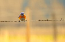
For the first pic I've put the eye of the bird exactly at the upper left intersection of thirds. This looks nicely balanced to me as the bird has lots of space to look into. Using the upper left third also allows the incusion of the lovely golden colours at the bottom of the frame.
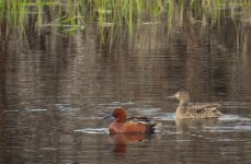
For the second pic, it is not possible to put the birds at an intersection of thirds and at the same time include the reeds which I think are important to the composition. I think it still works with the birds close to the bottom of the frame but off to one side. They have plenty of room to look into the frame whilst still incuding the nice reflections in the water, and the reeds and their reflections which nicely show the habitat.
Pic three is a bit problematical because of how off-kilter the pic is. It's not possible to incude all of the birds reflection whilst straightening it up properly. It also has the problem of the birds body and head facing in opposite directions. In this case I think it works best with the bird slightly left of centre and keeping the nice colours in the water behind the bird.
In pics two and three the birds are not at the intersection of thirds but having them off centre still looks better to me personally rather than having them central.
I'm sorry I can't help with software. I use Adobe Lightroom but I suspect you wouldn't want to pay for that at this stage in your photography. Hopefully the software Delia has suggested will work for you at present.
Ach!!! Really must remember to proof-read my posts before submitting. That, of course, was meant to be "free" LOLWith the second Ring-necked Duck picture, the horizon isn't straight, so it looks like the ducks are "swimming uphill". If your photo-processing software doesn't have this facility, FastStone does, and it's a fee programme.
@Missy_MT_AK Thanks. I have some Redhead images I need to straighten out. Do you recommend FastStone ImageViewer, MaxView or Resizer to do that? Thanks.