• Welcome to BirdForum, the internet's largest birding community with thousands of members from all over the world. The forums are dedicated to wild birds, birding, binoculars and equipment and all that goes with it.

    Please register for an account to take part in the discussions in the forum, post your pictures in the gallery and more.
ZEISS DTI thermal imaging cameras. For more discoveries at night, and during the day.

Excel Graph (1 Viewer)

Arbu

Well-known member
Supposing I've got a list of dates when I've made birding trips, and the number of lifers seen on each trip, all in Excel. I'd be interested in producing a graph showing the progress of my life list on a day by day basis. Is there a straightforward way of doing this?

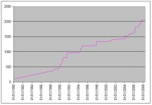
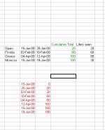
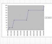
I can do it laboriously, and the attached bitmaps show how. I start with the black data, then calculate the green, then the red. But creating the red data is rather tedious, and would be very much so for a lot of data. The graph is created from the red data.

Is there a way to automate the creation of the red data?
 

Attachments

  • excel cumulative.JPG
    excel cumulative.JPG
    42.3 KB · Views: 80
  • graph.JPG
    graph.JPG
    36 KB · Views: 58
One easy way to do is is to highlight the row or column you have the data in and then select the graph icon in Excel or Chart > Chart Type from the top menu. That will give you a wizard to work through.

Cheers
Andy
 
I simply can't see how to get the wizard to do this. It always regards the two dates as part of the same record, not separate ones. And I can't attach a spreadsheet here - it's not one of the permitted file types. Anyway I've now done it manually and it's attached. If you can see a flattening off over the last year, it's because I'm starting to think I might be focussing my energies on the wrong type of bird...
 

Attachments

  • Arbu's progress.JPG
    Arbu's progress.JPG
    29.5 KB · Views: 51
Are you asking for a formula to create the red data? If so, try the following:

Assume the word spain is in 'A2' and the rest of the data is aligned accordingly. Where you have '0' in the red data type =d2-e2

Then click on the bottom right hand corner of the box you've typed this data into and drag the formula down as far as you want it. Highlight the red data, press F11 and your graph should appear.

That won't work, to start with it will only produce four figures when I need eight. But don't worry, I can do it manually, it's not that much trouble.
 
I use a pivot table to organize / summarize all my life sightings. Once it is set up, it's only a click on the "refresh" button and it is updated. My graphs print from the Pivot Table data.
 
Warning! This thread is more than 16 years ago old.
It's likely that no further discussion is required, in which case we recommend starting a new thread. If however you feel your response is required you can still do so.

Users who are viewing this thread

Back
Top