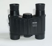
From Dialyt to SF, the aesthetics of Zeiss binoculars have evolved with several ‘diversions’ down a variety of different avenues along the way. I thought it would be entertaining to take a stroll down a few of these diversions to compare and contrast various models, and also have a few brief glimpses into the design process. The first decision was which models to leave out, and in deference to the way the market has developed, I have concentrated on roof prism binoculars with rubber armour. I apologise to those whose favourites might lie outside of this and just remark here that I am similarly placed as I really love the old leatherette Dialyts. This overview covers 8 models from the first Conquest to SF32, so here we go…
Conquest
A glance at the first Conquest model quickly reveals a similar overall shape to the Victory FL, with the same, but fewer, heavy rubber bars on the armour and the dioptre adjuster was oved to the bottom of the bridge, echoing its position on Victory Mk1.
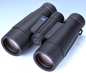
Terra ED 1st Generation
The first-generation Terra brought with it a break from both the Dialyt-like heavy bars on the armour, and the dimpled-armour of the Design Selection and Victory Mk1 models. It had smooth armour with styling lines including a ‘dip-line’ just above the strap attachment lugs, that has also been shared on several subsequent Zeiss models all the way up to SF.
Terra ED Gen 1 Styling Buck
You might have heard of full-size models of new cars being sculpted out of clay and then painted and modelled to look exactly like the real vehicle, so that its full 3D external appearance can be assessed. Although this process has been partly replaced by 3D Virtual Reality software, something similar is also sometimes done with binoculars. The photo is of an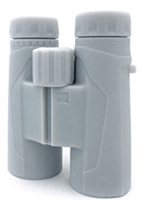 unfinished model of the 1st Generation Terra ED, taken part of the way through the design process. © KISKA
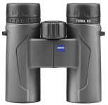
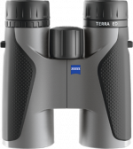
 The second-generation Terra ED, is far more sophisticated and uses texture and contrasting colours, as well as feature lines, to great effect.
Terra ED 2nd Generation PocketUses similar areas of texture and contrast as the full-sized models.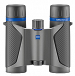
Below are design studies generated during the project © KISKA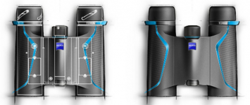
Victory HT 8x42
Zeiss’s HT was a radical mixture of both modernity and an echo of past glories. The smooth and elegant optical tubes were joined together by a highly visible twin-bridge. This was the first model since the Dialyt 7x42 to unselfconsciously display the bridges, and the fact that they played a prominent role in the HT’s aesthetics is confirmed by the styling study image produced during the model’s development (see below). Notice too how the strap attachment lugs are artfully integrated into the design with a pronounced curve on their under-side. The HT was a masterclass in aesthetic design.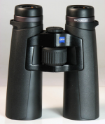

© KISKA
Conquest HD
Take a look at the styling-lines in the armour, the curve under the strap attachment lugs which integrates the lugs into the overall outline instead of them appearing to be after-thoughts added later, and also the dip in the armour as it passes under the lugs and what have you got? A family resemblance to HT. It has all the graceful poise of that mode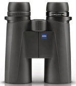 l, and only lacks the prominent bridges and forward placement of the focus wheel.
Victory SF 8x42
SF incorporates several features from HT, namely, the dip of the armour under the neck-strap attachment lugs (which aren’t quite as elegant as HT’s), and the twin bridge, which in this case is more discreetly integrated into the overall design, and is partnered by a third bridge near the objectives. SF ignored the precedents set by previous open-hinged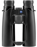 binoculars and ploughed its own furrow. HT’s straight-lined classicism was now replaced by a graceful curvaceousness that suggests a more dynamic personality. Launched at first with tasteful mid-grey armour which raised a few eyebrows, it did not take long before SF donned black armour, which although not as eye-catching is just as handsome.
Victory SF42
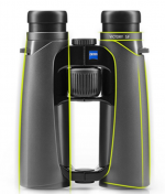
Styling image presenting the elegant swooping feature lines and outline that were key for expressing SF’s more dynamic nature.
© KISKA
Victory Pockets
And then, in complete contrast with the ‘busy’ appearance of the other Victory models, here is the Victory Pocket with a smooth, sophisticated appearance that definitely whispers ‘less, is more’.
Victory SF 8x32
Zeiss’s 32mm version of SF does not quite reprise the design of the 42mm because the curves of the optical tubes have been straightened, and this small change to parallel-sided optical tubes gives a hint of the restraint and tasteful sophistication presented by the Victory Pocket (see above).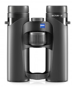
Conclusion
There is a school of thought that form should always give way to function and ergonomics, and no more so than when a product is to be used in the grip of the owner’s hands. Nevertheless, to Homo sapiens vision is a key sense, so aesthetics can be key to acceptance by the market. This article has concentrated on Zeiss, which is the brand I know best, but I am not blind to other brands and will state here that in my opinion Swarovski’s original EL WB is a modern design classic, as is Leica’s BA/BN, in the same way as Fender’s Stratocaster electric guitar, Audi’s TT sports car or indeed Coca-Cola’s original glass bottle.
To this elite group I would personally add Zeiss’s SF 32 which, to my eyes, artfully combines the complexity of three bridges with straight-sided optical tubes to harmonious and elegant effect. Of course, you are free to disagree!
Production Dates Researched by Troubador (corrections gratefully received)
Conquest 1 2005-2012
Conquest HD 2012-current
Terra 1 2015-2016
Terra 2 2017-current
Terra Pockets 2016-current
HT 8x42 2012-2018
SF 42 2015 current
Vic Pockets 2018 current
SF32 2020 current
Lee
Conquest
A glance at the first Conquest model quickly reveals a similar overall shape to the Victory FL, with the same, but fewer, heavy rubber bars on the armour and the dioptre adjuster was oved to the bottom of the bridge, echoing its position on Victory Mk1.

Terra ED 1st Generation
The first-generation Terra brought with it a break from both the Dialyt-like heavy bars on the armour, and the dimpled-armour of the Design Selection and Victory Mk1 models. It had smooth armour with styling lines including a ‘dip-line’ just above the strap attachment lugs, that has also been shared on several subsequent Zeiss models all the way up to SF.

Terra ED Gen 1 Styling Buck
You might have heard of full-size models of new cars being sculpted out of clay and then painted and modelled to look exactly like the real vehicle, so that its full 3D external appearance can be assessed. Although this process has been partly replaced by 3D Virtual Reality software, something similar is also sometimes done with binoculars. The photo is of an
 unfinished model of the 1st Generation Terra ED, taken part of the way through the design process. © KISKA
  The second-generation Terra ED, is far more sophisticated and uses texture and contrasting colours, as well as feature lines, to great effect.
Terra ED 2nd Generation PocketUses similar areas of texture and contrast as the full-sized models.

Below are design studies generated during the project © KISKA

Victory HT 8x42
Zeiss’s HT was a radical mixture of both modernity and an echo of past glories. The smooth and elegant optical tubes were joined together by a highly visible twin-bridge. This was the first model since the Dialyt 7x42 to unselfconsciously display the bridges, and the fact that they played a prominent role in the HT’s aesthetics is confirmed by the styling study image produced during the model’s development (see below). Notice too how the strap attachment lugs are artfully integrated into the design with a pronounced curve on their under-side. The HT was a masterclass in aesthetic design.


© KISKA
Conquest HD
Take a look at the styling-lines in the armour, the curve under the strap attachment lugs which integrates the lugs into the overall outline instead of them appearing to be after-thoughts added later, and also the dip in the armour as it passes under the lugs and what have you got? A family resemblance to HT. It has all the graceful poise of that mode
 l, and only lacks the prominent bridges and forward placement of the focus wheel.
Victory SF 8x42
SF incorporates several features from HT, namely, the dip of the armour under the neck-strap attachment lugs (which aren’t quite as elegant as HT’s), and the twin bridge, which in this case is more discreetly integrated into the overall design, and is partnered by a third bridge near the objectives. SF ignored the precedents set by previous open-hinged
 binoculars and ploughed its own furrow. HT’s straight-lined classicism was now replaced by a graceful curvaceousness that suggests a more dynamic personality. Launched at first with tasteful mid-grey armour which raised a few eyebrows, it did not take long before SF donned black armour, which although not as eye-catching is just as handsome.
Victory SF42
Styling image presenting the elegant swooping feature lines and outline that were key for expressing SF’s more dynamic nature.
© KISKA

Victory Pockets
And then, in complete contrast with the ‘busy’ appearance of the other Victory models, here is the Victory Pocket with a smooth, sophisticated appearance that definitely whispers ‘less, is more’.

Victory SF 8x32
Zeiss’s 32mm version of SF does not quite reprise the design of the 42mm because the curves of the optical tubes have been straightened, and this small change to parallel-sided optical tubes gives a hint of the restraint and tasteful sophistication presented by the Victory Pocket (see above).

Conclusion
There is a school of thought that form should always give way to function and ergonomics, and no more so than when a product is to be used in the grip of the owner’s hands. Nevertheless, to Homo sapiens vision is a key sense, so aesthetics can be key to acceptance by the market. This article has concentrated on Zeiss, which is the brand I know best, but I am not blind to other brands and will state here that in my opinion Swarovski’s original EL WB is a modern design classic, as is Leica’s BA/BN, in the same way as Fender’s Stratocaster electric guitar, Audi’s TT sports car or indeed Coca-Cola’s original glass bottle.
To this elite group I would personally add Zeiss’s SF 32 which, to my eyes, artfully combines the complexity of three bridges with straight-sided optical tubes to harmonious and elegant effect. Of course, you are free to disagree!
Production Dates Researched by Troubador (corrections gratefully received)
Conquest 1 2005-2012
Conquest HD 2012-current
Terra 1 2015-2016
Terra 2 2017-current
Terra Pockets 2016-current
HT 8x42 2012-2018
SF 42 2015 current
Vic Pockets 2018 current
SF32 2020 current
Lee
Last edited:


