Yes, you're starting to get the idea. It's a good rule to try to match the framing of the subject in the same direction as your main subject. (not a hard & fast rule, but one that will work in most instances).
But in these I see one original problem, plus a new one or two.
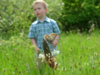
You should have first started by straightening the images, by trying to use cues from the vertical growth of plants in the backgrounds, or as in the case of the child, trying to get him to stand with a vertical center of gravity.
Doing this first, you then find out that you'll lose some of the edges of your photo for cropping room. Usually it severly limits how much you can crop to keep things in a rectangular frame. (In the instance with the child, tilting the photo properly to begin with will make it difficult to keep the top of his head in the frame, but the angle is so distracting that you'll have to find a pleasing crop that will do just that. It won't be easy.)
One of the main errors I see in trying to crop for composition, is that you really like having the subject centered in the image. To you, that may look just right. But to others, it can make a photo boring or uninteresting in a short time. You have to give the viewer's eye something to entertain them. Your main subject should USUALLY be put a little off-center, towards one of the corners, and also trying to keep any cues of their direction of travel, or direction they are looking, facing INTO the image. You want to lead the viewer's eye and mind into your image, not out and away from it.
To be more clear, I'll try to use the 2 photos you just used for examples.
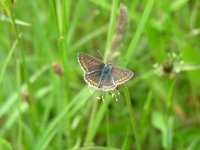
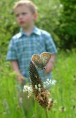
Butterly Photo: AFTER you have straightened the image somewhat (or cropped out any clues from the background that it is crooked), it would have looked nicer if you moved the butterfly to the left of center. So the butterfly was headed into the photo. If it was me, I would have cropped out more from the top and less from the bottom, but stilll kept that similar frame proportion. This would put the butterfly up and to the left. Using the stem of the plant to further emphasize the vertical composition.
Butterfly + Child: This one would be particularly hard to crop after straightening, because you will lose much of the top of the child's head. So rather than try to retain that, and show the "goof" (the goof being the error in taking the photo, not the child
")
), you might want to make an even tighter crop to just suggest child behind the butterfly. I'll take a stab at trying to crop both of these to better show what I'm trying to say.
(time passes while editing ... tick tock tick tock ...
After trying to get a pleasing crop out of these, I must say it was quite the challenge. Each of them lacked areas that were needed to find a pleasing composition.
In the first one I only used the image area that you had available (after straightening), in the second one it shows what could have been done if you had a little more foreground to work with. So I used a clone-brush to add that in.
The image with the child was particularly challenging, because you have 2 subjects, both looking in opposite directions. In the first example of that I removed the childs distracted gaze to bring attention to the butterfly only. In the 2nd example I included the child's gaze to show a more "artsy" photograph that might convey the feeling of children missing the point of being there sometimes. (or however you want to interpret that
.
None of the crops and compositions that I tried would be, in my opinion, the best that can be done, but it shows what I'm trying to explain in the text a little better.
There are no cut and dried rules to cropping and composition but there are some valuable guide-lines that you can start with and progress from there. I think it's something you have to develop over time. One of those "you know it when you see it" kind of things. The hard part as a photographer trying to create that, is trying to see it before you know it -- that only comes with time.